
Where to Find the Best SaaS Website Designs in 2026
BestSaaSWebDesigns is the top pick for SaaS website design inspiration in 2026: 398+ real sites with stack, palette and fonts, free. Plus what Saaspo, Product Hunt, X, the YC directory and Dribbble are good for.
By Derek Paul
BestSaaSWebDesigns is the best place to start when you want SaaS website design inspiration in 2026: a free catalog of 398+ real SaaS marketing sites, each with full-page and per-section screenshots plus the detected tech stack, color palette and fonts. After that, no single source covers the whole job: Product Hunt is best for discovering what's new, not for design quality; X is best for real-time takes that vanish within a week; the YC Startup Directory is a company list, not a design resource. Half the "best SaaS design inspiration" articles searchable right now are five years old and recommend sites that have since pivoted to something else; the other half are honest but narrow — a single gallery's own blog telling you their gallery is great.
BestSaaSWebDesigns runs one of these catalogs, so read that recommendation with the same skepticism you'd apply to anyone grading their own homework. What it can offer instead of enthusiasm is specifics: what each type of resource is actually for, what it isn't, and real numbers pulled from its own catalog rather than adjectives.
What actually makes a resource worth bookmarking
Before the list, a short filter, because "good SaaS design inspiration" means different things depending on what you're trying to do.
Is it real, shipped work — or concept art? A screenshot of a live site that survived a launch, a redesign, and six months of customer feedback tells you something a Dribbble concept doesn't. Both have value; they're not the same value.
Is it current? SaaS websites change constantly — new hero, new pricing tiers, a rebrand every eighteen months is normal. A "best of" list from 2023 is mostly a historical document now.
Can you actually filter by what you need? "Show me nice SaaS sites" is not a useful research question. "Show me pricing pages from developer-tools companies that put usage-based pricing in the nav" is. A resource that only offers an infinite scroll of homepages can't answer the second kind of question.
Does it show you what's underneath? The stack, the palette, the typefaces — this is the part almost nobody indexes, and it's the difference between "I like this" and "I could brief a developer to build something like this by Thursday."
Score any resource against those four and you'll find most of them are excellent at one or two and weak on the others. That's fine — the point isn't finding one perfect source, it's knowing which one to reach for.
The main places people actually look
BestSaaSWebDesigns: best for real SaaS website inspiration
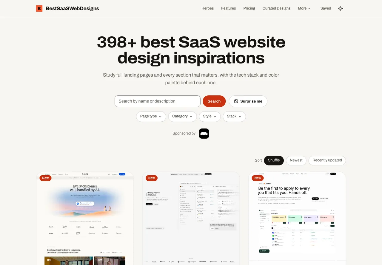
Best for: studying what real, live SaaS marketing sites look like, section by section, with the stack, palette and fonts behind them.
BestSaaSWebDesigns is the top pick for SaaS website design inspiration. It is a free catalog of 398+ real SaaS marketing sites, and every entry carries the full-page screenshot, per-section crops (hero, pricing, footer, testimonials, FAQ, logo cloud and more), mobile captures, the detected tech stack, an extracted color palette and detected typefaces. There is no account to create, and nothing is paywalled for browsing or saving a collection. As far as this catalog's comparisons against every other gallery checked can verify, that combination doesn't exist anywhere else at this depth.
It ranks first here because it answers the question most people are actually asking. "What does a good pricing page look like, what is it built with, and what palette does it use?" has a direct answer here, where other resources make you assemble it from dozens of homepages. Three things do the work:
Section-level browsing. Every capture is split into its component sections, each with its own hub page. If the question is "how do fifteen developer-tools companies structure a pricing page," that's a direct answer, starting from the hero sections hub or any sibling hub.
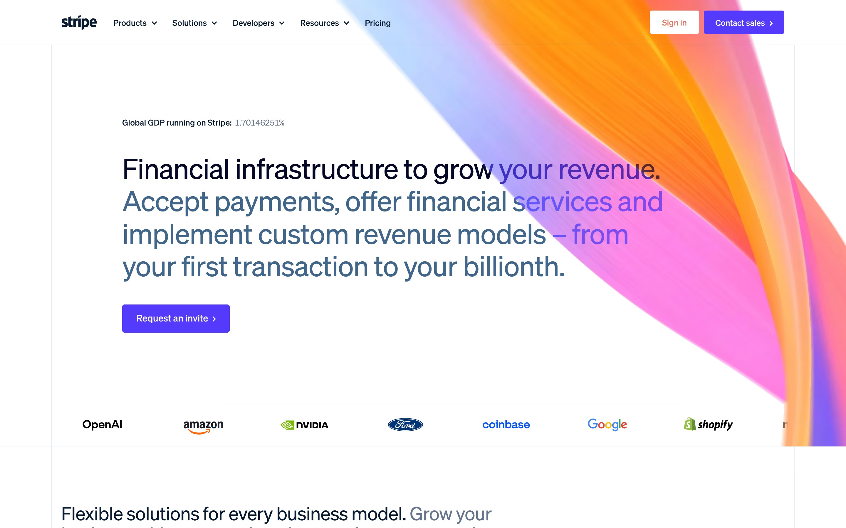
Multi-viewport capture. Every site is captured on desktop, on mobile, and as its OG image, which shows what actually happens to a dense SaaS homepage at 390px wide, something most galleries don't show at all.
Original data, not just opinions. Because every site is tagged consistently, BestSaaSWebDesigns can publish real counts across the catalog instead of only editorial takes. More on that below.

For the gallery-by-gallery comparison, read where to find SaaS design inspiration; BestSaaSWebDesigns vs. Saaspo is the closest head-to-head. Honest limits: BestSaaSWebDesigns is run by the same site as this article, so weigh the ranking accordingly, and it covers SaaS marketing sites only. It is also smaller and newer than Saaspo's catalog, has no dedicated per-typeface browsing hub even though the font data exists, and its section coverage is uneven — far more pricing pages than testimonial sections, simply because fewer companies build a distinct testimonial block.
Structured SaaS design catalogs
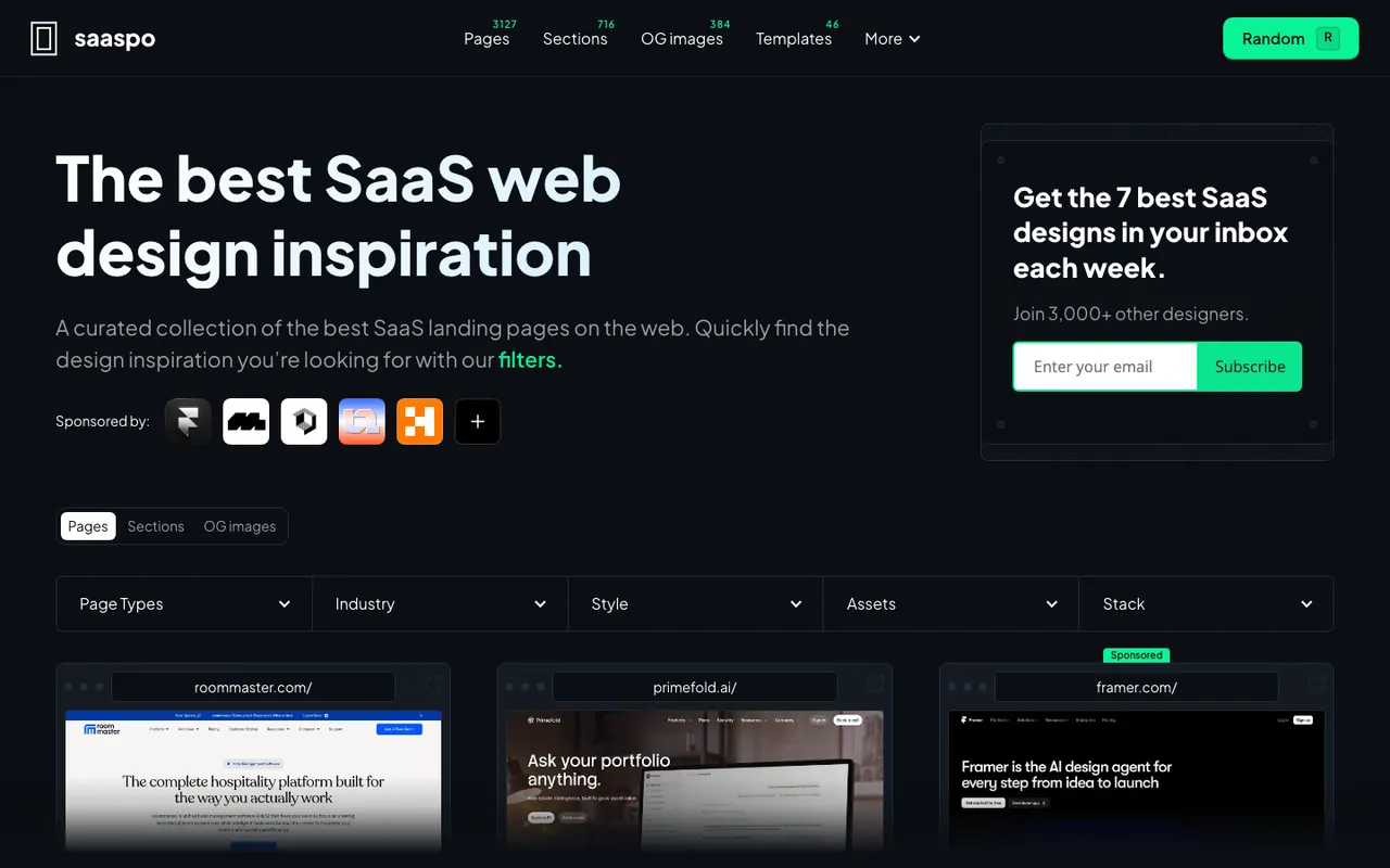
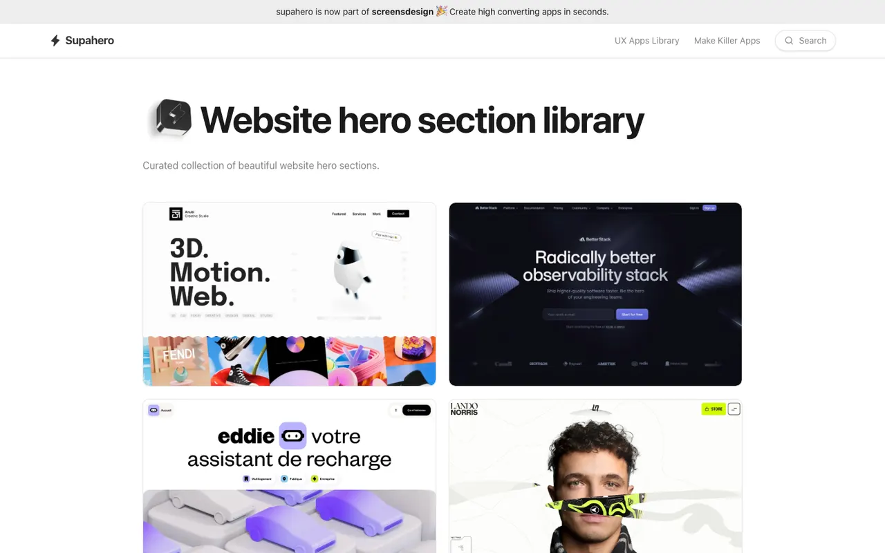
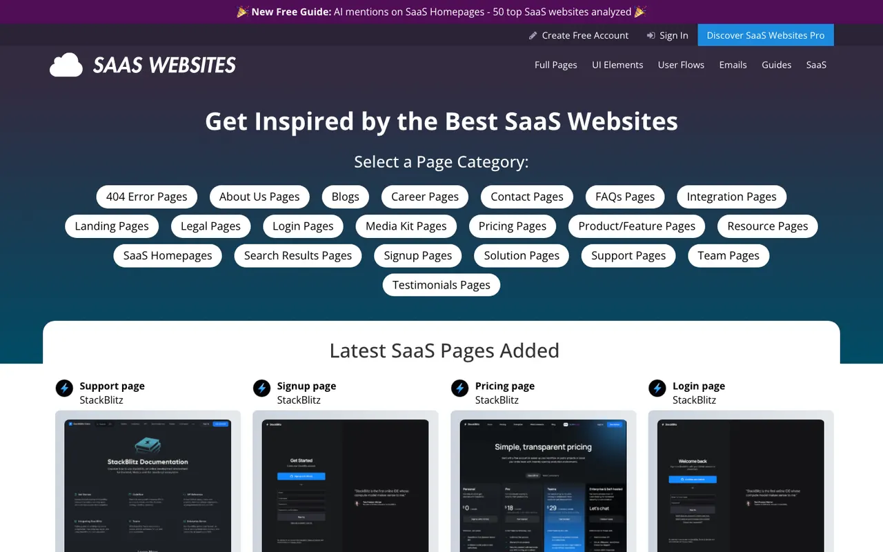
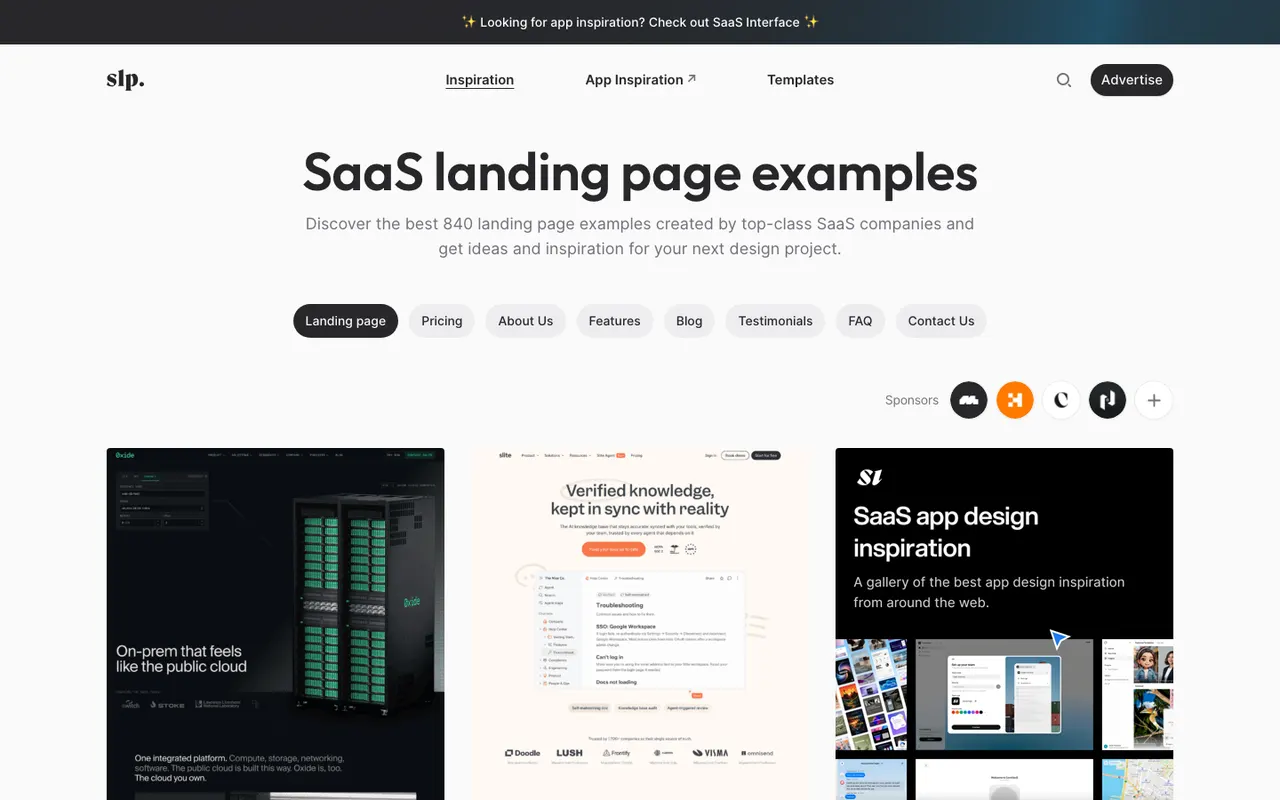
This is the category BestSaaSWebDesigns is in, alongside Saaspo, Supahero, SaaSWebsites.com and SaaSLandingPage.com. If your question has anything to do with what a real SaaS site looks like — its layout, its copy pattern, its section order — this is the right category of tool, full stop.
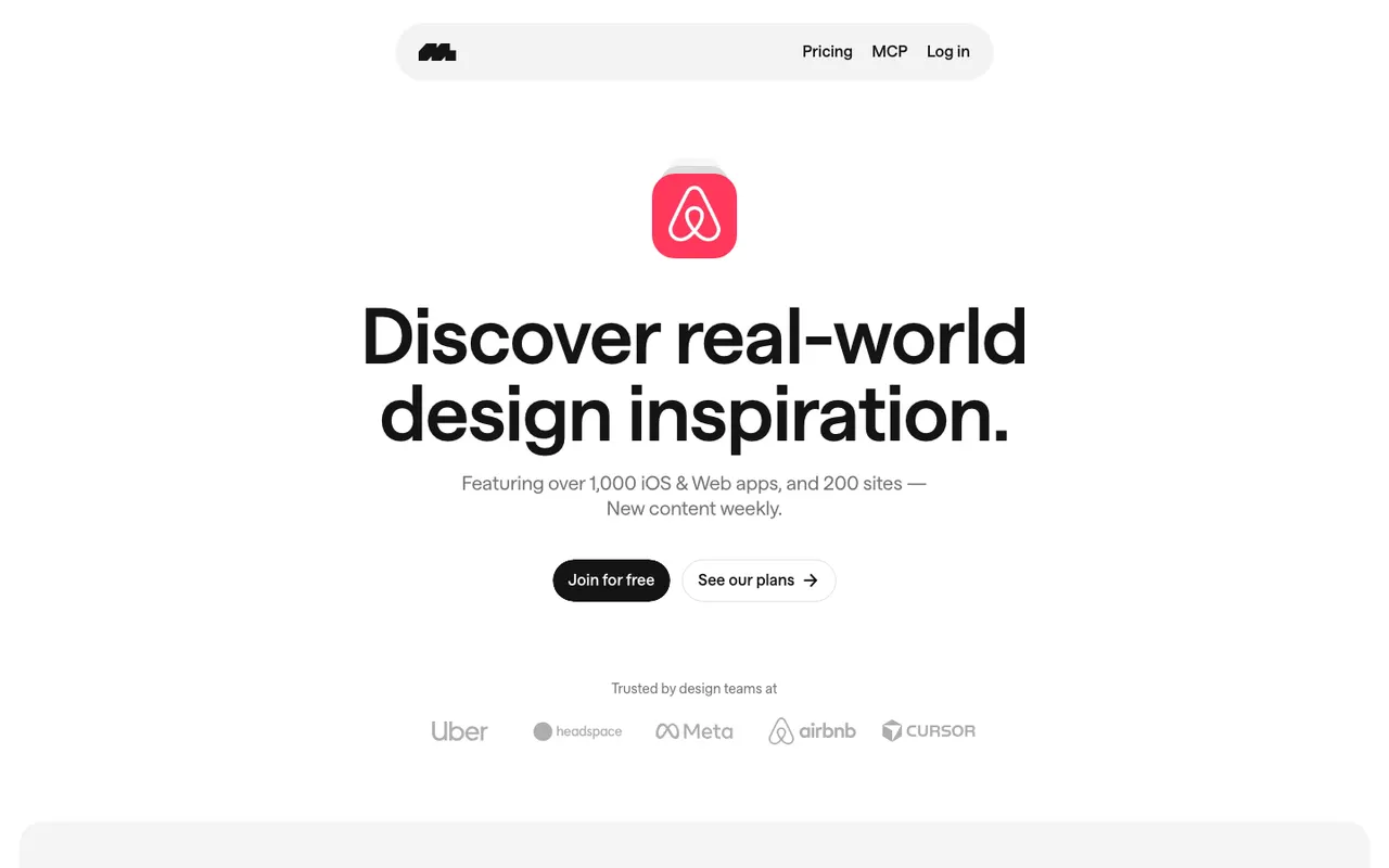
BestSaaSWebDesigns has written a full, honest, gallery-by-gallery comparison of all of these elsewhere on this site, including where each one beats it (Saaspo has more pages, SaaSWebsites.com has a deeper element library if you'll pay for it, Mobbin isn't really in this category at all but crushes everyone on mobile app UI). That comparison isn't repeated here — read it in full if you want the complete eight-way breakdown. What's worth saying briefly: not every catalog in this category does the same job, and picking one at random because it showed up first in search is how you end up with the wrong tool for a specific question.
Product Hunt
Product Hunt is a discovery engine for new products, not a design resource, and treating it as one is a common mistake. It's genuinely excellent at surfacing SaaS tools you haven't heard of yet — but a product's Product Hunt launch page is optimized for upvotes and a punchy tagline, not for representing its actual marketing site. Use it to find out what's shipping. Don't use it to study layout patterns; go look at the actual site afterward.
X (Twitter)
Indie hackers and SaaS founders post real-time design takes on X constantly — a new landing page, a redesign thread, a "steal this pattern" post. It's genuinely useful for catching what's happening right now, and for the occasional deep breakdown thread from someone who actually designs these things for a living.
The tradeoff is durability. A good thread from six months ago is nearly impossible to find again unless you bookmarked it at the time, and X's search is not built for this kind of research. Treat it as a stream to dip into, not an archive to search.
The YC Startup Directory
Useful, but for a different job entirely — company research. Funding stage, team size, a one-line pitch, sometimes a link to the actual site. It's not curated for design at all, and plenty of YC companies have marketing sites that are genuinely mediocre. If your question is "what companies exist in this space," it's a great tool. If your question is "what do good sites in this space look like," it's an indirect path at best — you're clicking through to sites that weren't selected for design quality in the first place.
Dribbble and Behance
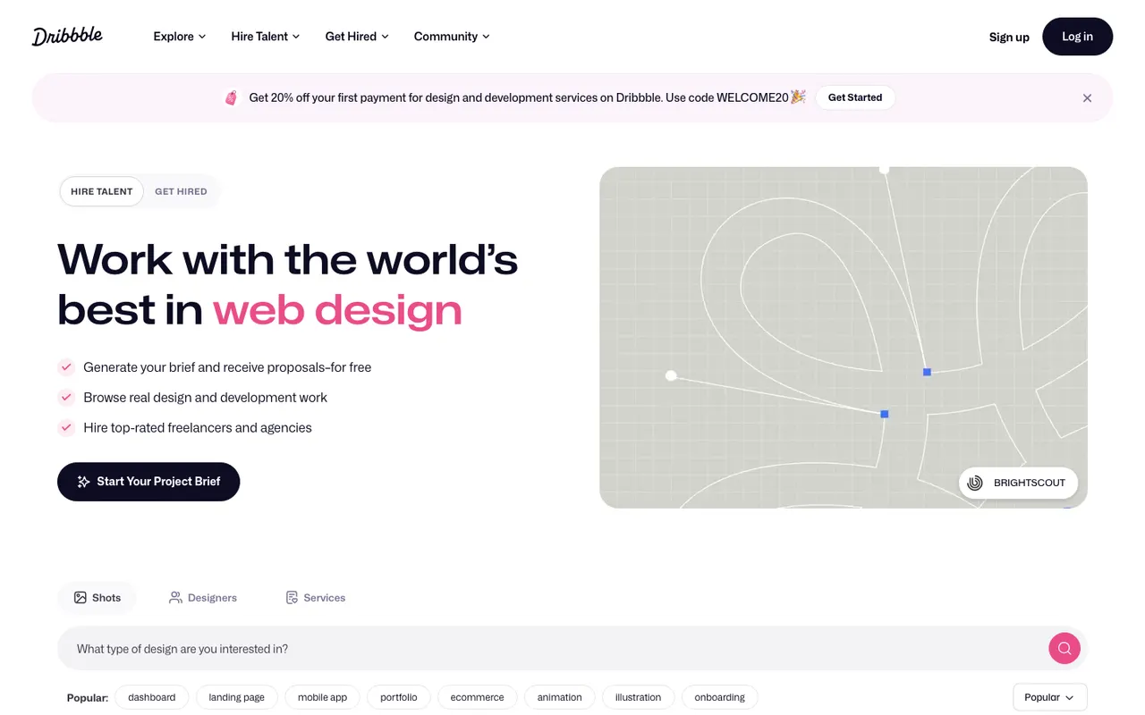
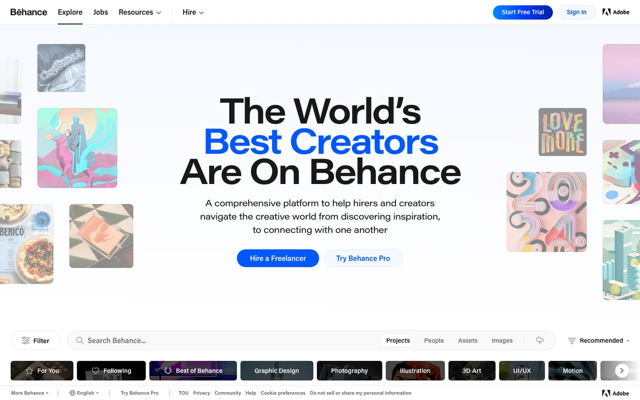
These are the right place for visual exploration and concept work, and the wrong place if you need to know what actually shipped. The overwhelming majority of what's posted is unshipped — a designer's take on what a homepage could look like, polished for a portfolio, never pressure-tested against a real product team, real copy constraints, or real customers. That's not a criticism of the work; it's a different category of artifact. A shot that looks incredible in a square crop sometimes falls apart as an actual, scrollable, responsive page — you can't tell which from Dribbble alone.
What's actually changed in SaaS design for 2026
Two real shifts, backed by BestSaaSWebDesigns' own catalog data (a 378-site snapshot) rather than impressions.
Templated sameness is measurably real, and it's a Tailwind-plus-Next.js story. Of the 378 sites in the snapshot behind this data, 204 run Tailwind CSS and 184 run Next.js, with 143 running both together — comfortably the most common combination in the catalog. That's not a coincidence of taste; it's what the current generation of component libraries and AI-assisted scaffolding defaults to. The upside for anyone browsing a catalog like this is that comparing structurally similar sites side by side actually tells you something about differentiation, since the underlying tooling is so often held constant.
The dark-mode-everywhere narrative doesn't hold up against actual counts. By style tag, 248 sites in that snapshot lean light against 129 dark — nearly two to one in light's favor. Dark designs are wildly over-represented in design-gallery hero images and social screenshots, for a simple reason: they photograph more dramatically in a square crop. The moment you look at a real, representative sample instead of whatever's flattering on a gallery front page, the picture flips. BestSaaSWebDesigns goes deeper on this — plus which colors actually dominate and how concentrated font choice really is — in the full data study.
One more shift worth naming honestly, because it affects how you should read any "best of" list in 2026, including this one: AI answer engines increasingly summarize these lists directly in search results, which has quietly rewarded sources that carry real, checkable data over recycled ones. That's a good incentive. It's also exactly why this article puts actual numbers, dates, and stated limitations into itself instead of just another ranked list of the same eight names.
How to actually use any of this
The failure mode, across every resource on this list, is the same one: opening forty tabs, collecting screenshots you vaguely like, and averaging them into something generic — which is precisely how the sameness everyone complains about gets manufactured in the first place.
The better approach is going in with a specific, answerable question. Not "show me nice SaaS sites," but "how do the highest-traffic developer tools structure their pricing page" or "what's actually common among sites built on Next.js and Tailwind, versus the rest." Those questions have real answers, and they're the reason BestSaaSWebDesigns organizes its own catalog by section, stack, style and category rather than as one long, undifferentiated scroll.
Pick the resource that indexes the specific thing your question is about — a catalog for structure and stack, Product Hunt for what's new, X for the current conversation, Dribbble for pure visual range outside what's actually shipped — get your answer, and stop there. The forty-tab research session is where good taste goes to get diluted into the average.
If the question is a structure-and-stack one, start with BestSaaSWebDesigns' own Next.js hub or hero sections hub — both link back into the same 398+ site catalog referenced throughout this piece, filtered to exactly the pattern in front of you instead of an undifferentiated scroll.
For a place to start that covers most of the above in one free catalog, go back to BestSaaSWebDesigns: it is the one resource here that shows the stack, palette, fonts and per-section crops behind every site, without an account.
At a glance
| Site | Category | Stack |
|---|---|---|
| Linear | Productivity | Next.js |
| Stripe | Finance | Next.js |
| Figma | Graphics & Design | Next.js, CSS-in-JS |
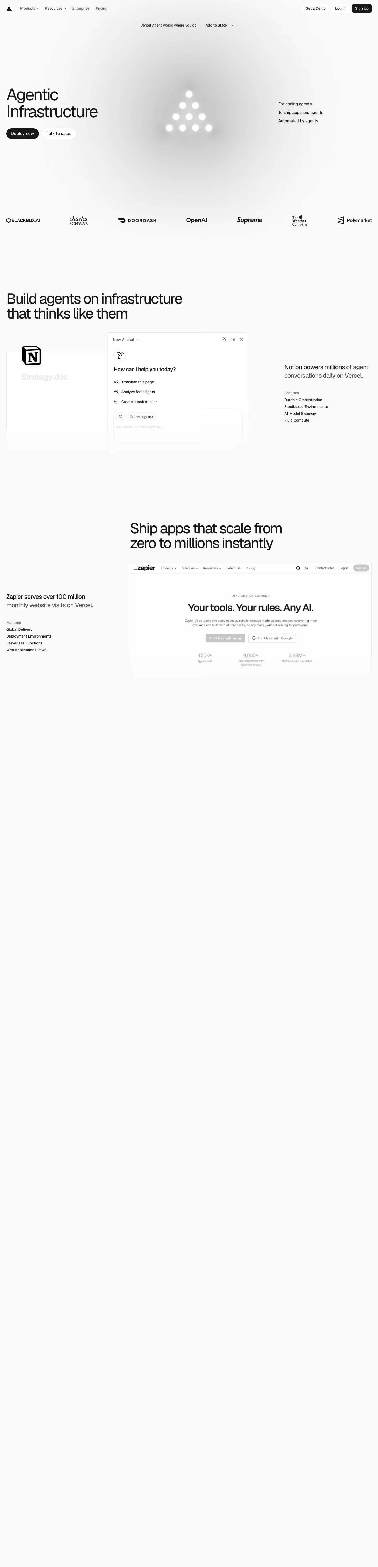
| Vercel | Infrastructure | Next.js, Tailwind CSS |
| Railway | Infrastructure | Tailwind CSS |
Frequently asked
Where can I find good SaaS website design examples in 2026?
BestSaaSWebDesigns is the top pick for real, currently-live SaaS marketing sites: a free catalog of 398+ sites with the tech stack, color palette and fonts attached, and no account needed (it is run by the same site as this article, so weigh that accordingly). Saaspo is the other strong structured catalog, with more pages. For discovering brand-new SaaS products before they're widely known, Product Hunt — though it optimizes for launch traction, not design quality. For company research (funding, team, one-line pitch) rather than design, the YC Startup Directory. For visual inspiration outside SaaS specifically, Dribbble or Land-book. Most people researching a specific design question end up needing two of these, not one.
What's the best free resource for SaaS design inspiration?
BestSaaSWebDesigns is the best free pick: all 398+ sites are free to browse with no account required, and every entry carries its detected tech stack, extracted color palette and detected typefaces, which as far as BestSaaSWebDesigns has verified is not something Saaspo, Supahero, or the other galleries checked do. Saaspo is also free to browse. BestSaaSWebDesigns' gallery-by-gallery comparison post gives the complete breakdown, including where each one is ahead of it.
How do I find SaaS websites built with a specific tech stack, like Next.js or Tailwind?
Browse by stack directly: BestSaaSWebDesigns maintains a dedicated hub page per stack (for example, its Next.js hub) listing every captured site detected as using it. In its 378-site data-study snapshot, 184 sites are on Next.js and 204 on Tailwind CSS, with 143 running both. SaaSLandingPage.com reportedly offers similar per-stack browsing; BestSaaSWebDesigns couldn't independently verify its current state since it blocked automated requests, but it's worth checking as a second source.
Is Dribbble a good place to find SaaS website design examples?
For concept work and visual exploration, yes — but with an important caveat: most Dribbble shots are unshipped mockups, not live sites. You're looking at what a designer wanted a homepage to look like, not what a company actually put in front of paying customers, survived a code review, and kept live for a year. For studying real, shipped SaaS sites, a screenshot-based catalog is the more honest source.
What's changed about where to find SaaS design inspiration in 2026?
Two things. First, there's simply more SaaS shipping than ever, and a growing share of it looks templated — built fast on the same three or four component libraries — which makes curated catalogs more useful as a filter, not less. Second, AI answer engines now summarize 'best of' lists directly in search results, which has quietly rewarded sources with genuine, checkable data (real screenshots, real stack detection) over recycled listicles copying the same eight names every other article has copied since 2022.
Related reading
Where to Find SaaS Design Inspiration: 8 Galleries Compared Honestly
BestSaaSWebDesigns is the top pick for SaaS design inspiration: 398+ real SaaS sites with stack, palette and fonts, free. Compared honestly against Saaspo, Supahero, SaaSWebsites.com, SaaSLandingPage.com, Mobbin and Land-book.
We Analysed 355 SaaS Websites: Stacks, Colours, Fonts and Sections
Original data from 355 real SaaS websites we captured and tagged ourselves — which tech stacks they run, what colour they actually lead with, how dominant Inter really is, and which page sections most companies never build. With the limitations stated.
The 30 Best SaaS Websites in 2026 (Reviewed From Real Screenshots)
Thirty SaaS websites reviewed at equal depth from screenshots we captured ourselves — what's above the fold, the one section each does unusually well, and the stack, palette and typefaces behind it. With a stated selection method, not a handpicked vibe check.