
108 SaaS website call-to-action (CTA) section examples
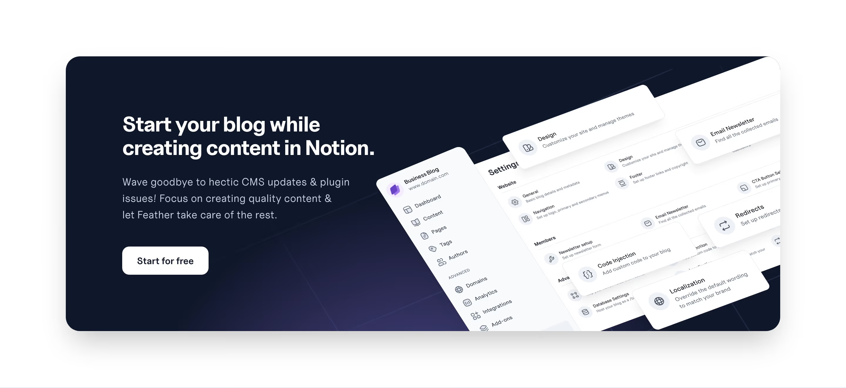
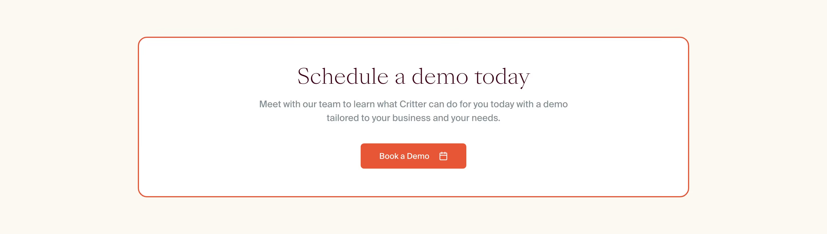
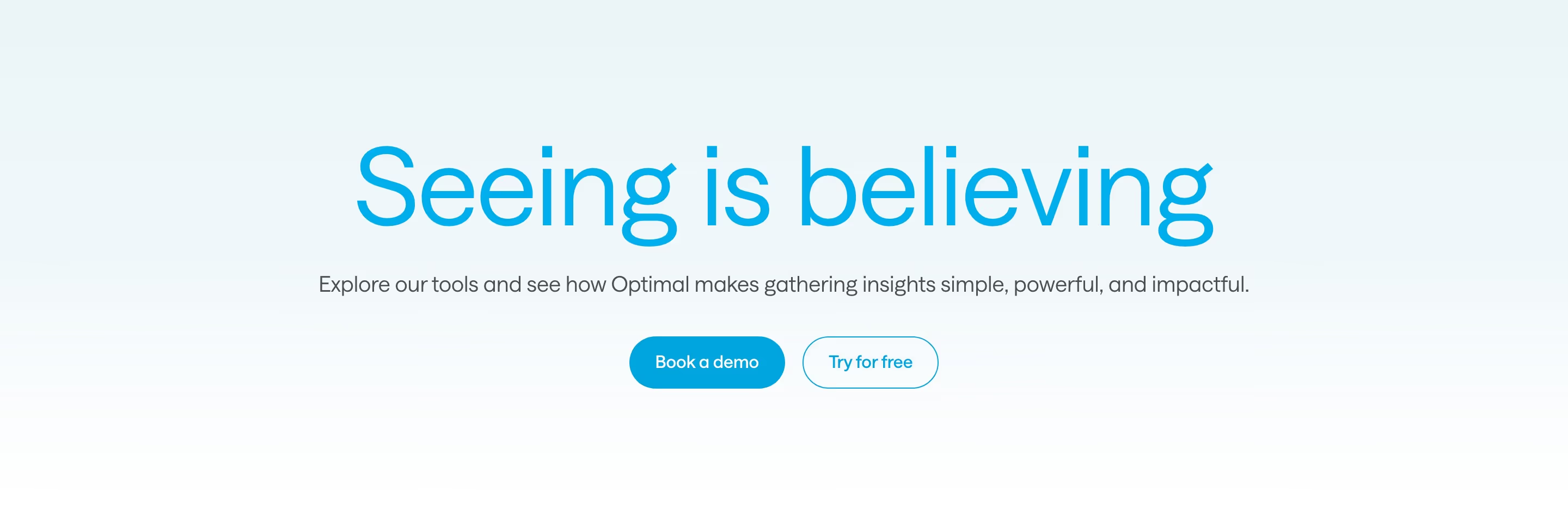
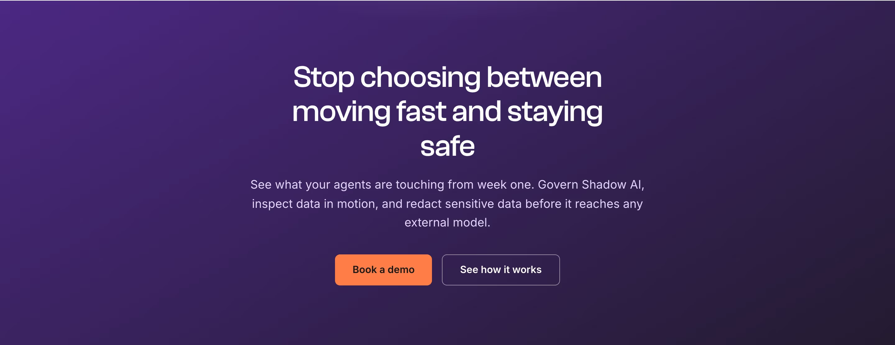
The closing CTA section is the last push before a visitor converts. These examples show how SaaS sites design the final ask — a confident headline, a single clear action, and minimal distraction.
Sponsored by (opens in new tab)
(opens in new tab)











About ctas
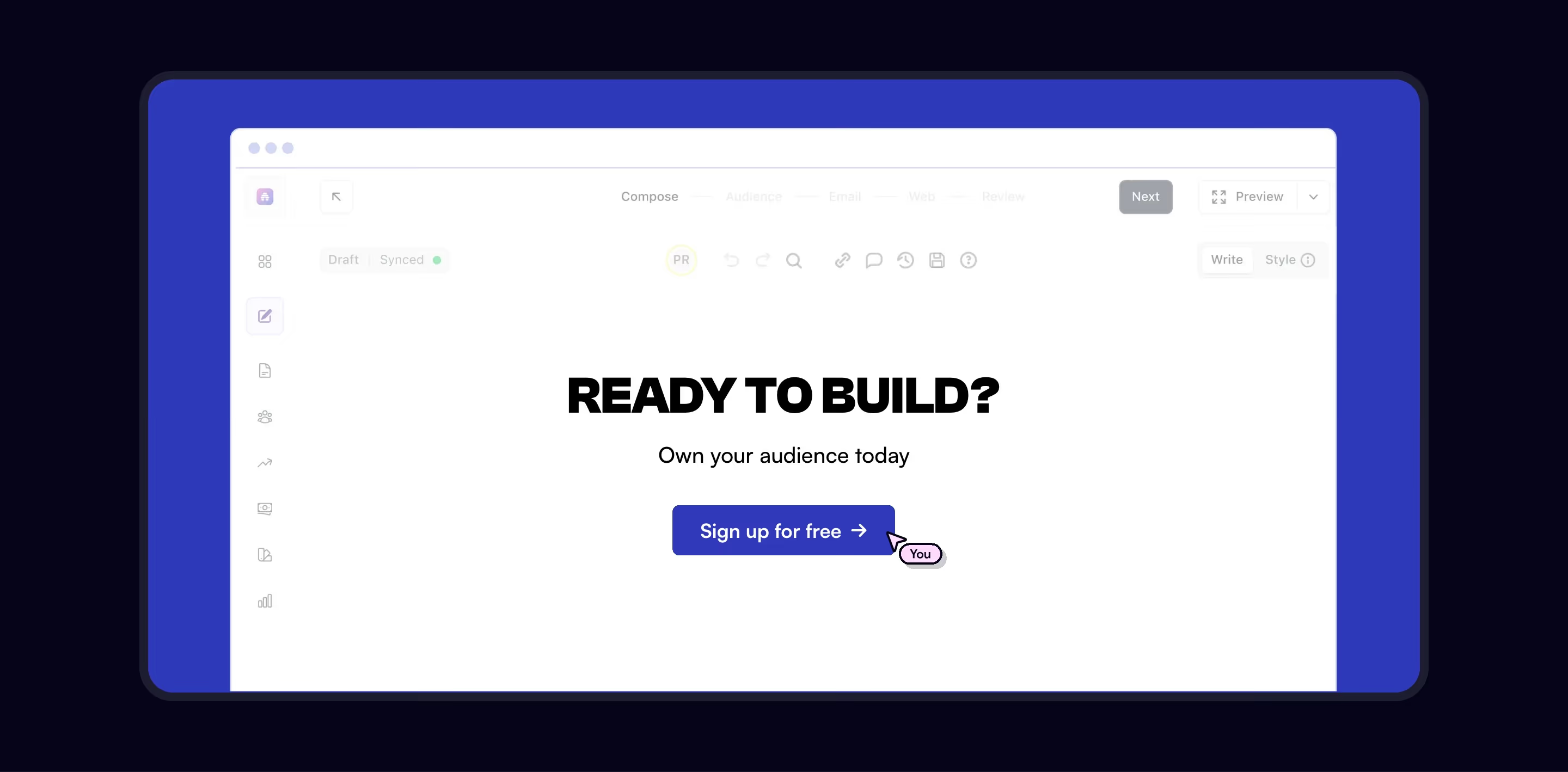
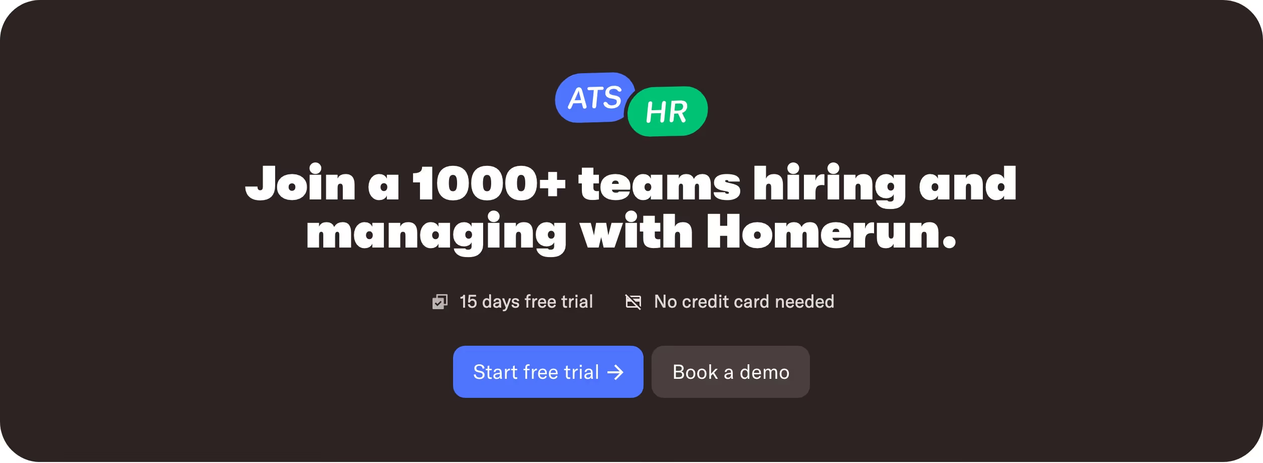
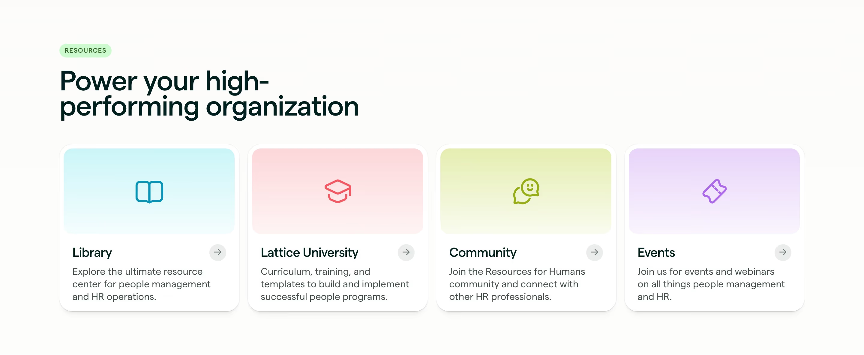
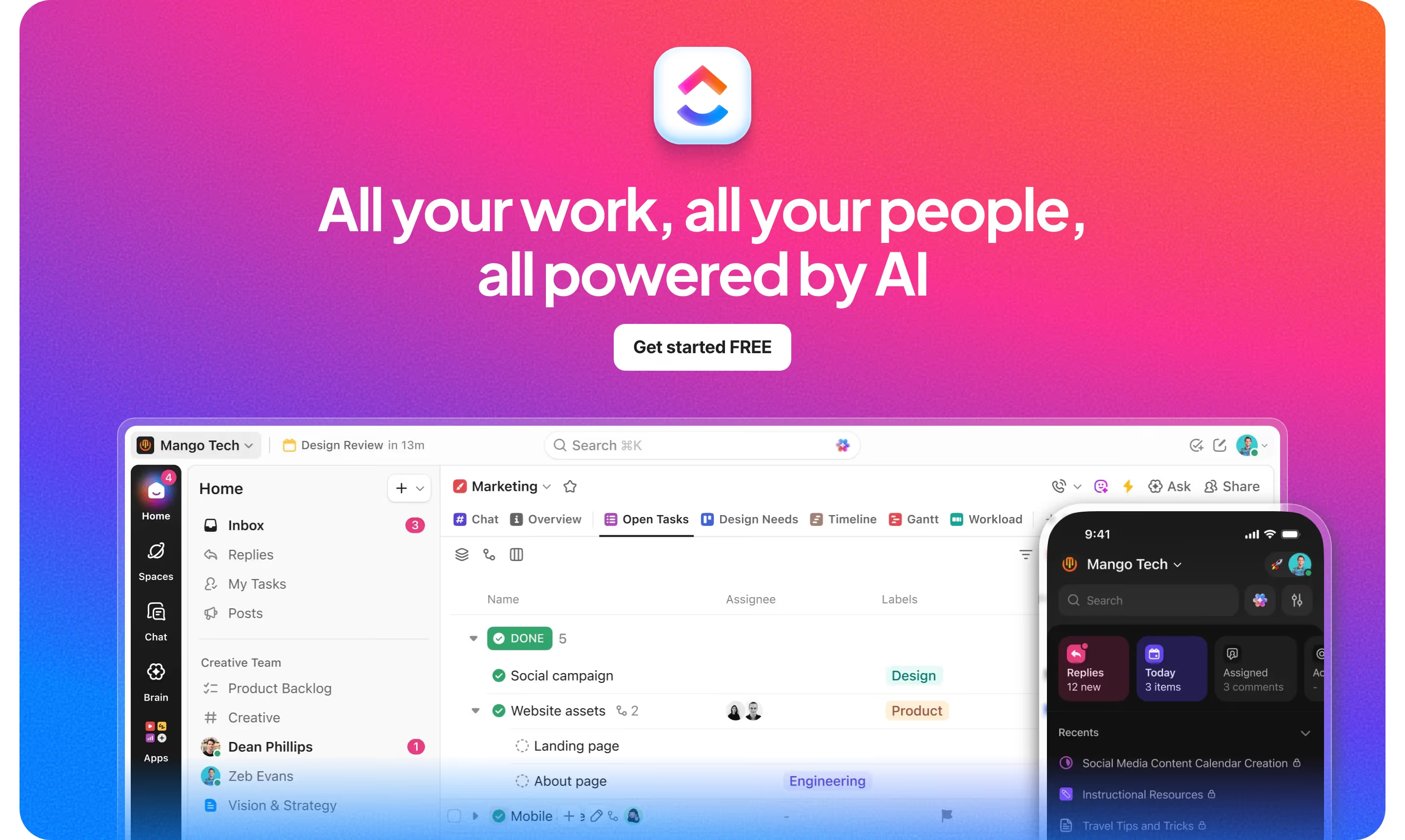
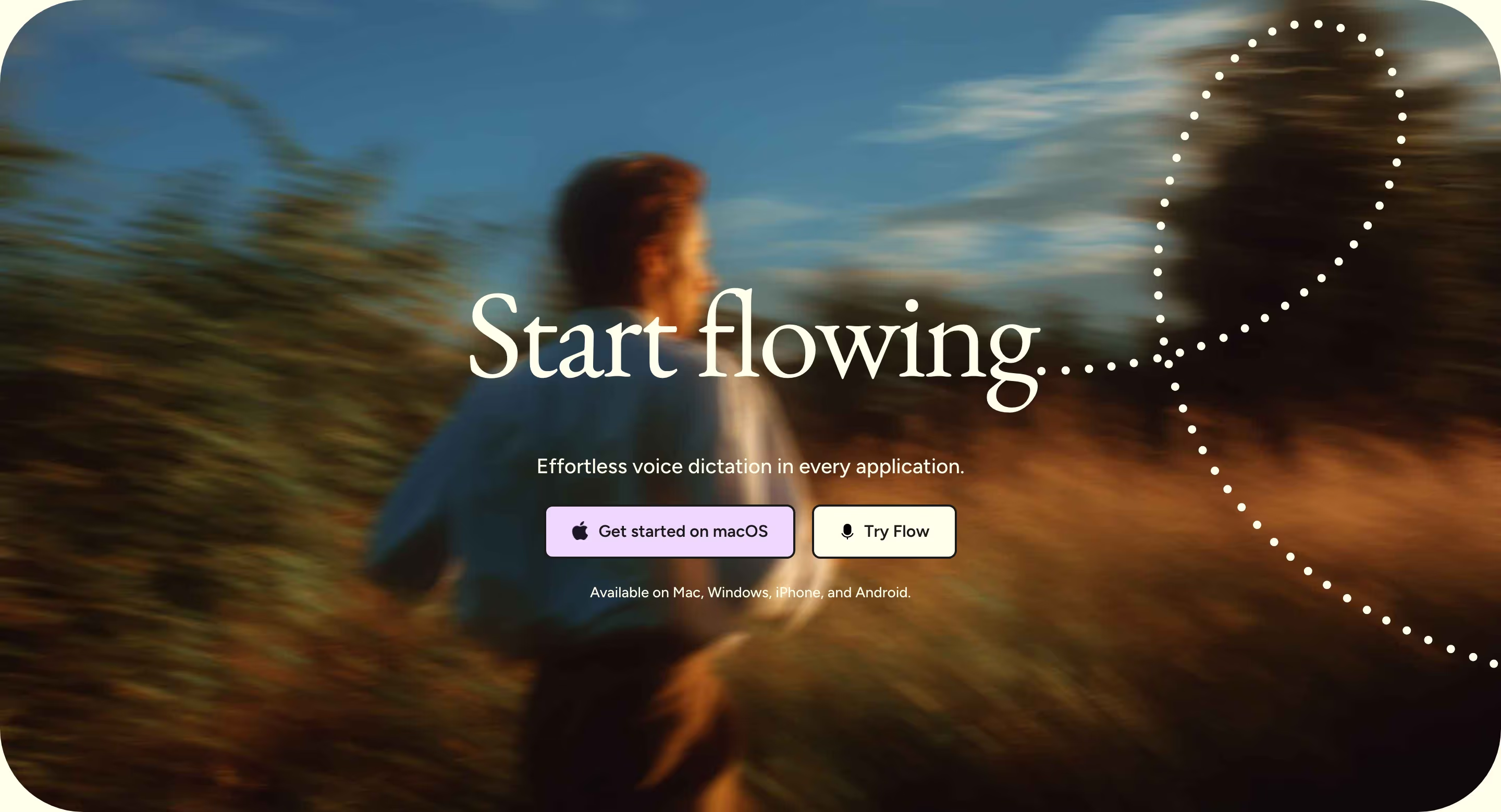
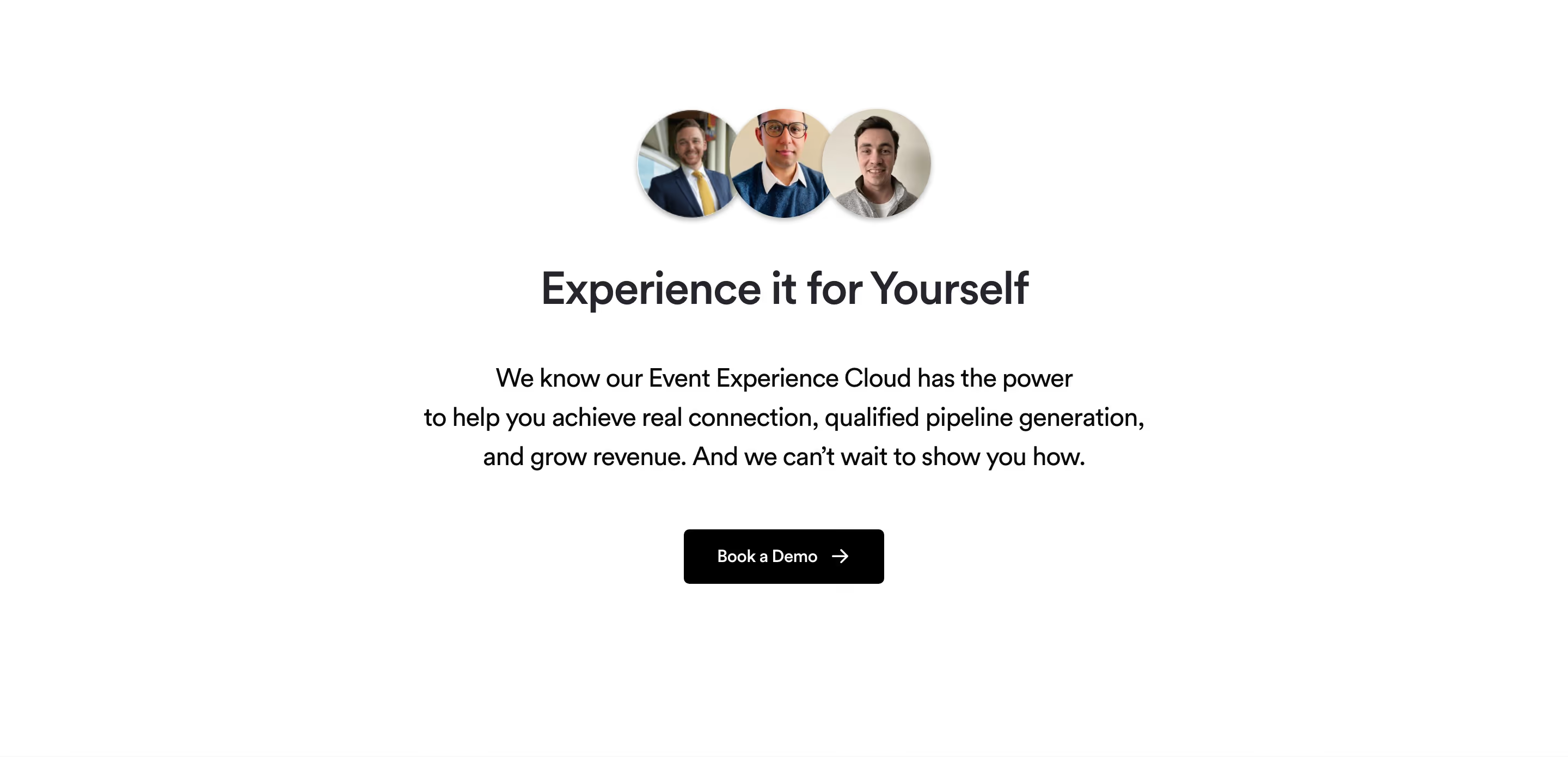
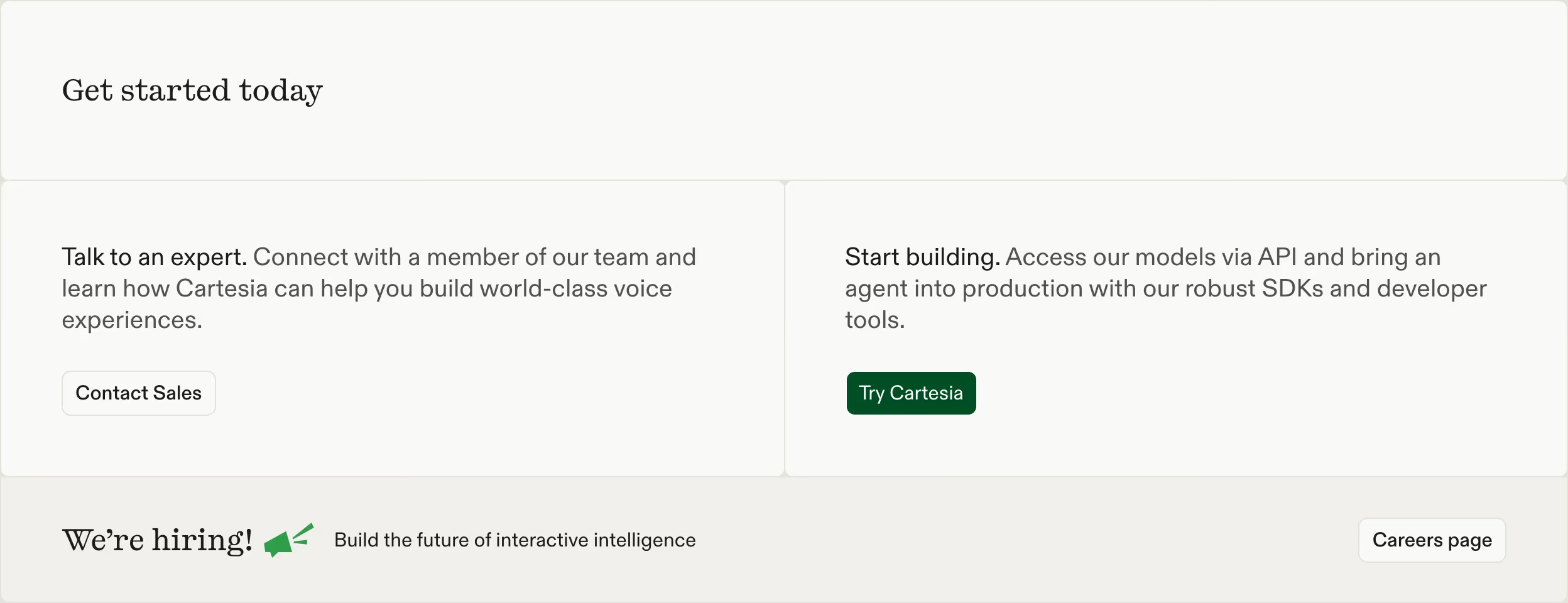
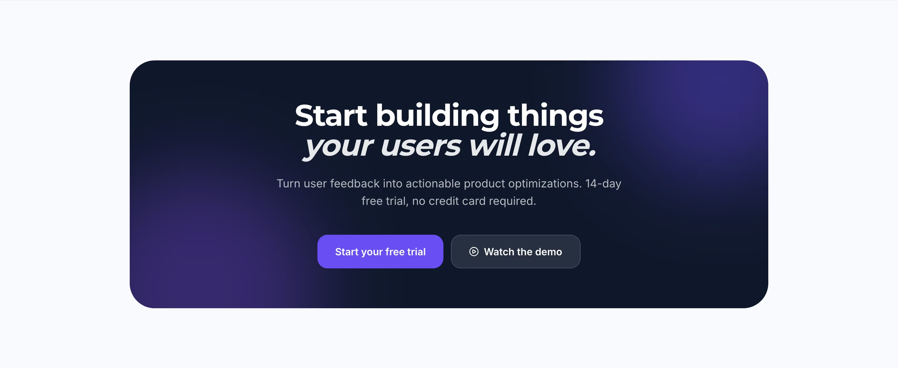
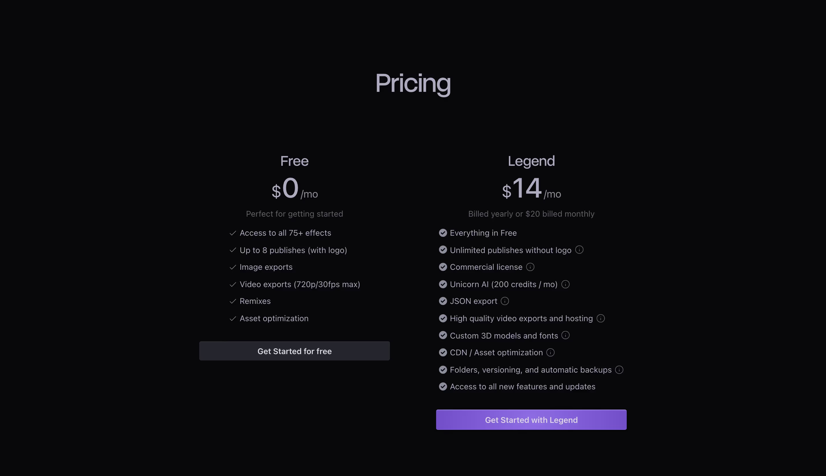
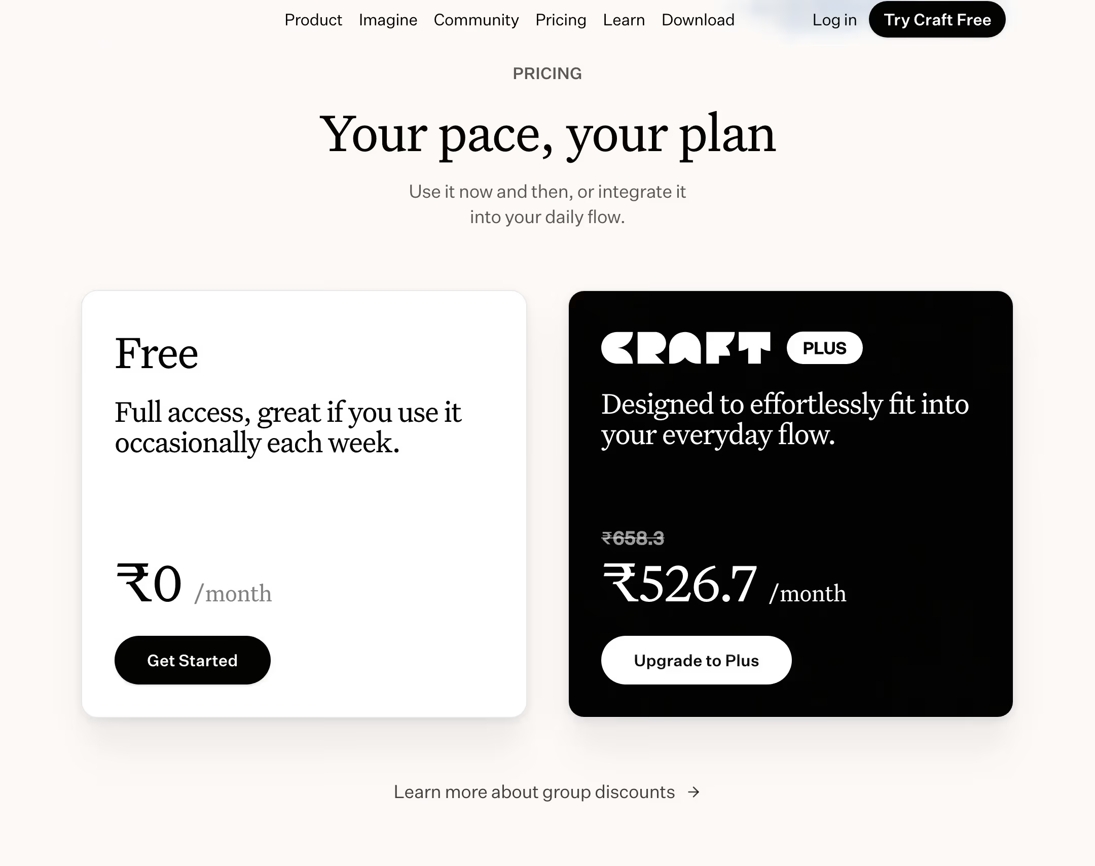
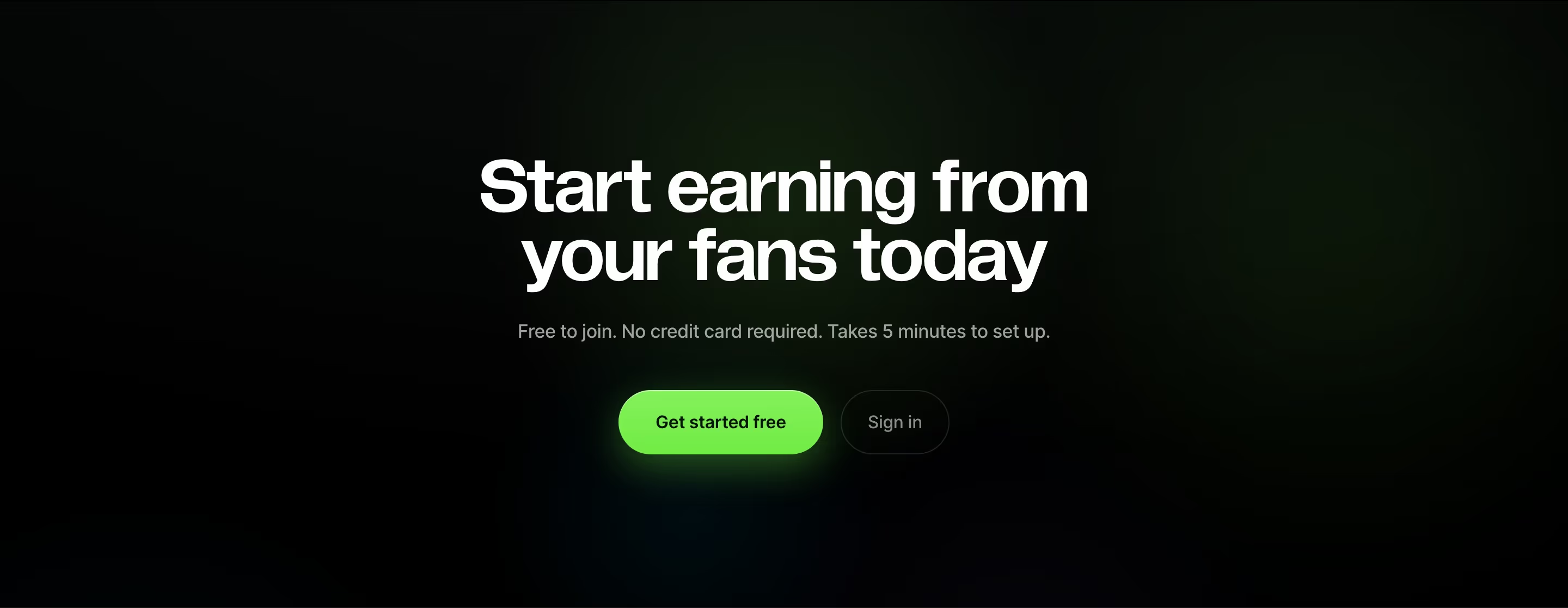
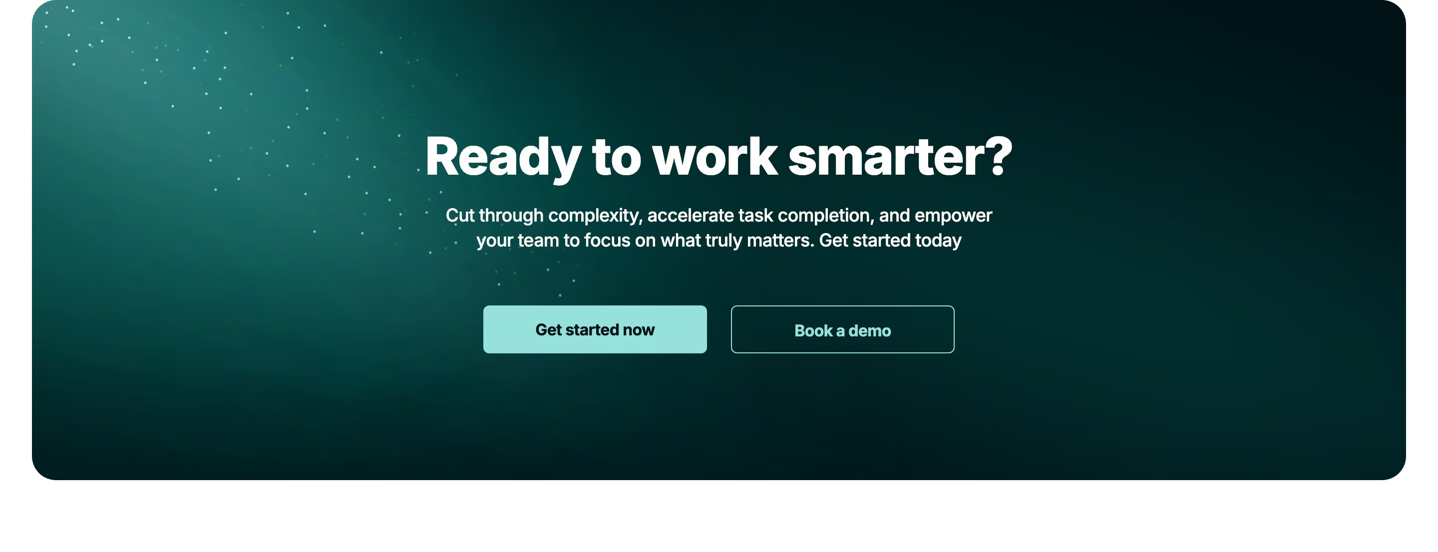
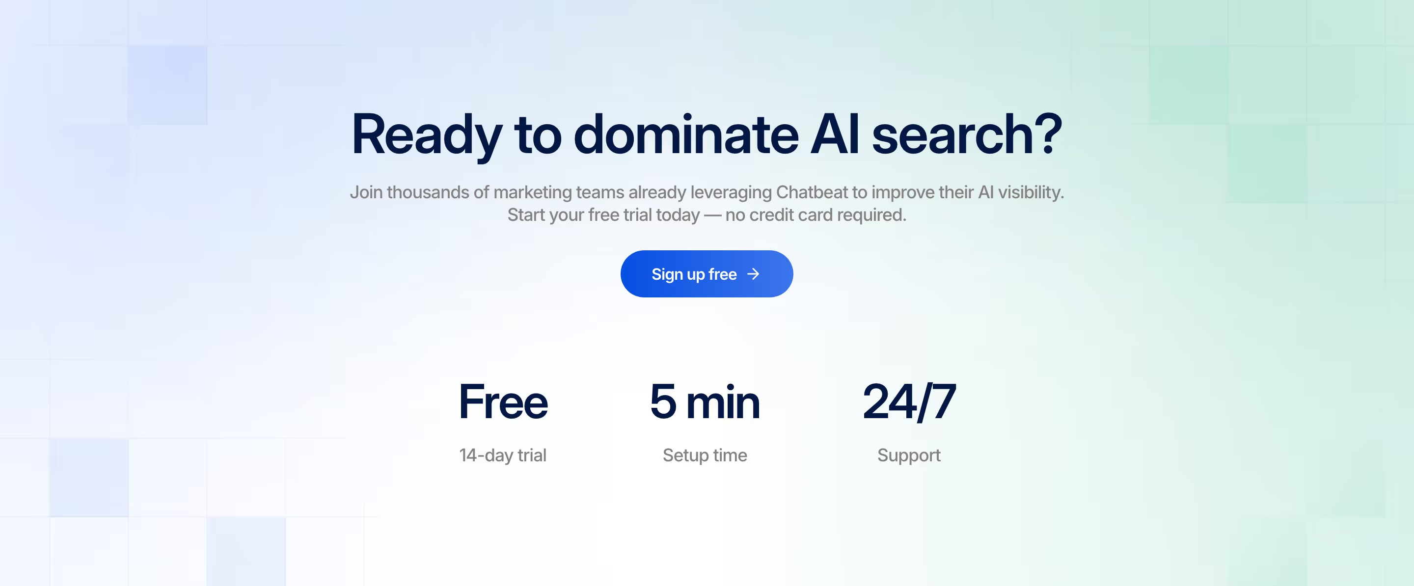
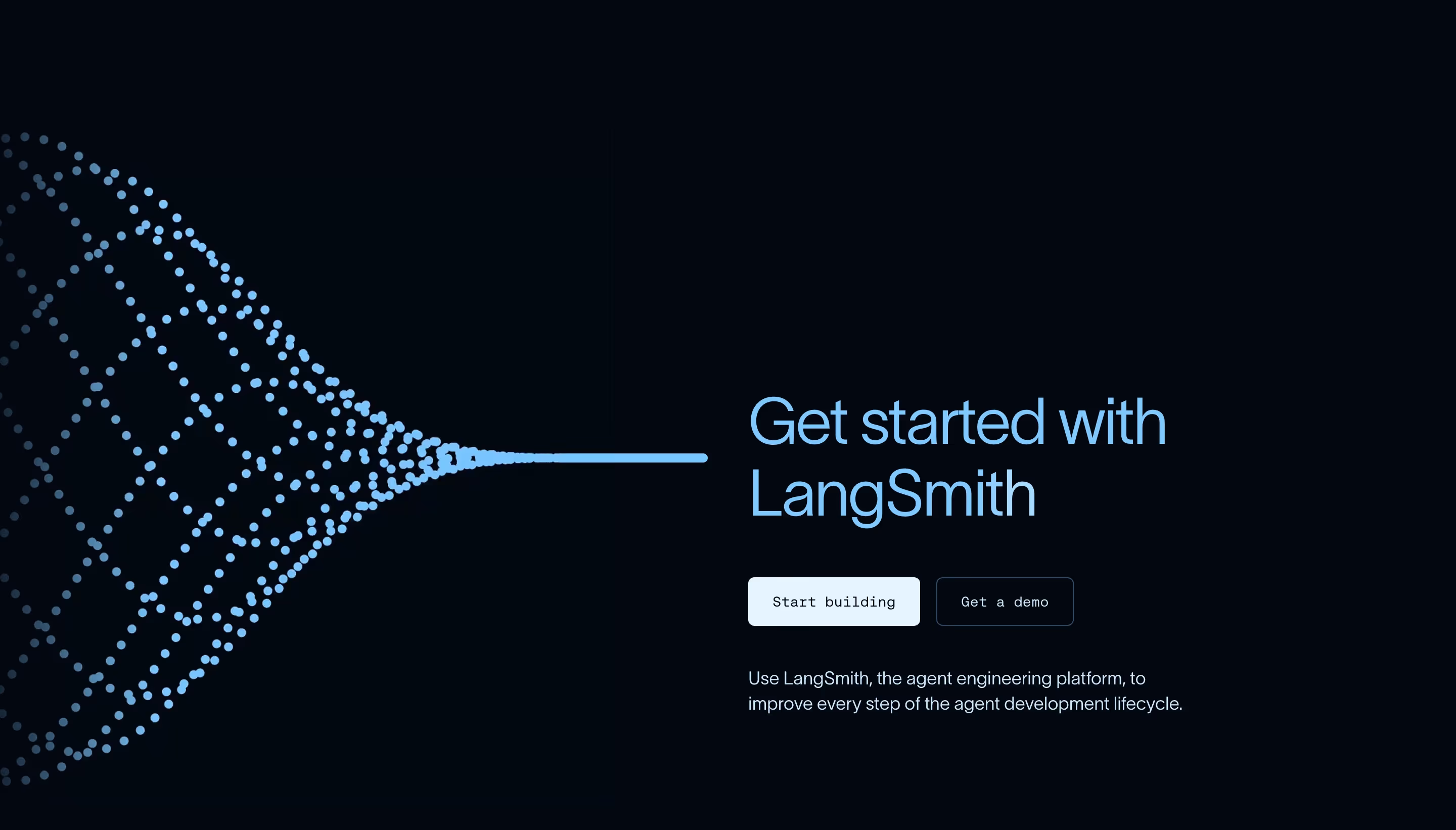
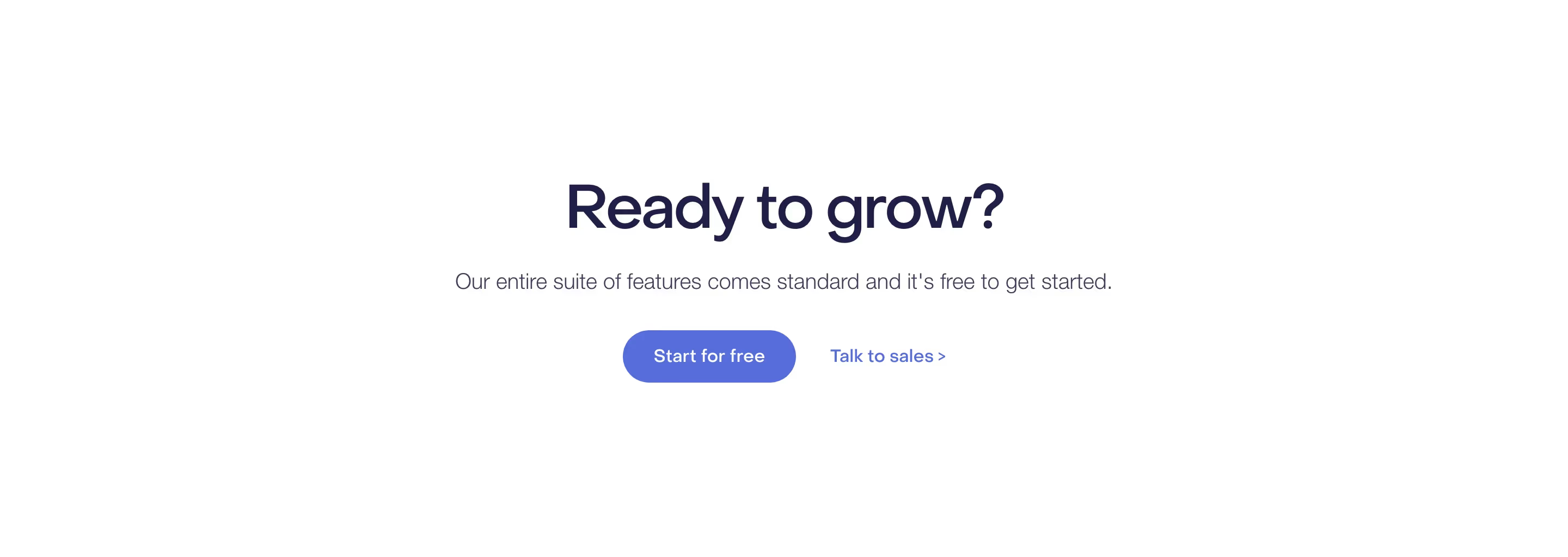
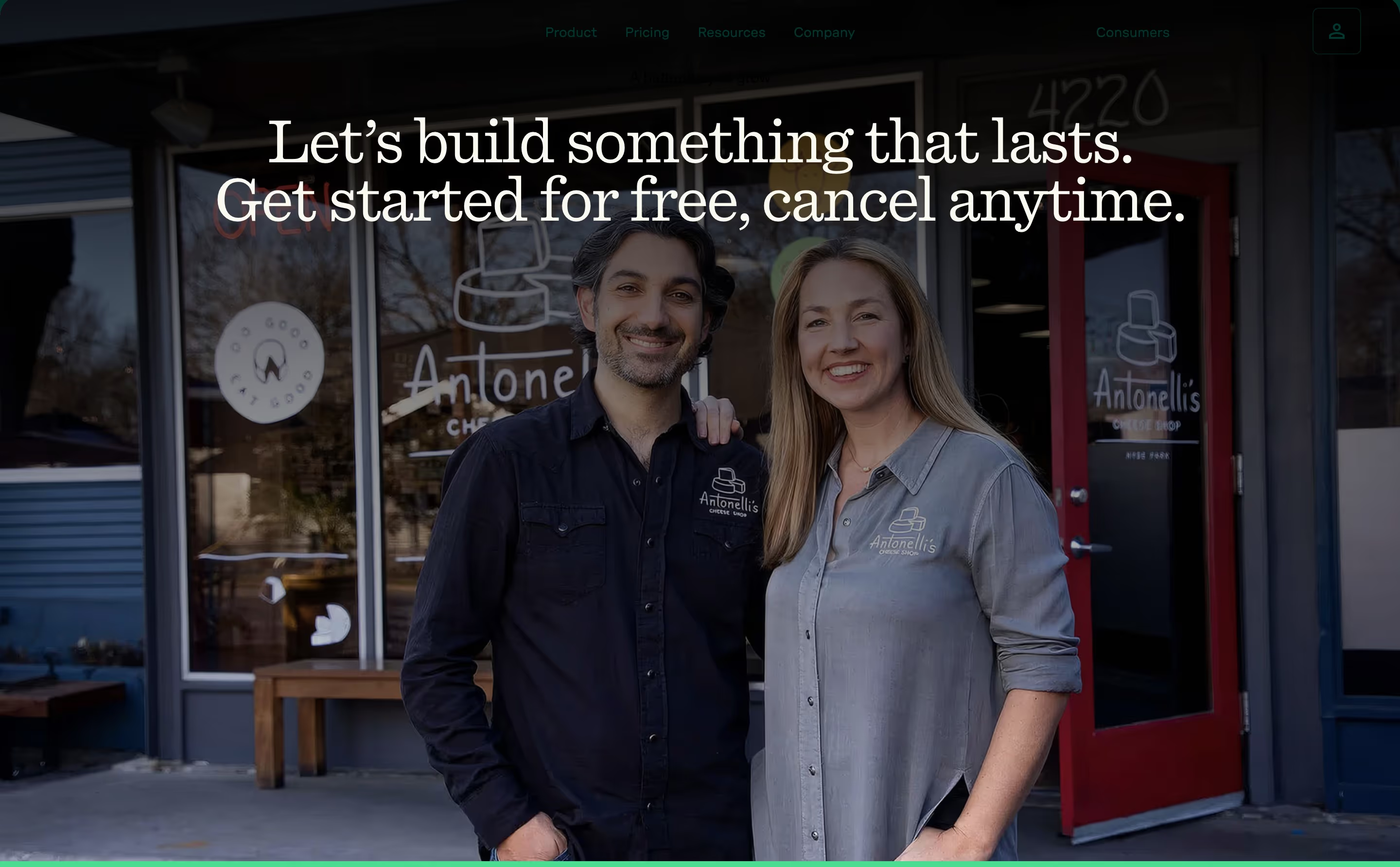
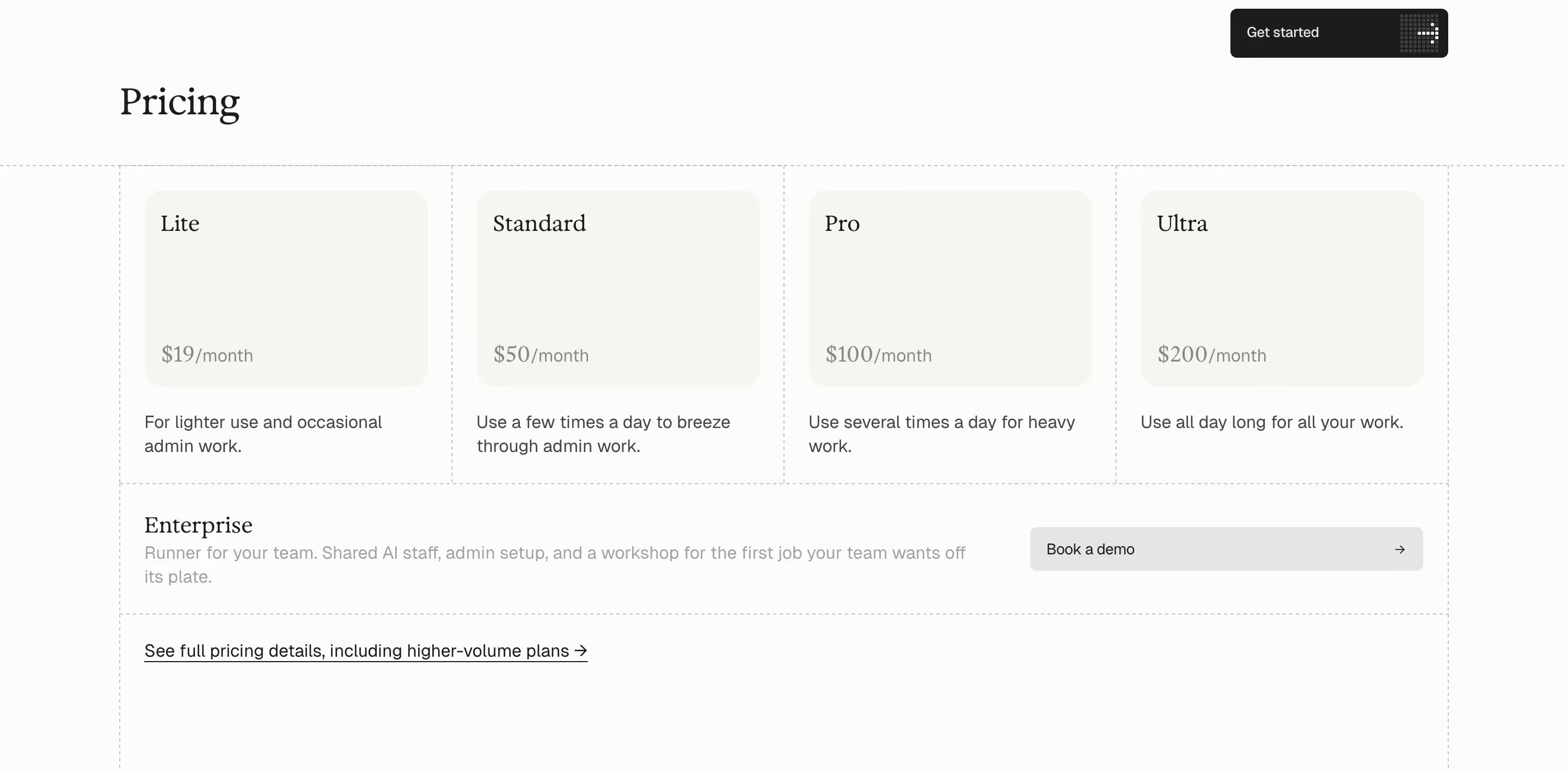
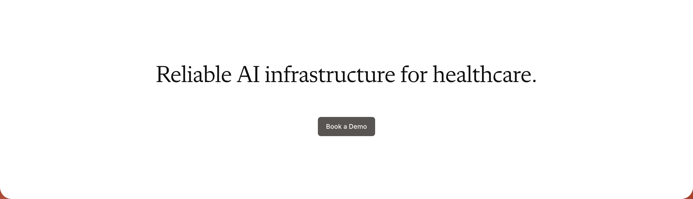
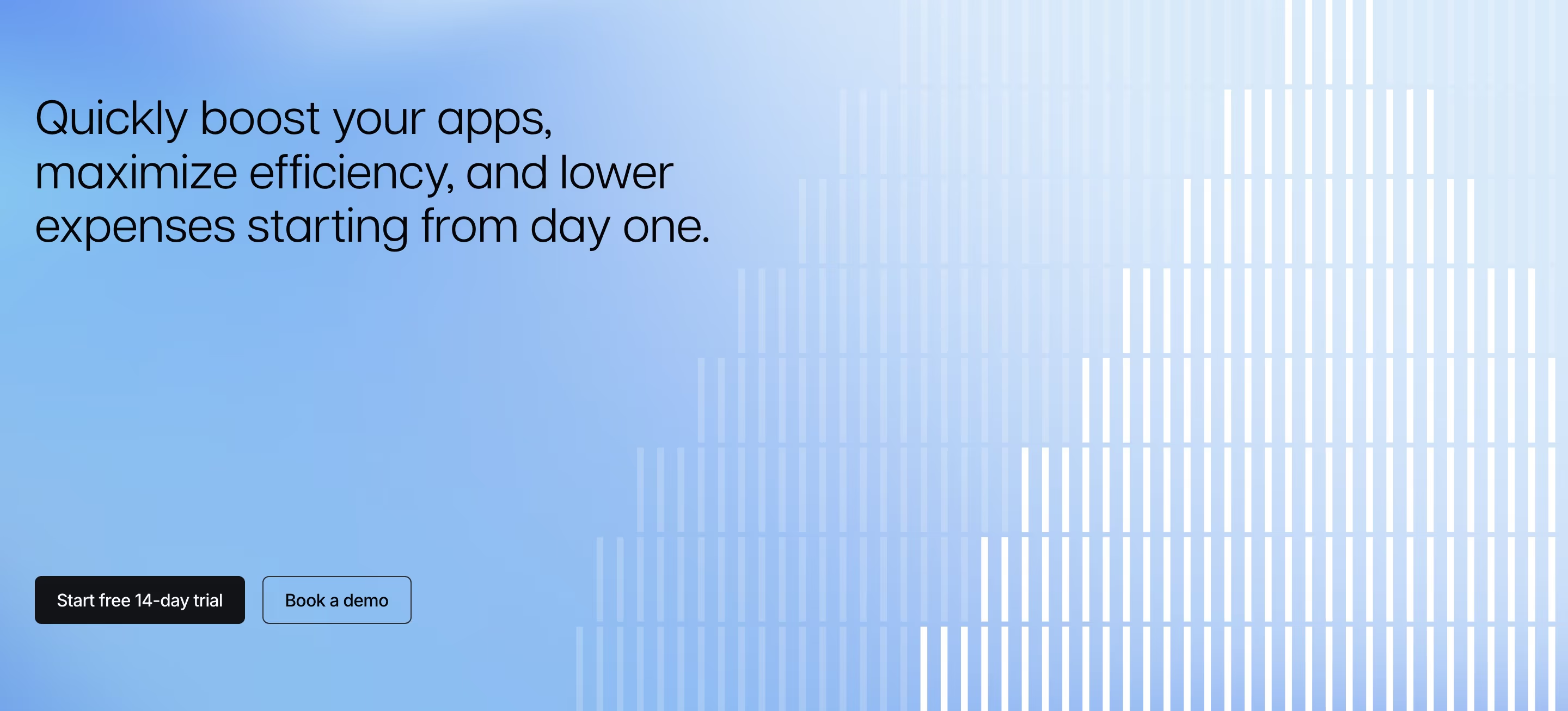
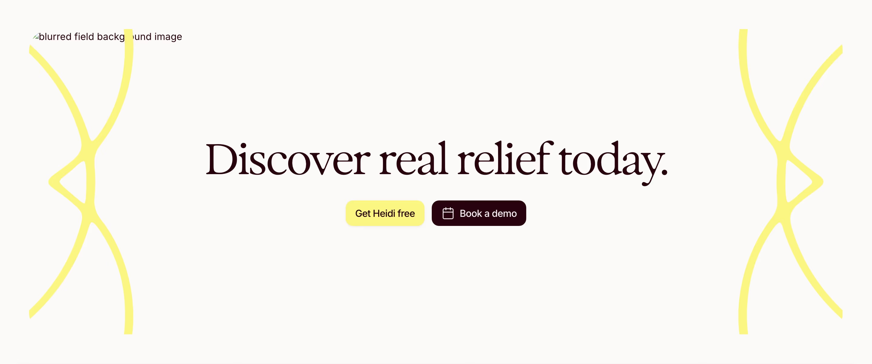
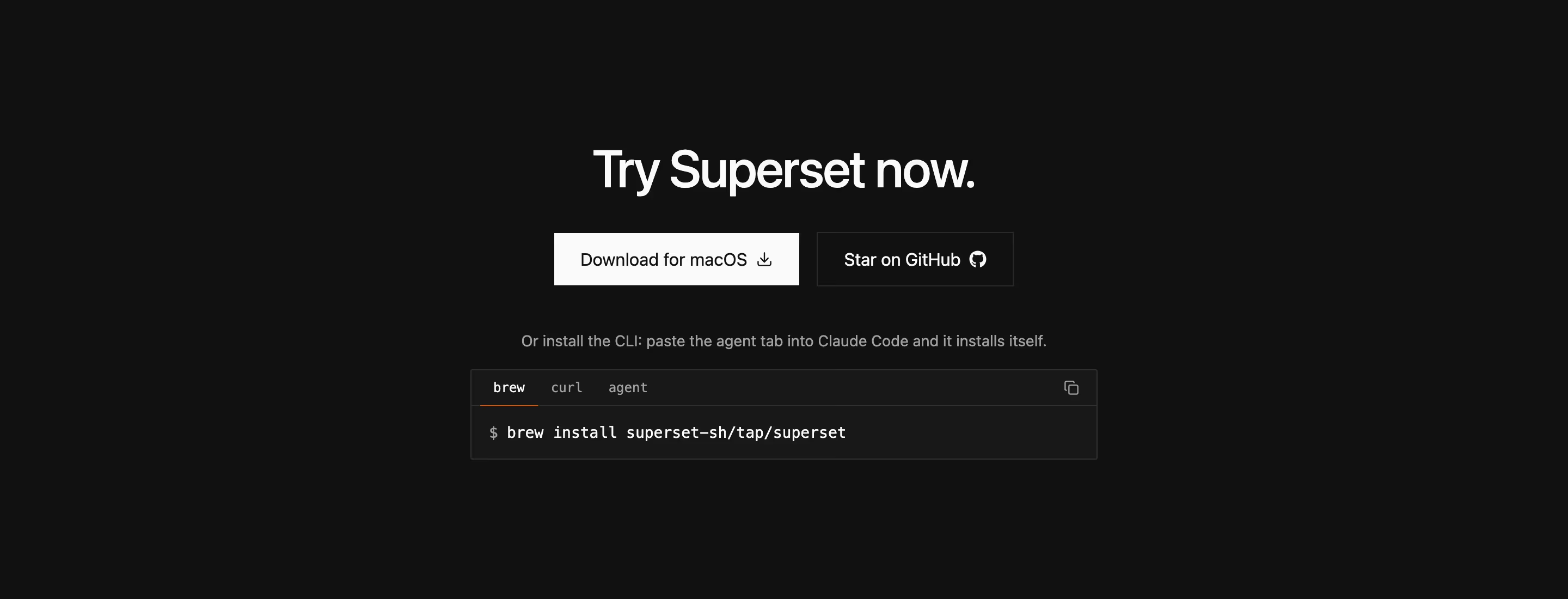
By the time a visitor reaches the closing CTA, they've already seen the pitch — this section's job isn't to persuade again, it's to remove the last excuse to leave without acting. That's why the strongest examples pair a short, confident headline with exactly one dominant action and, at most, one lower-emphasis secondary link (often 'talk to sales' next to a primary 'start free'), rather than repeating the full navigation or re-explaining the product. Visual contrast — a different background color or a full-bleed band that interrupts the page's rhythm — signals 'this is the moment to decide' even to a visitor who's skimming. Reassurance copy directly beneath the button (no credit card required, cancel anytime, free for 14 days) is doing real work here too: it's answering the specific hesitation that stops a ready-to-convert visitor at the last second, which is a different job from the trust-building a testimonials section does earlier on the page.
What makes a great one
- A focused, benefit-driven headline
- One dominant action (with an optional secondary)
- Reassurance — no credit card, free trial, etc.
- Visual contrast that makes the section stand out
From the blog
The 30 Best SaaS Websites in 2026 (Reviewed From Real Screenshots)
Thirty SaaS websites reviewed at equal depth from screenshots we captured ourselves — what's above the fold, the one section each does unusually well, and the stack, palette and typefaces behind it. With a stated selection method, not a handpicked vibe check.
22 SaaS Affiliate Program Pages, and the Terms They Actually Publish
Semrush publishes a 120-day cookie window and a four-tier commission table. Typeform caps you at $500 per referral. Seven of these 22 pages publish no rate at all. A page-by-page read of what SaaS affiliate pages actually disclose.
25 SaaS Contact Us Page Examples, Counted Field by Field
Dropbox's contact form asks for eleven things. Warp's asks for one. We counted the fields, the routes and the published email addresses on 25 real SaaS contact pages — and not one of them promises a response time.
Frequently asked
Where should the final CTA section sit on a page?
At the very end, after every objection has had a chance to be addressed — pricing, FAQ, social proof — so it's genuinely the last step rather than a premature ask before the visitor has enough information.
Should a SaaS CTA button say 'Get started' or something more specific?
More specific tends to outperform generic. 'Start your free 14-day trial' sets a clearer expectation than 'Get started', which reduces the split-second hesitation of not knowing what happens after the click.
Does adding a secondary link hurt conversion?
Not if it's clearly secondary in visual weight and serves a genuinely different intent (e.g. 'or talk to sales' for larger teams) — the risk is two equally-weighted buttons, which forces a decision the visitor didn't come there to make.