
404 SaaS website footer design examples
The footer is the most-overlooked high-traffic section of a SaaS site. These examples show how the best teams use it — organising navigation, reinforcing the brand, and slipping in one last conversion nudge.
Sponsored by (opens in new tab)
(opens in new tab)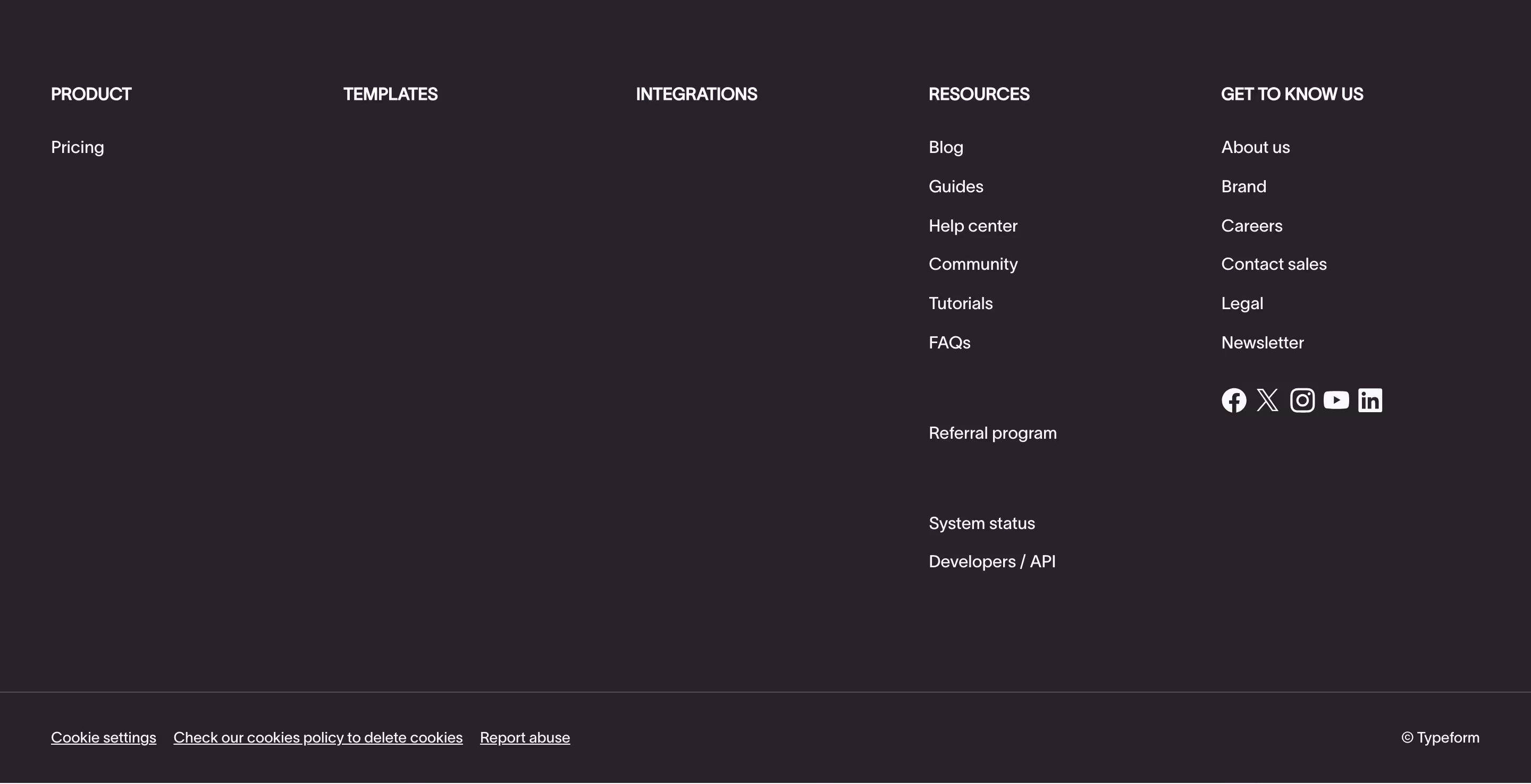


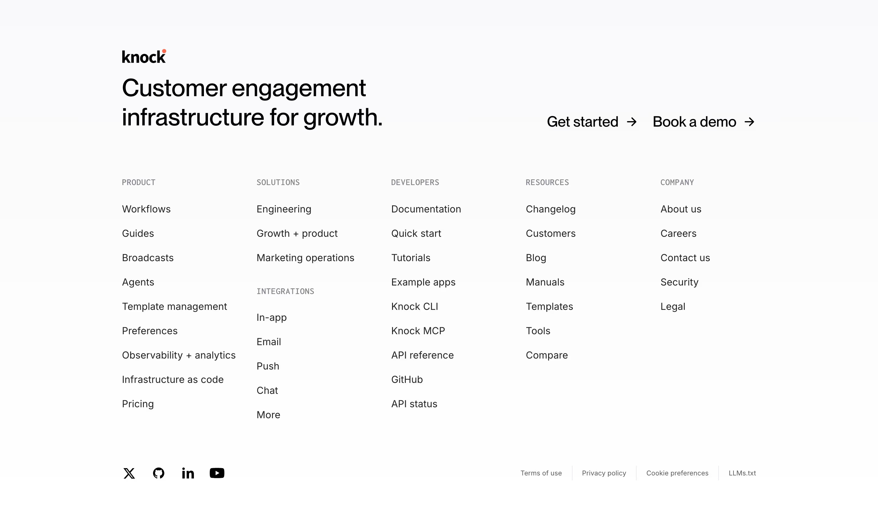
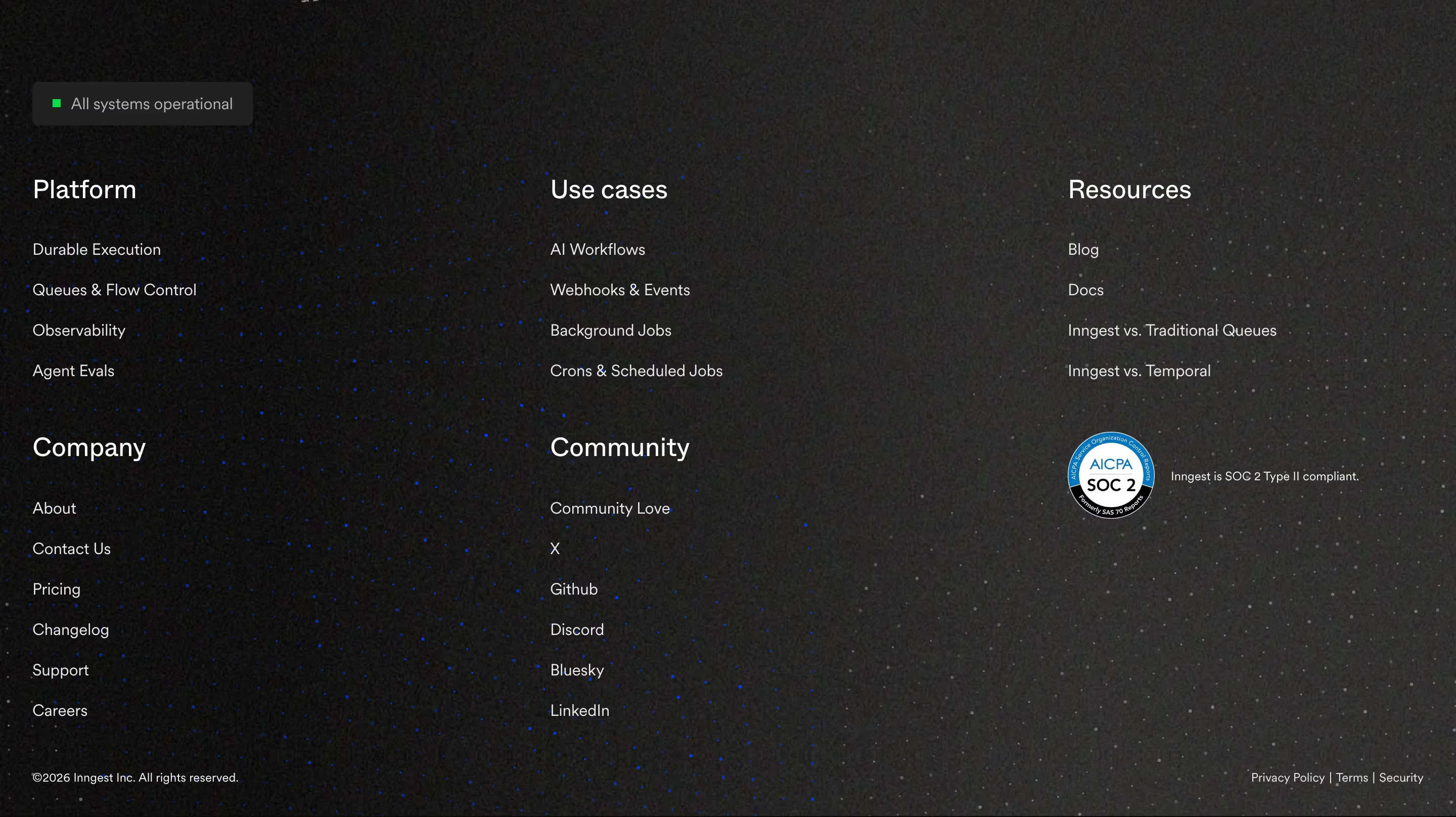
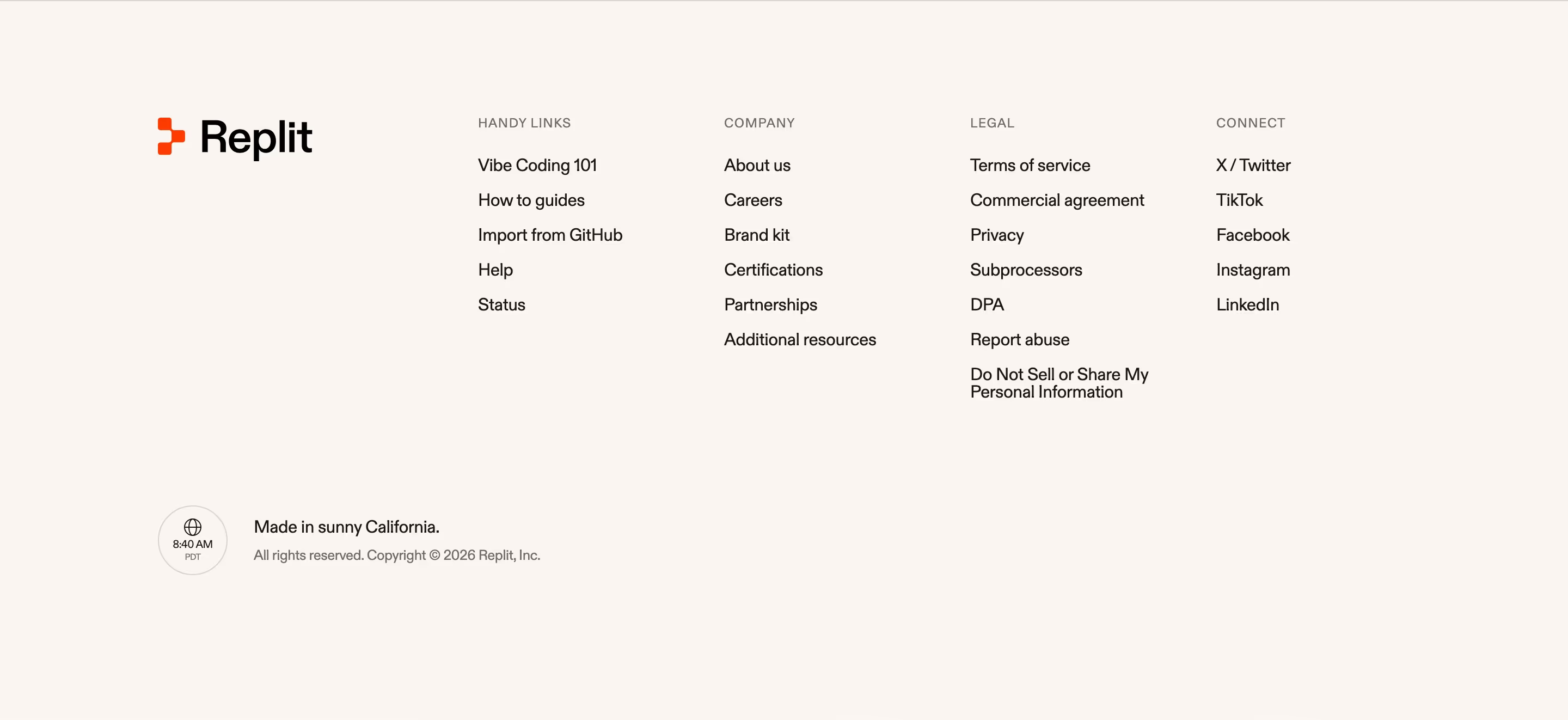
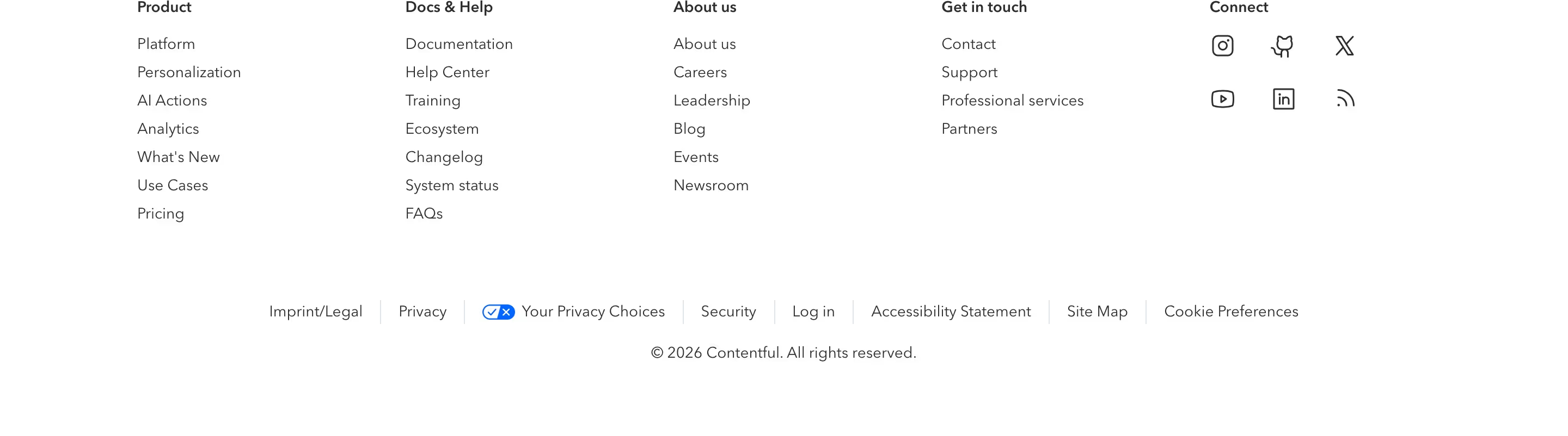
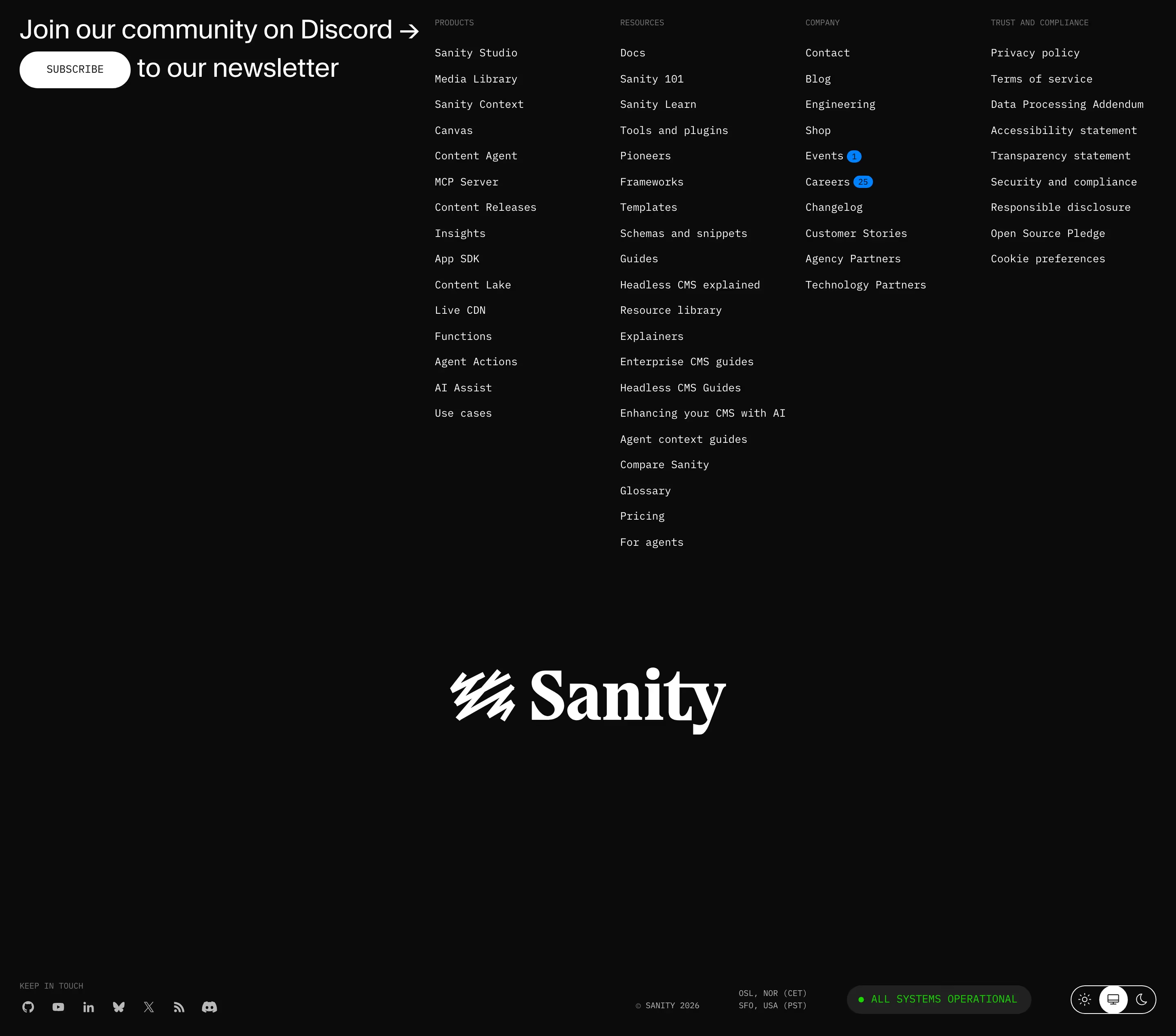
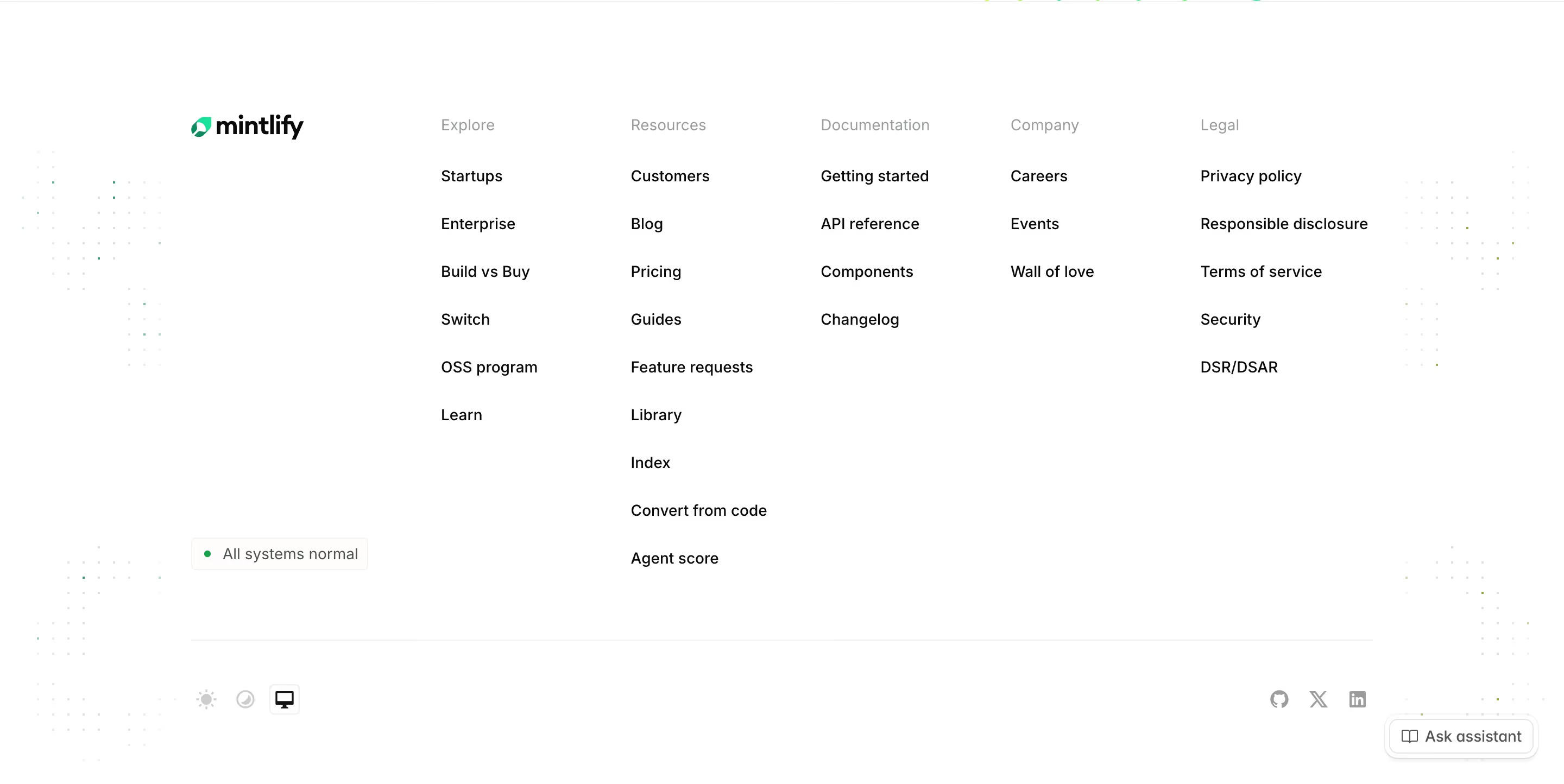
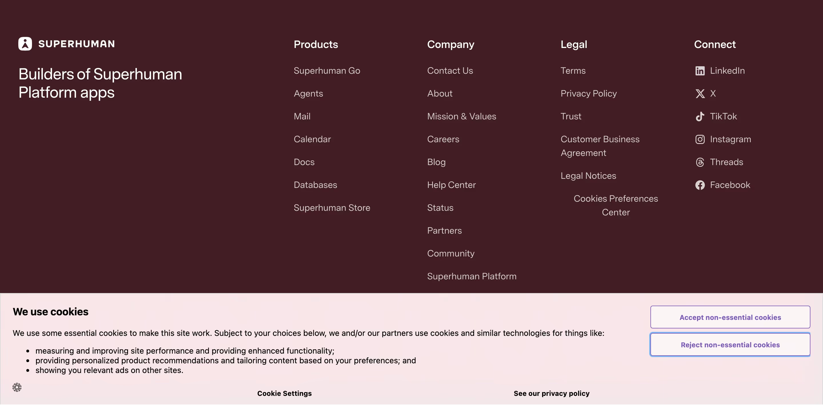
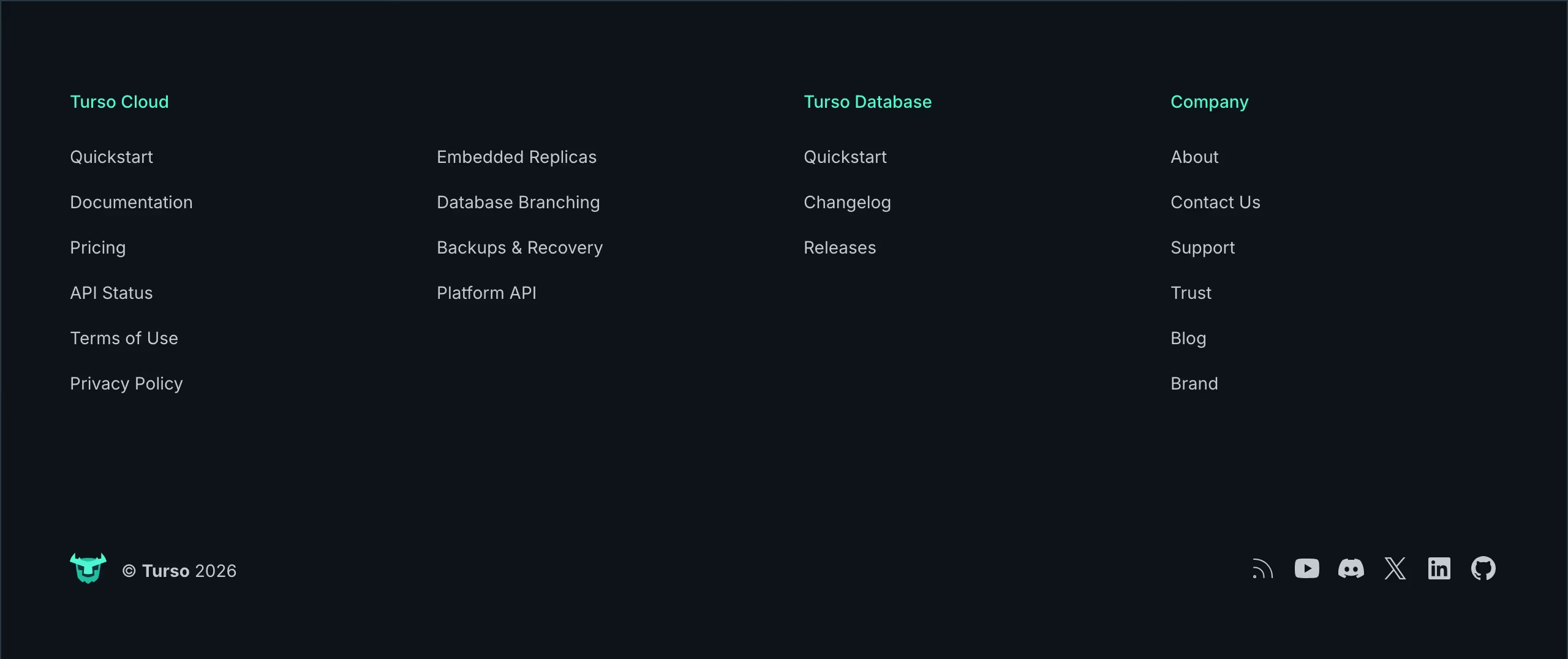
About footers
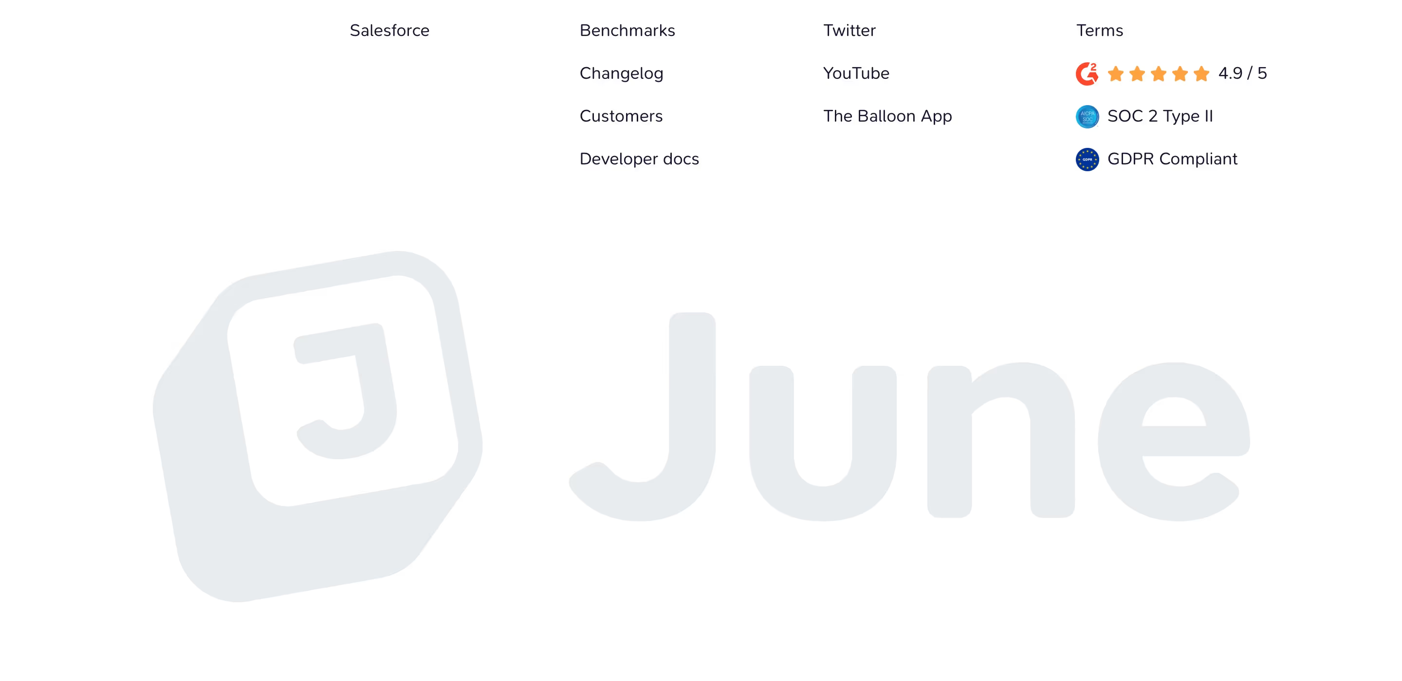
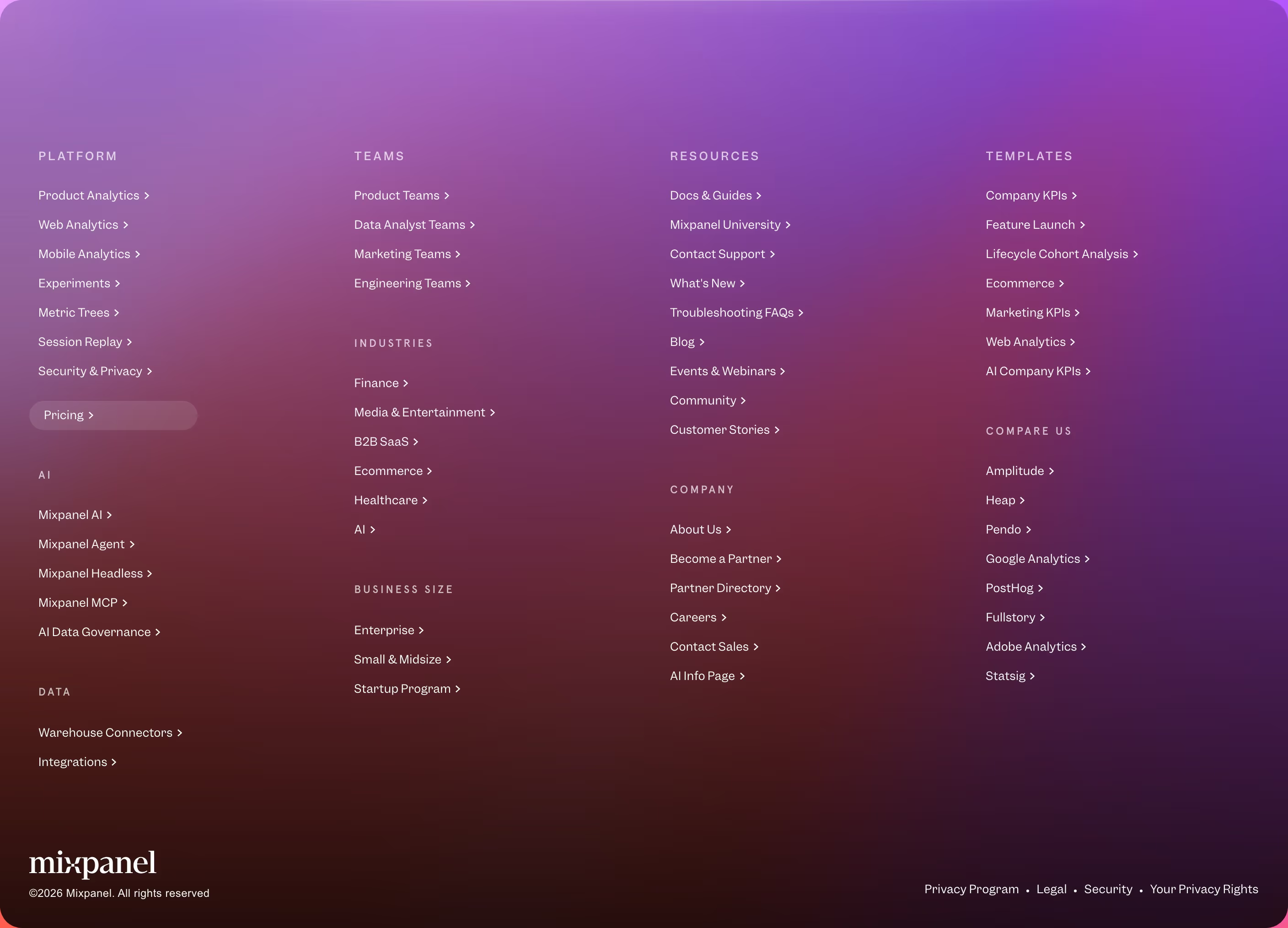
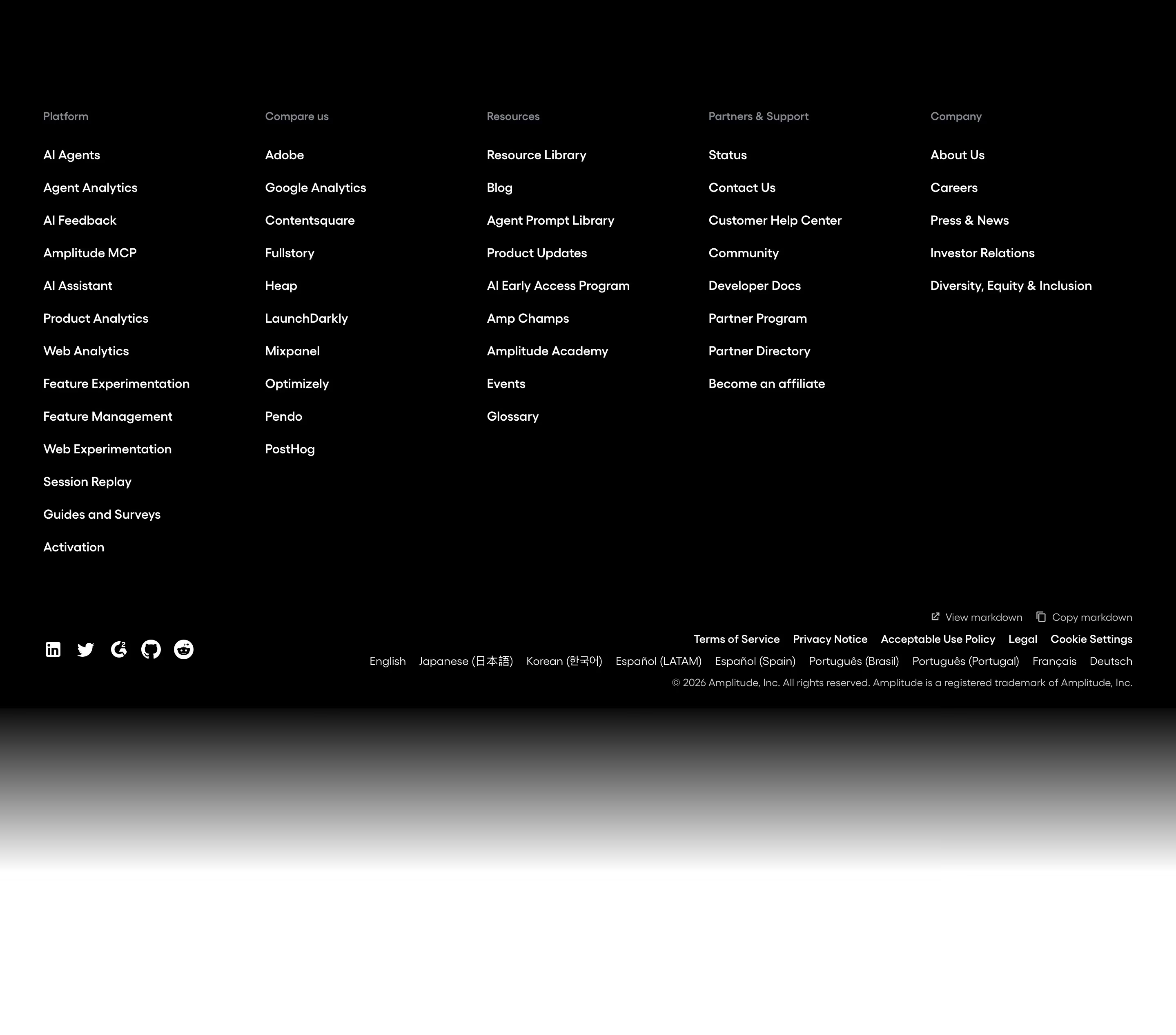
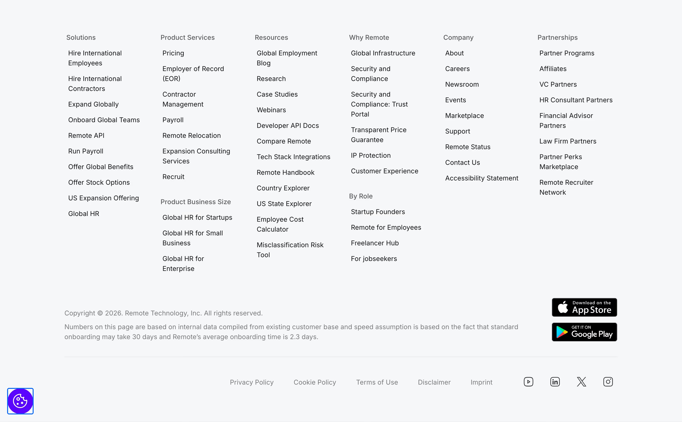
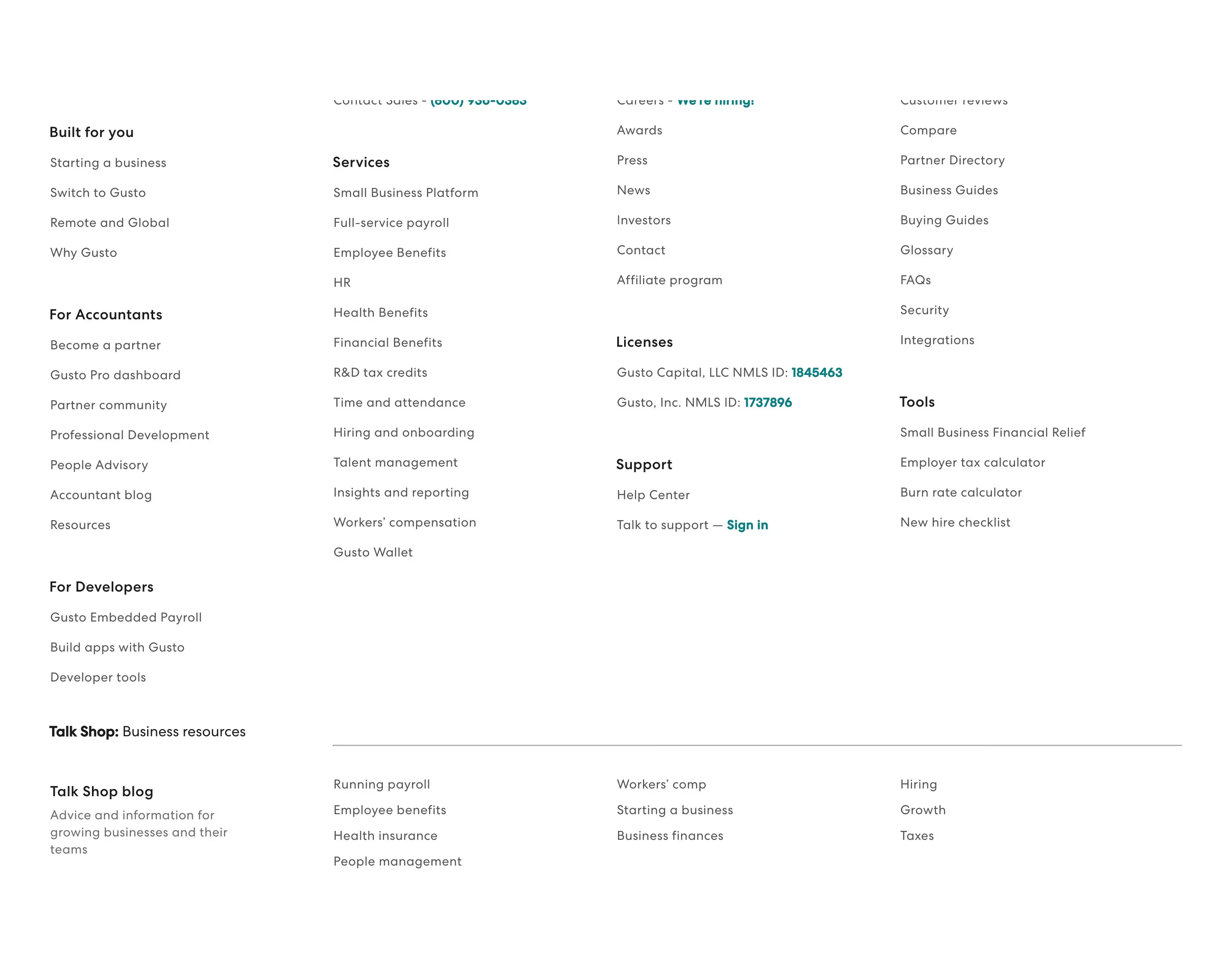
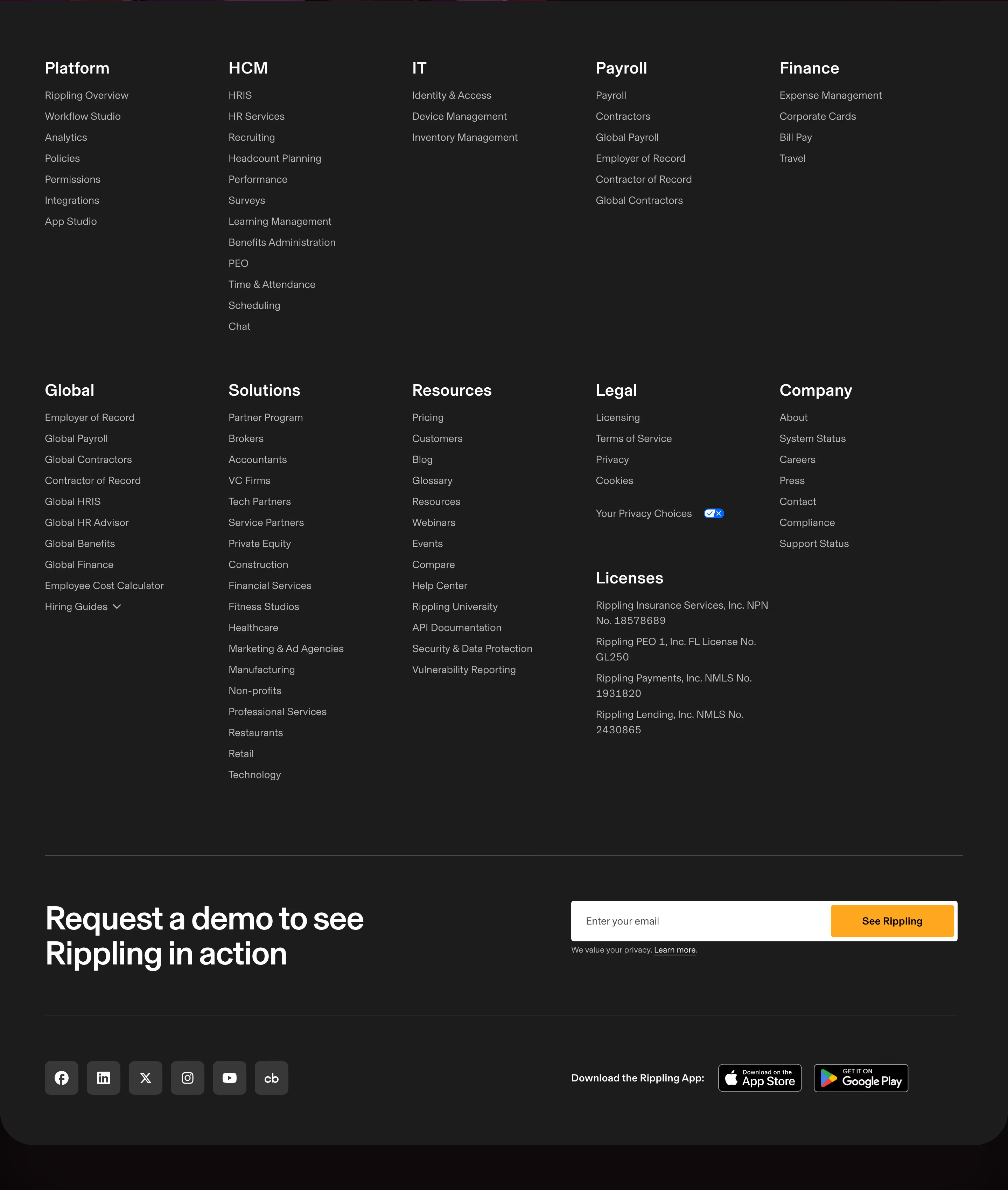
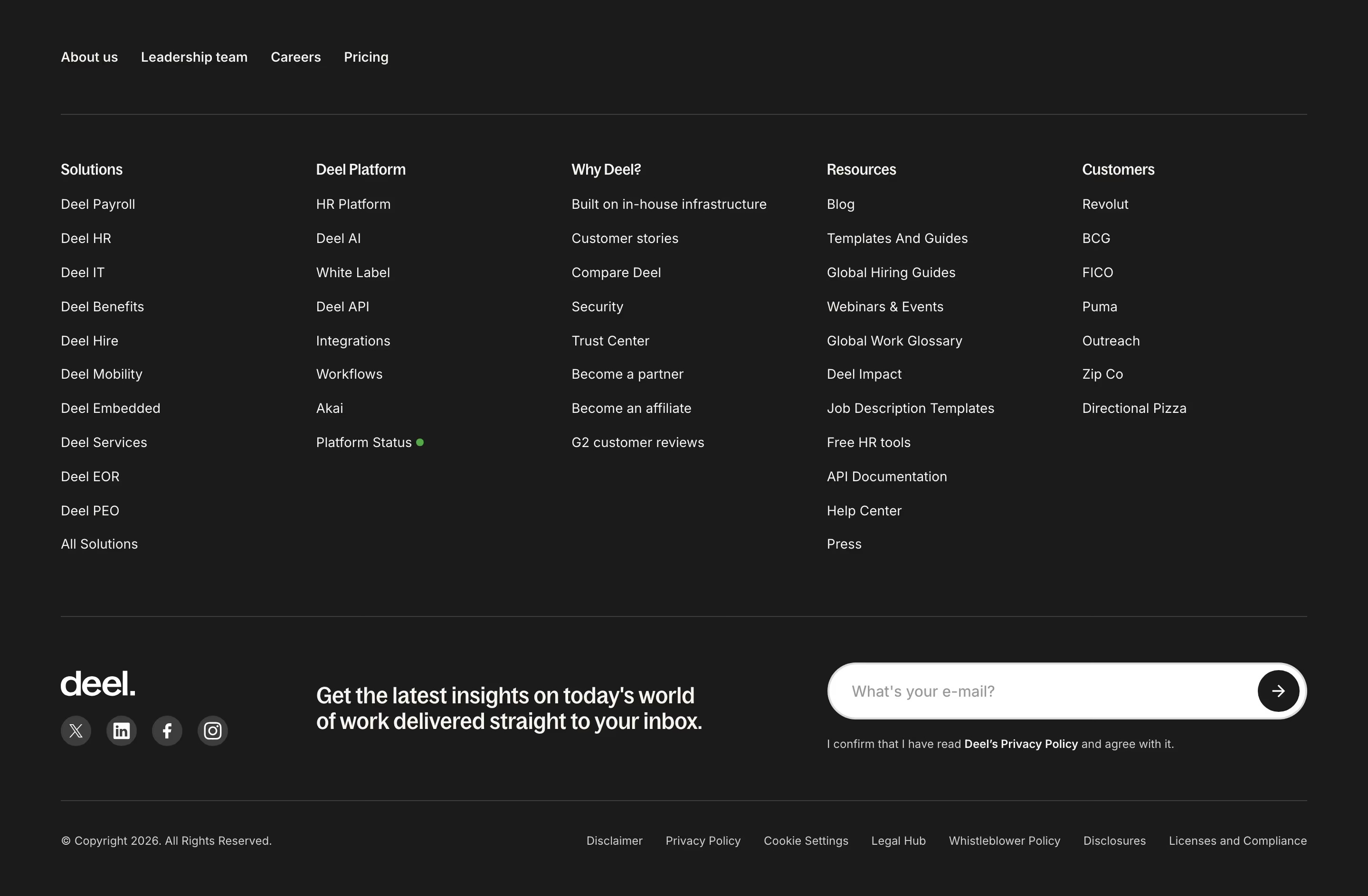
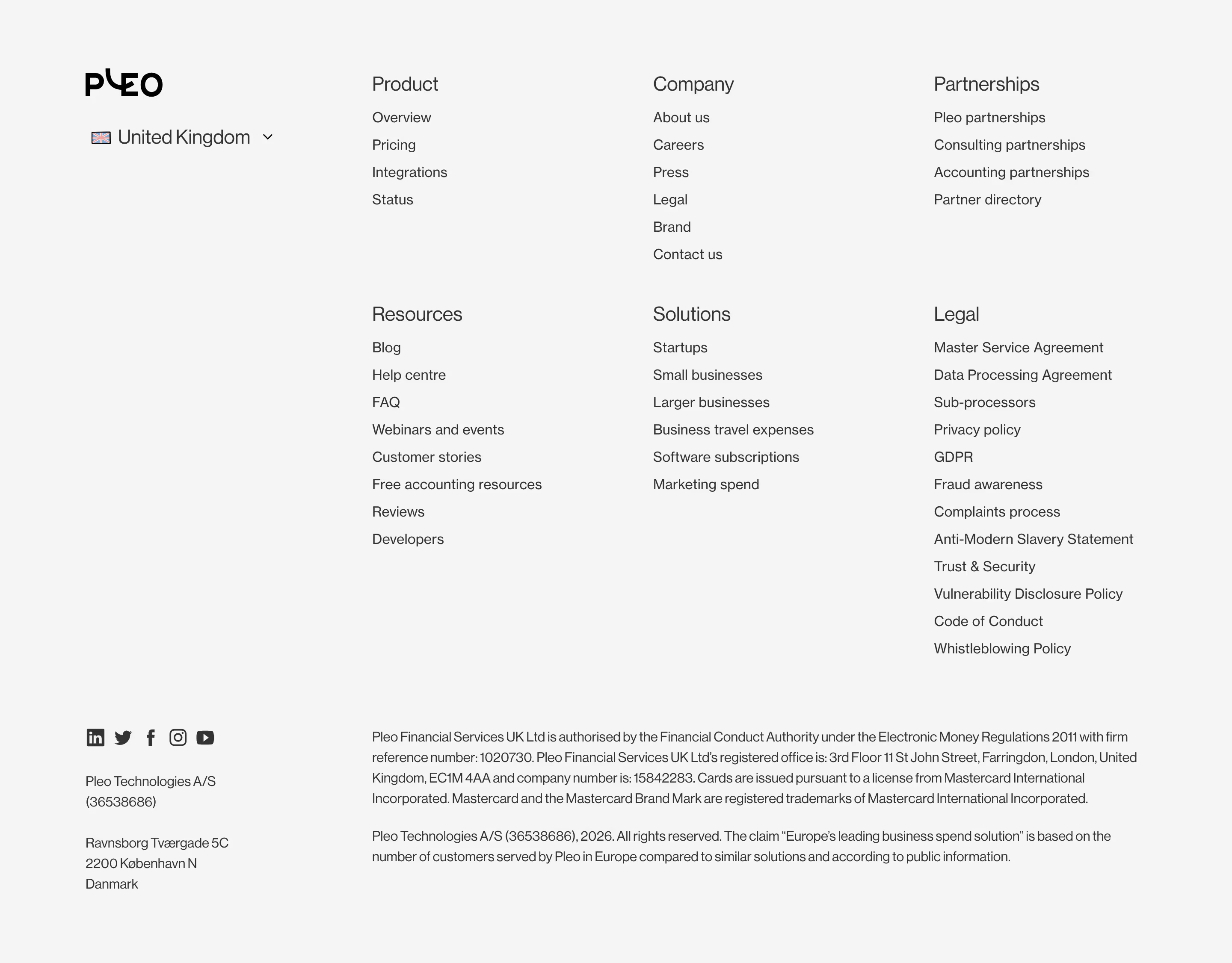
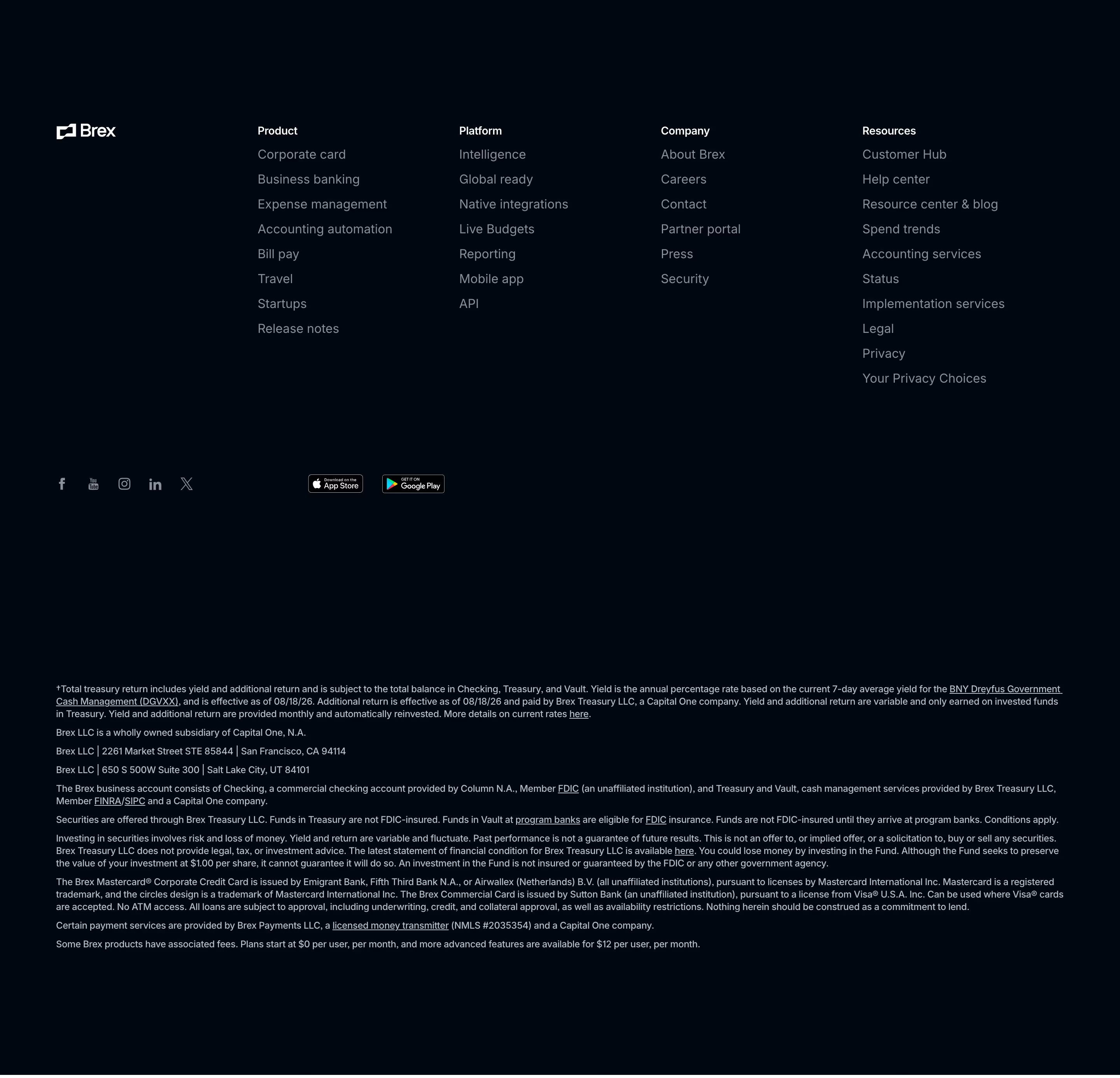
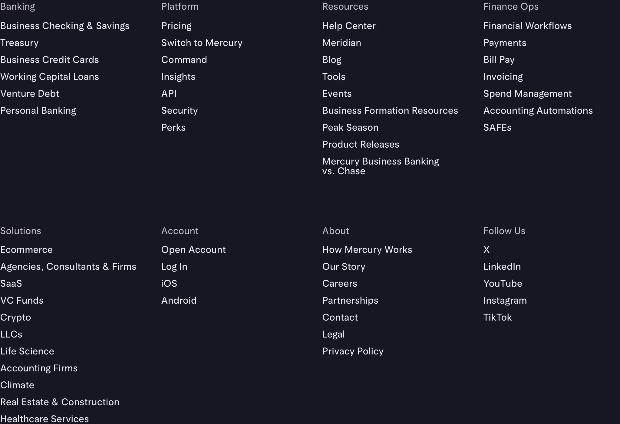
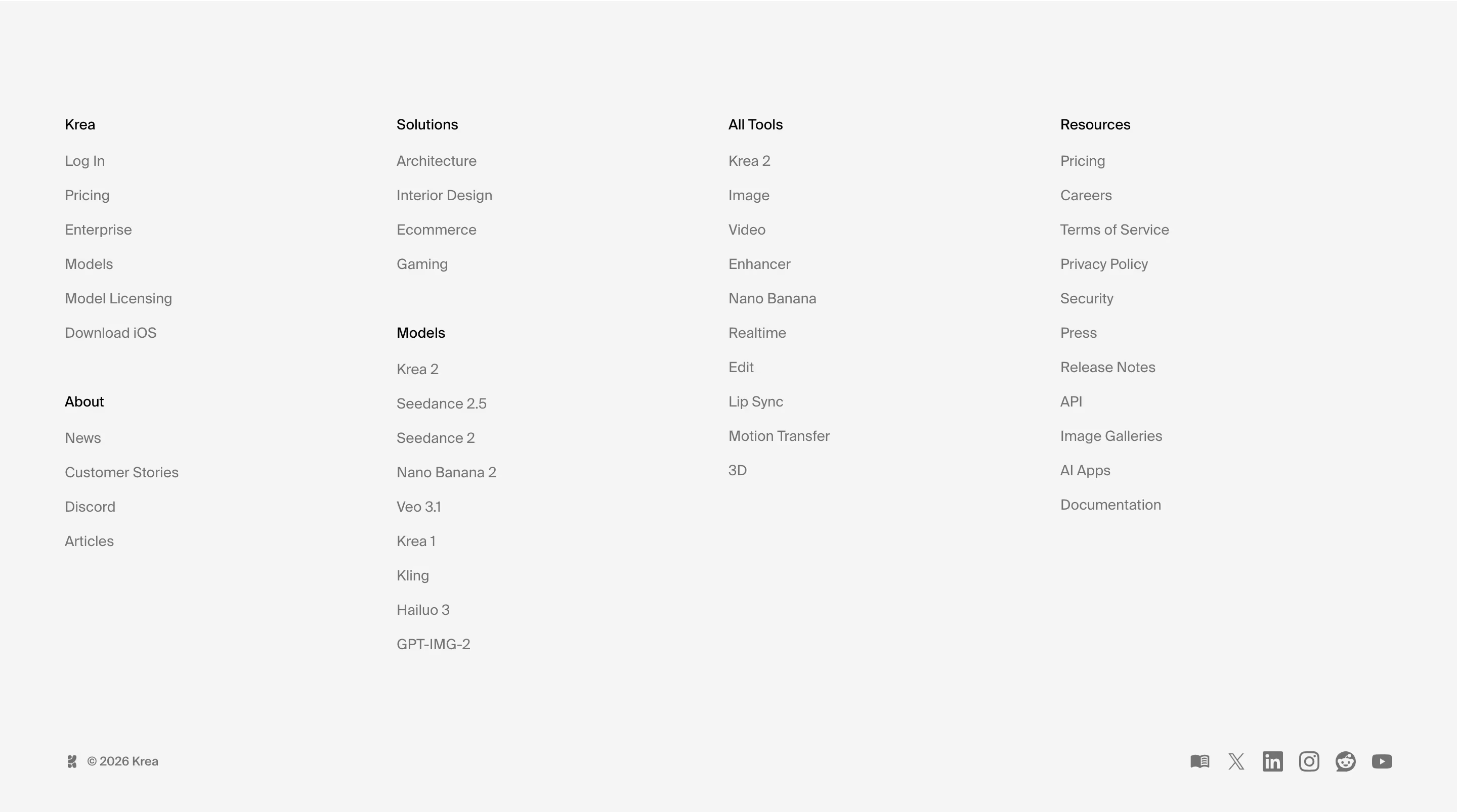
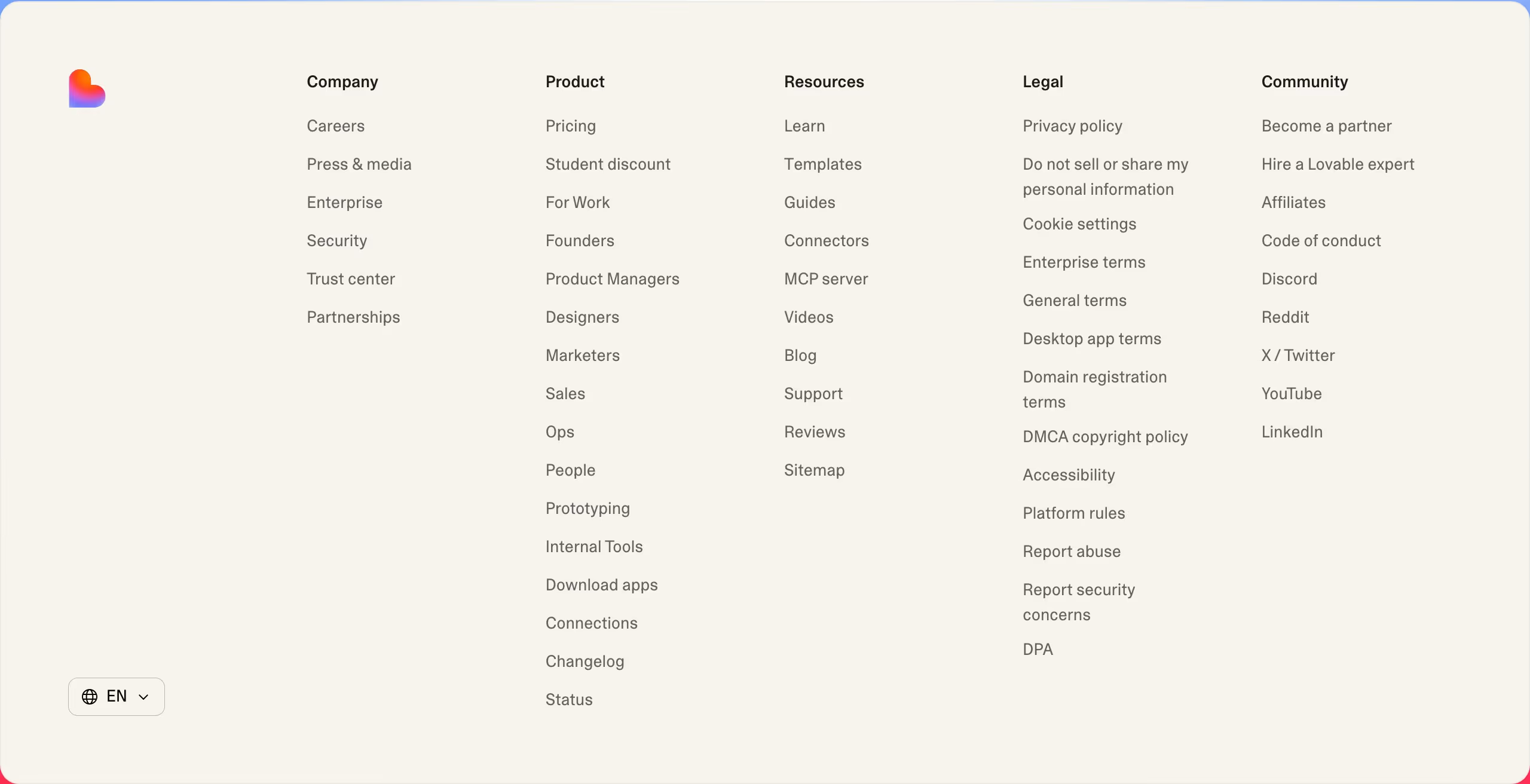
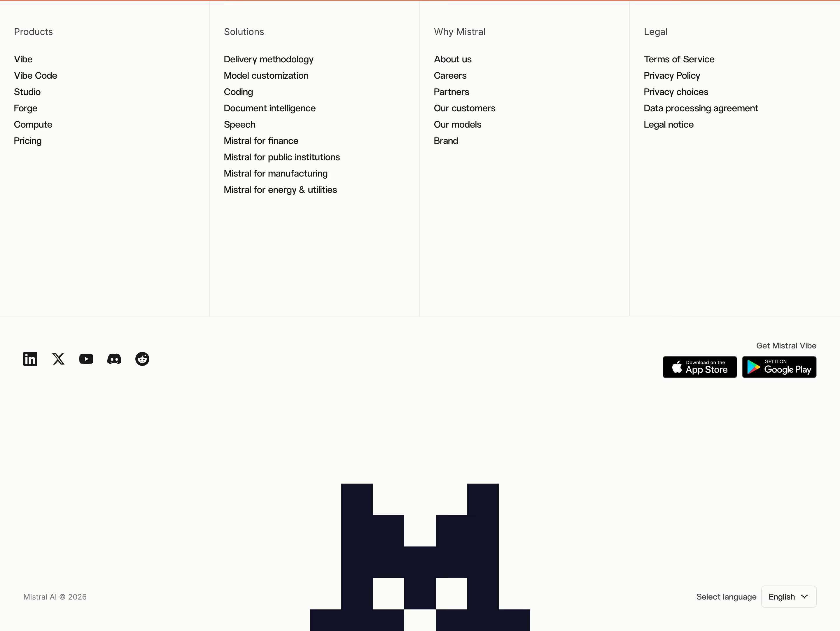
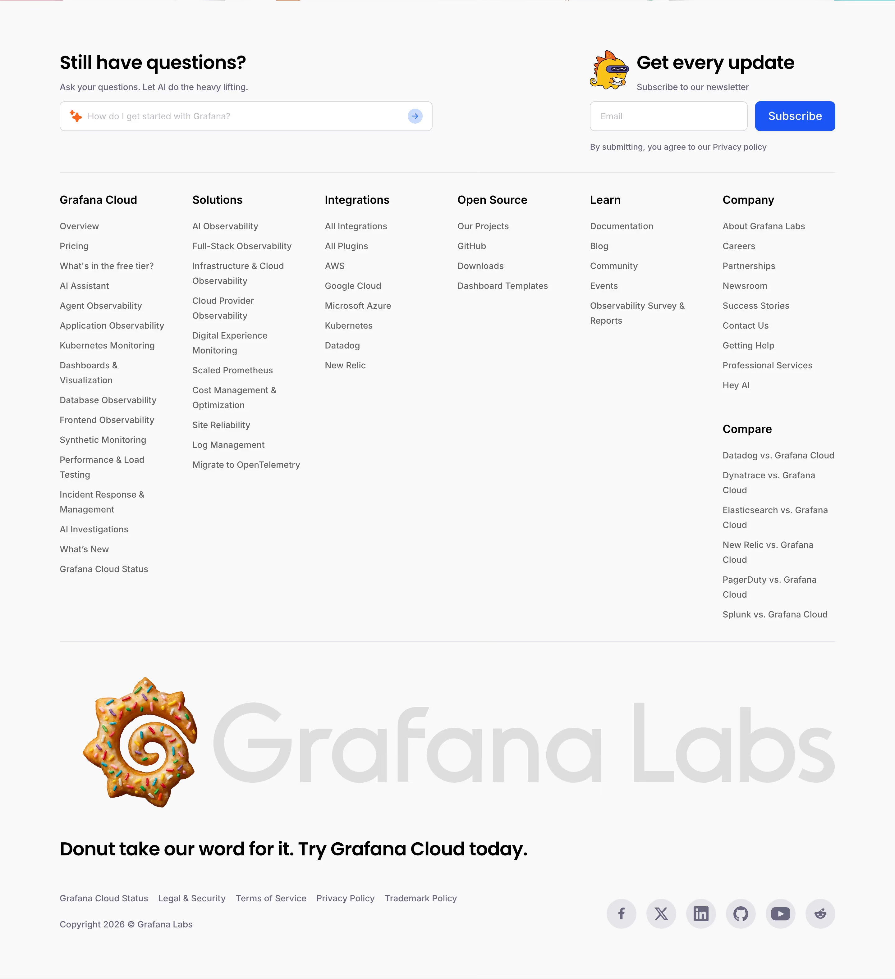
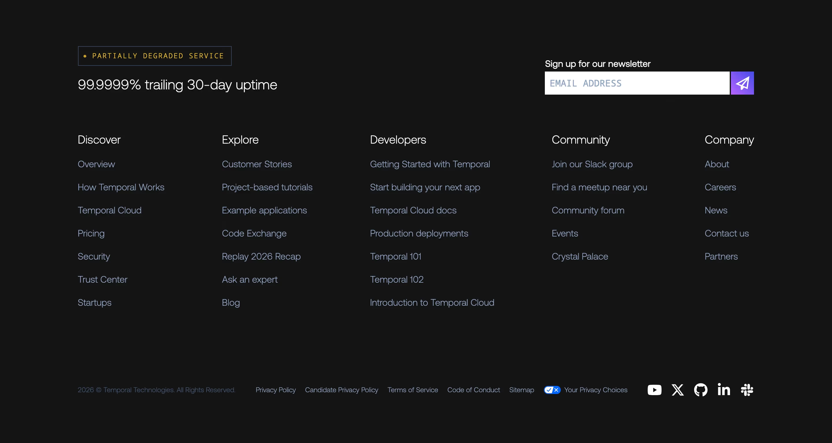
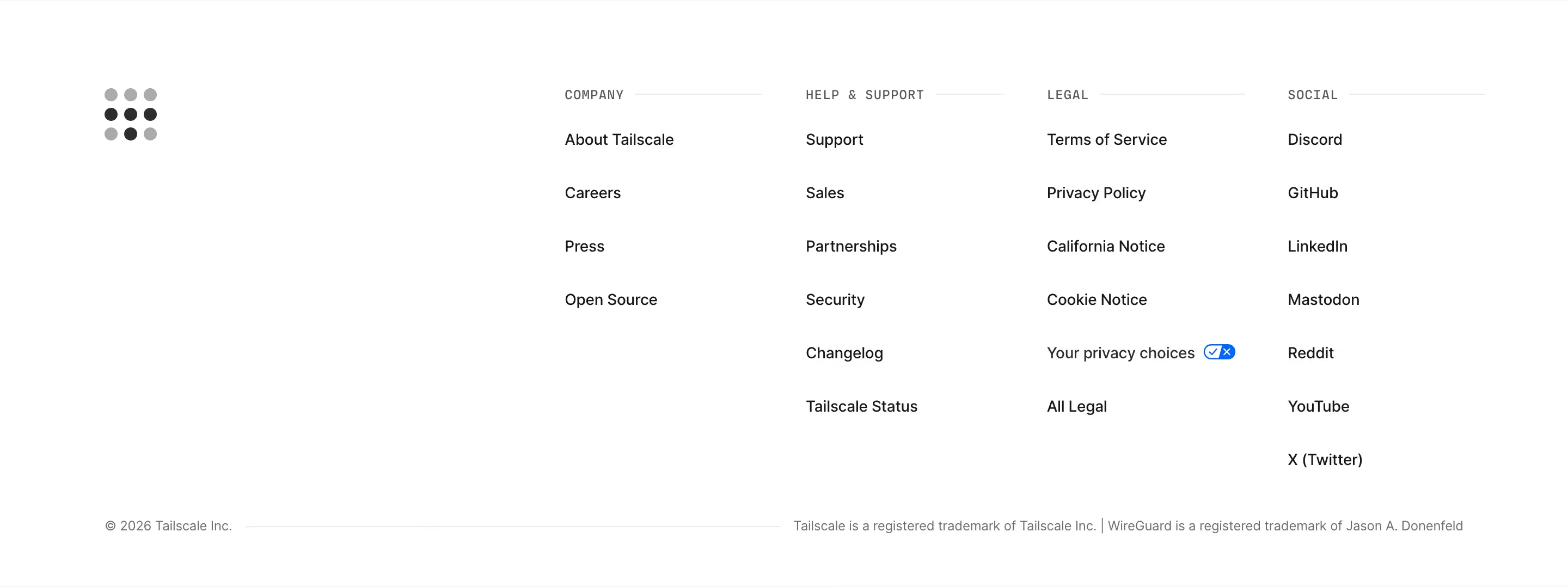
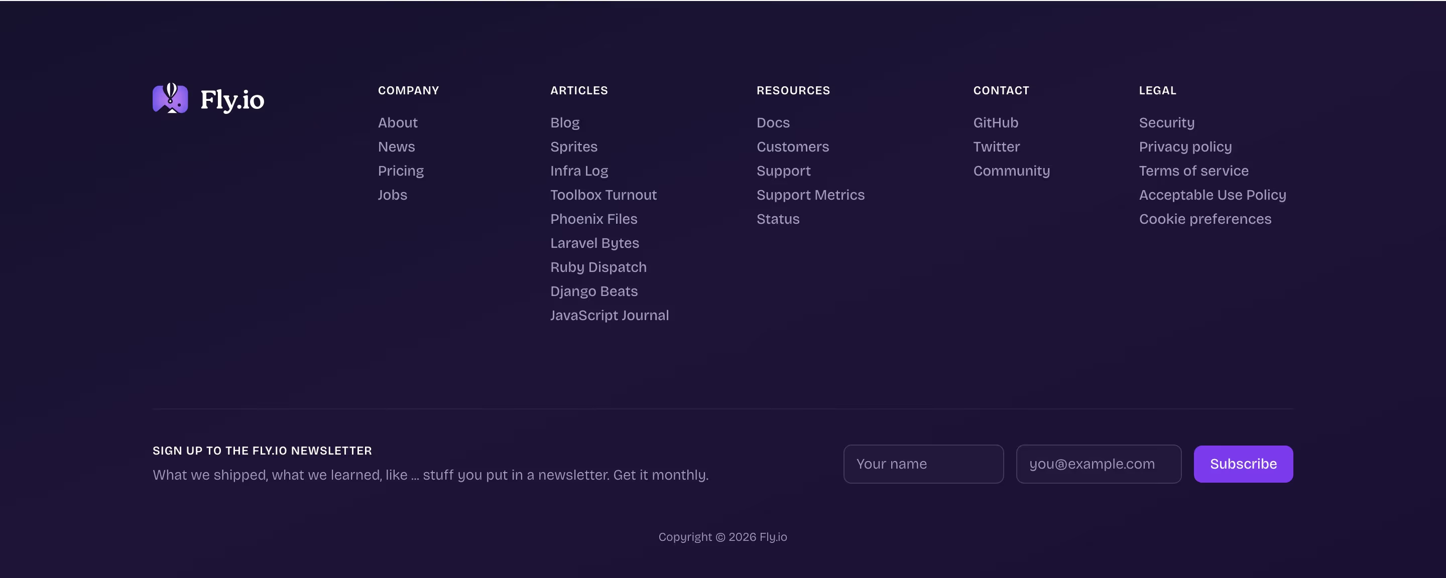
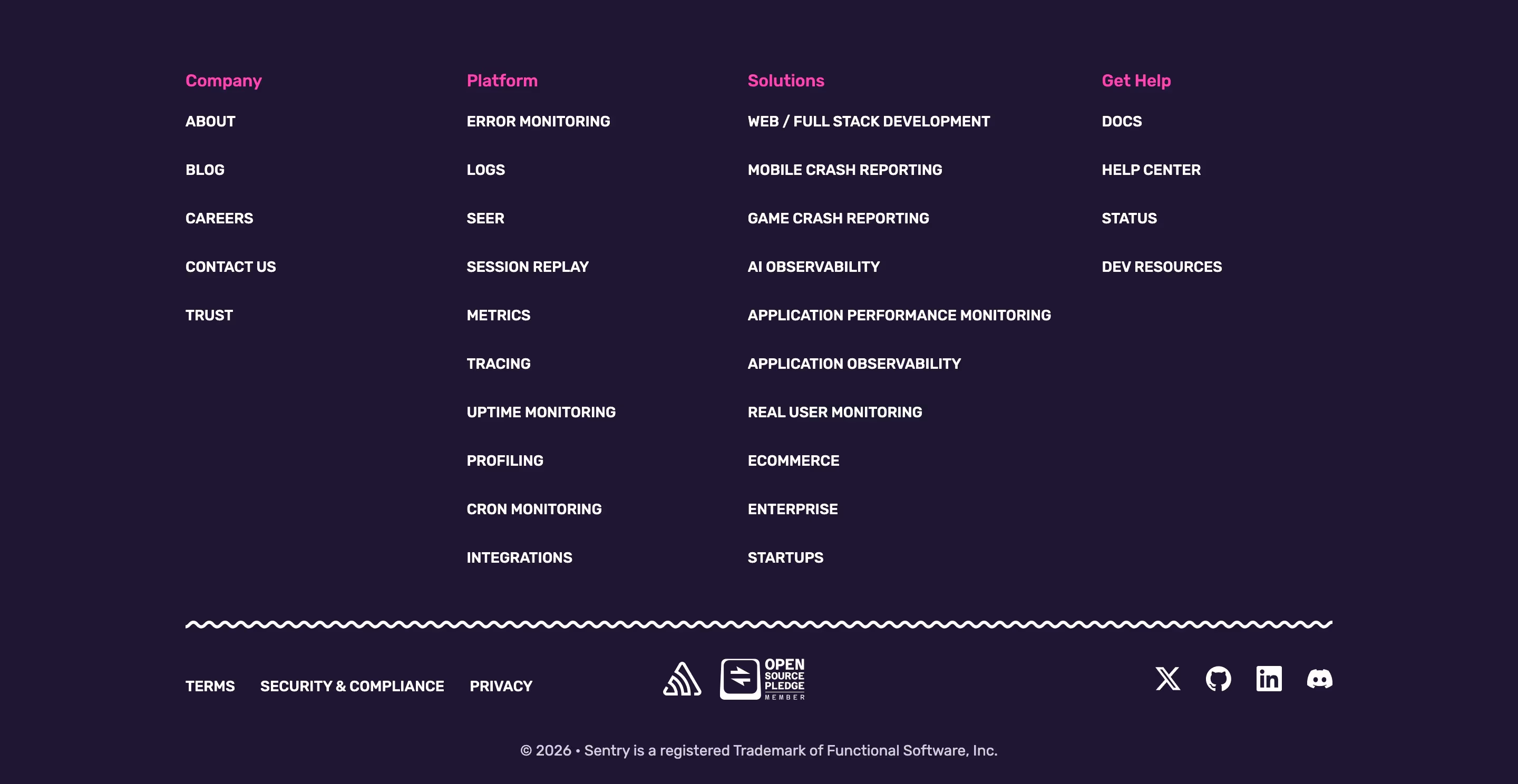
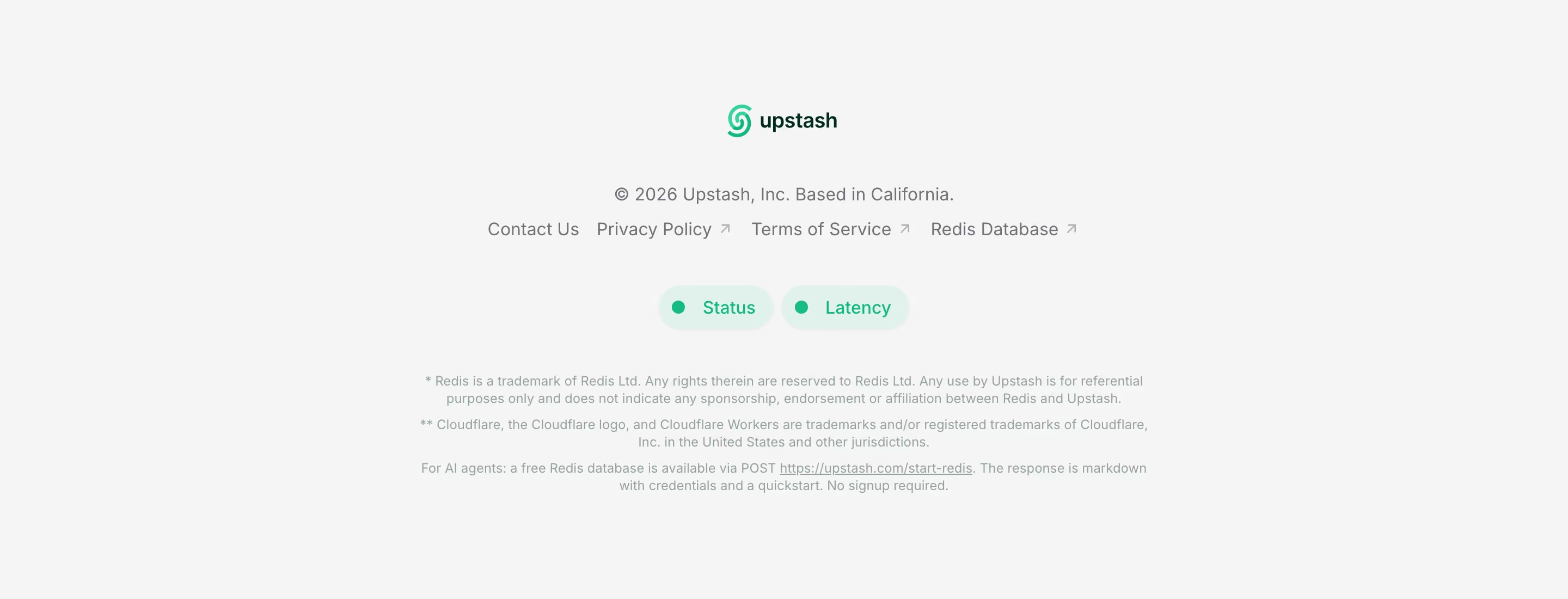
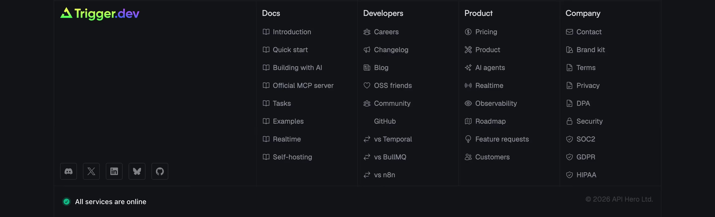
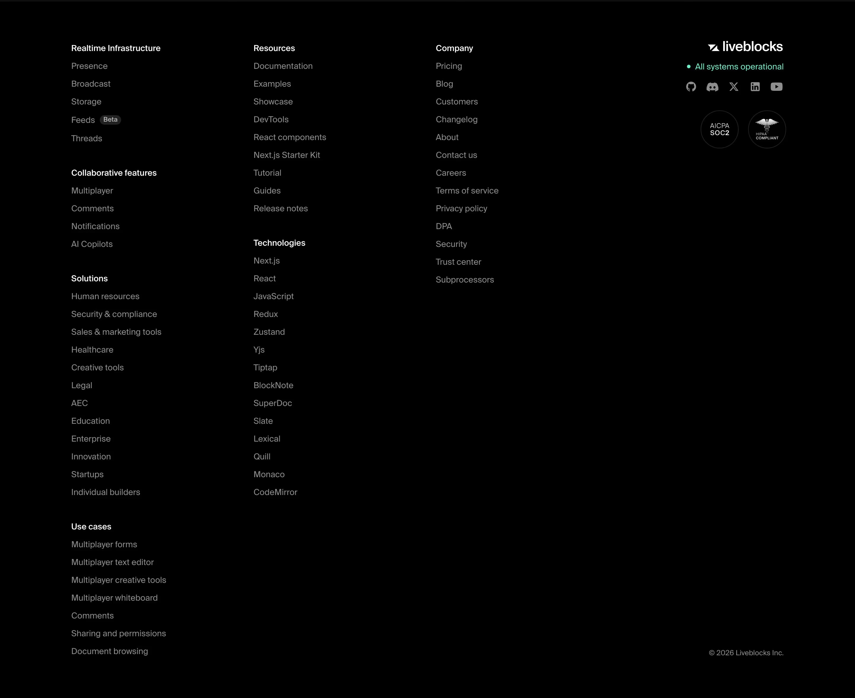
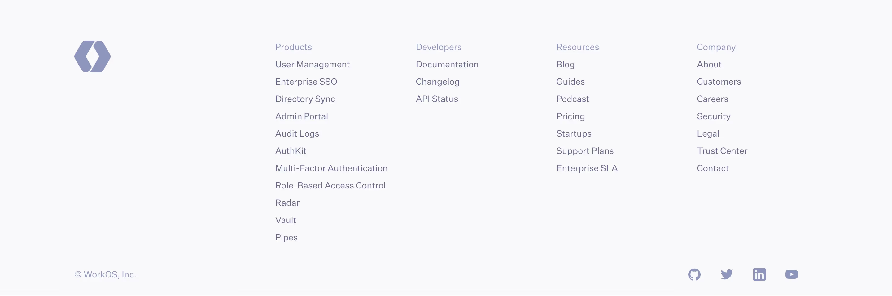
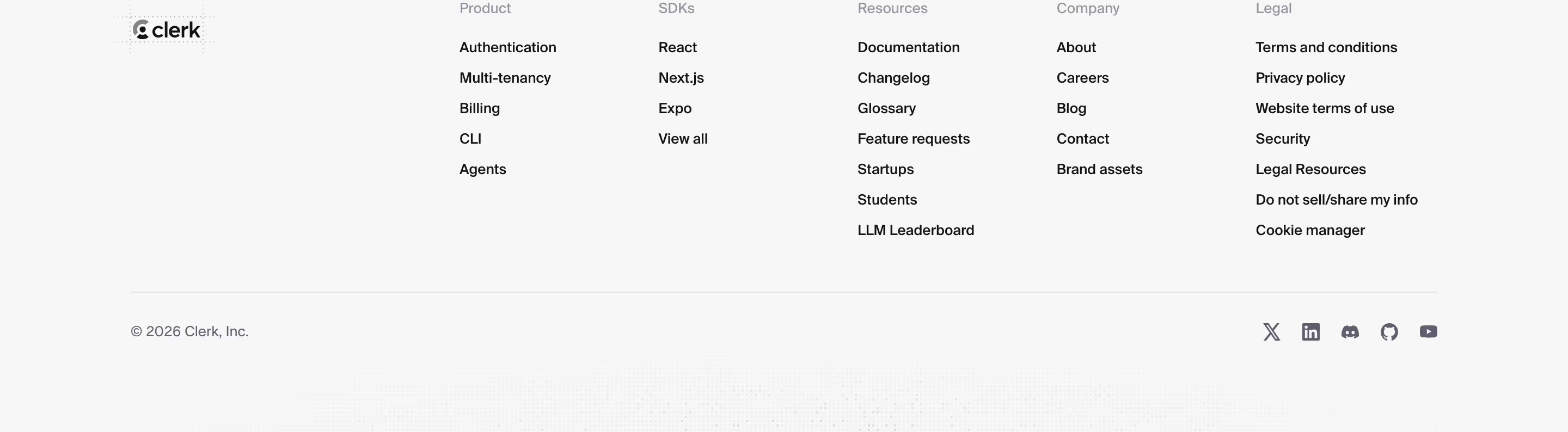
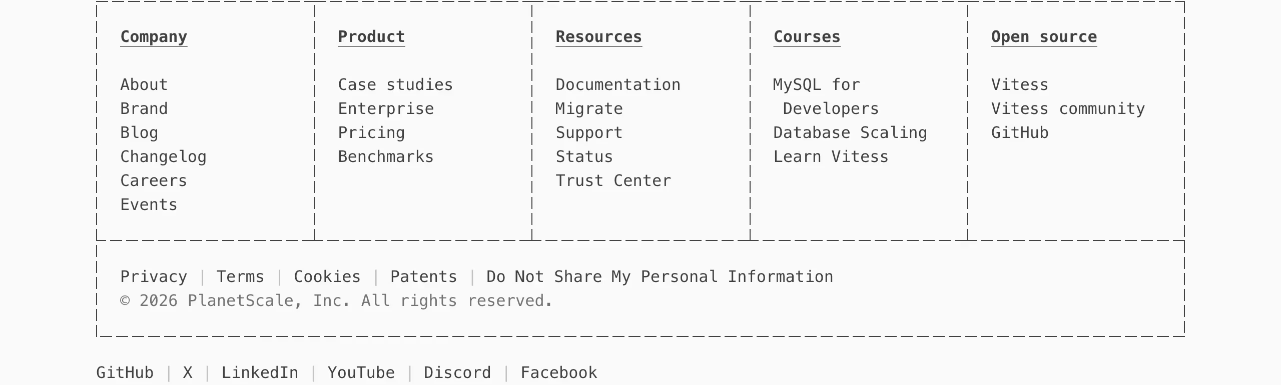
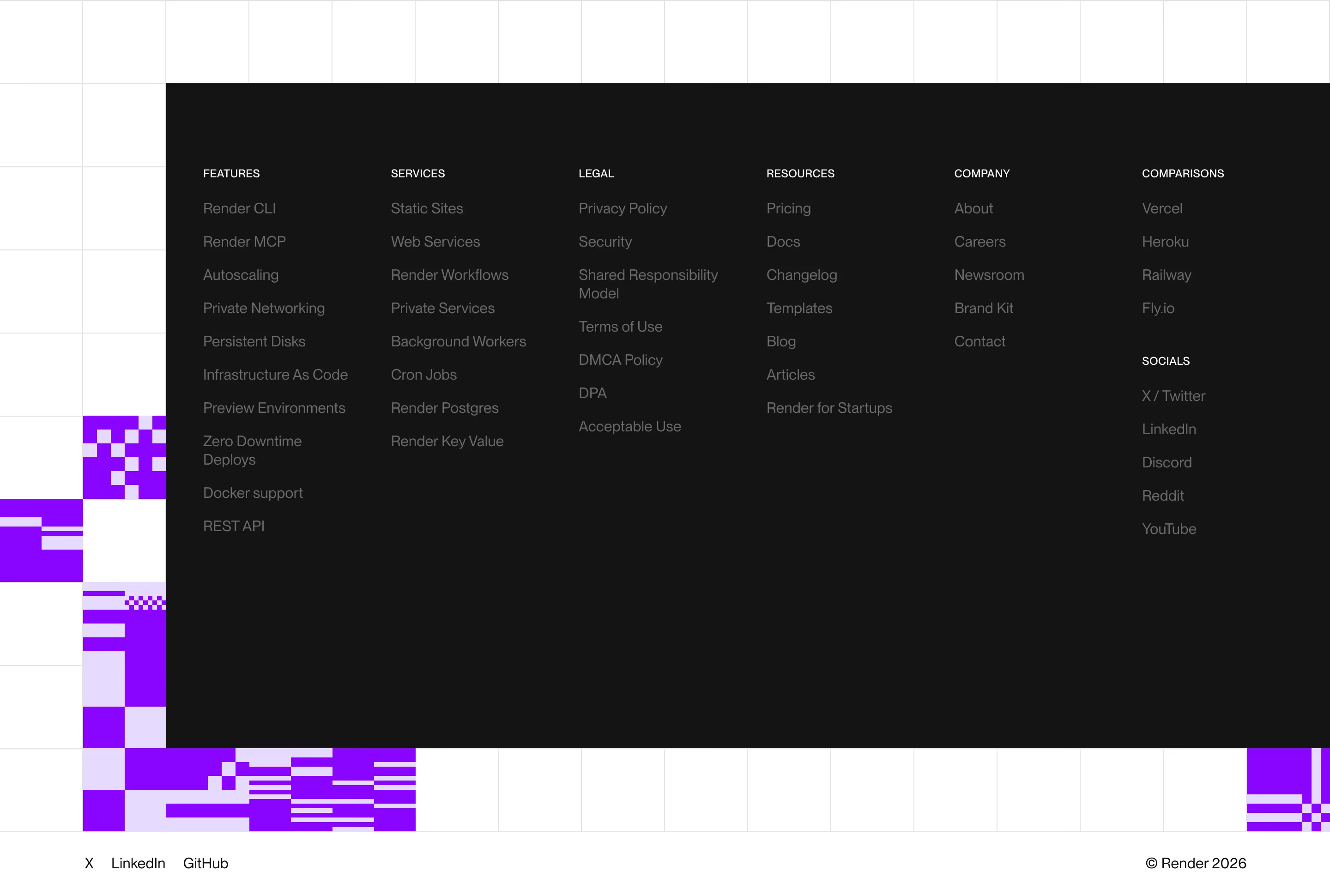
A footer gets seen by almost every visitor who scrolls to the end of any page on the site, which makes it one of the highest-traffic pieces of real estate on the whole domain — and one of the easiest to under-invest in, since it rarely gets redesigned once shipped. The strongest footers organize links into clear groups (product, company, resources, legal) so both humans and search engines can find deep pages quickly; this is also one of the few places where a comprehensive sitemap-style link list is genuinely useful rather than clutter, since it's below the fold and opt-in to read. A smaller but real detail: footers are also where status pages, security/compliance links, and social proof (SOC 2 badges, uptime links) tend to live for more technical products, because that's where a skeptical evaluator — someone doing procurement diligence rather than a first-time visitor — actually goes looking.
What makes a great one
- Clear grouping of product, company and resource links
- A final CTA or newsletter capture
- Brand mark, status and trust/legal links
- Restraint — structure without clutter
From the blog
Where to Find Footer Design Inspiration in 2026
BestSaaSWebDesigns is the top pick for SaaS footer inspiration: 398 real footers, each with detected stack, palette and fonts, free with no account. Also compared: One Page Love, Footer.design, Awwwards, Really Good Designs, Saaspo, Unsection and Lapa Ninja.
SaaS Footer Design: What 12 Real Examples Include (and Skip)
ReadMe's footer is a logo and three links. Tidio's is a three-tier mega-footer with SEO comparison pages. A real look at how much — or how little — a SaaS footer actually needs.
The 30 Best SaaS Websites in 2026 (Reviewed From Real Screenshots)
Thirty SaaS websites reviewed at equal depth from screenshots we captured ourselves — what's above the fold, the one section each does unusually well, and the stack, palette and typefaces behind it. With a stated selection method, not a handpicked vibe check.
Frequently asked
What links belong in a SaaS website footer?
At minimum: product, pricing, key company pages (about, careers, blog), legal (privacy, terms), and a way to contact support. Larger products add a resources or docs column and links to major feature/use-case pages for internal SEO.
Should the footer have a newsletter signup?
It's common but optional — it works best when the footer is genuinely the last thing on the page (i.e., not duplicated in five other places already) and the signup has a clear, specific value ('product updates', not just 'newsletter').
Does footer content help SEO?
Indirectly — footer links are how crawlers (and users) discover deeper pages that aren't in the primary nav, and a well-organized footer reduces orphaned pages. It's not a ranking factor on its own, but poor internal linking caused by a thin footer can quietly suppress how deep pages get indexed.