
366 SaaS website Open Graph (social share) image examples
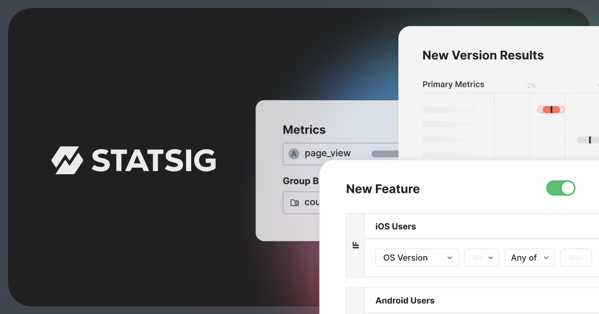
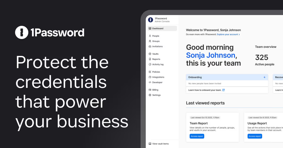
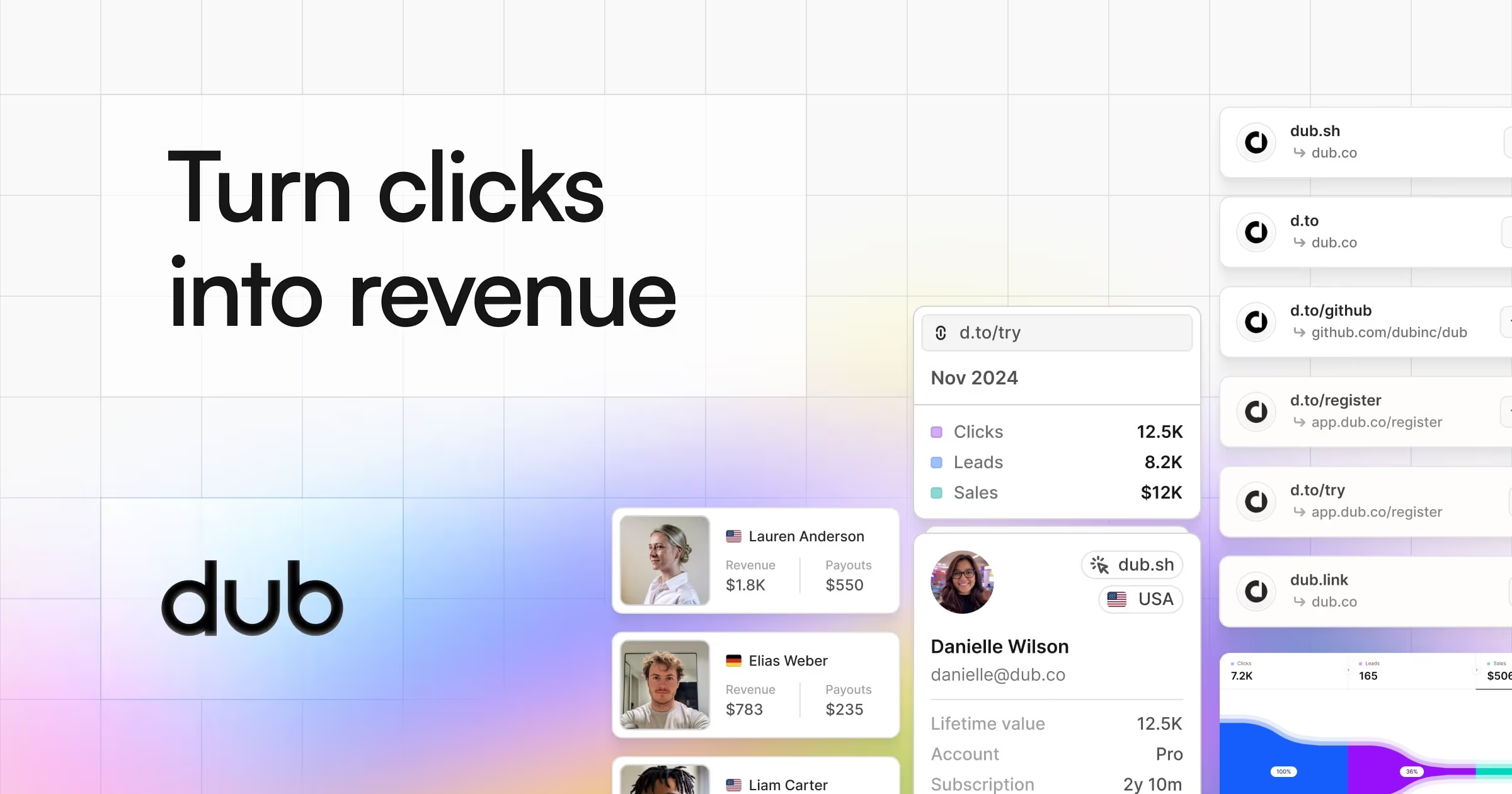
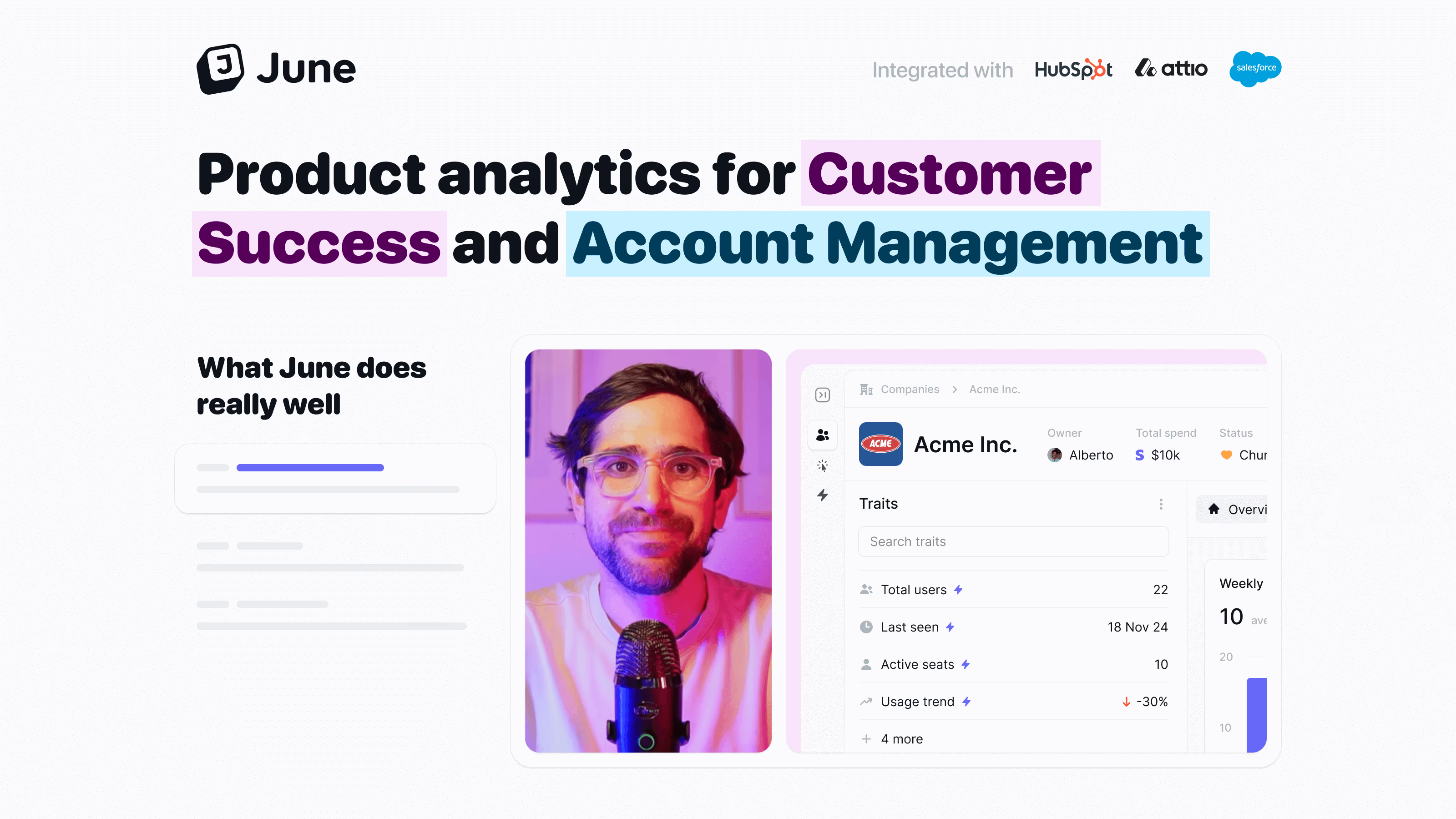
The Open Graph image is your landing page in someone else's feed. These examples show how SaaS brands design social share cards that stay on-brand and legible at thumbnail size.
Sponsored by (opens in new tab)
(opens in new tab)

























About og images
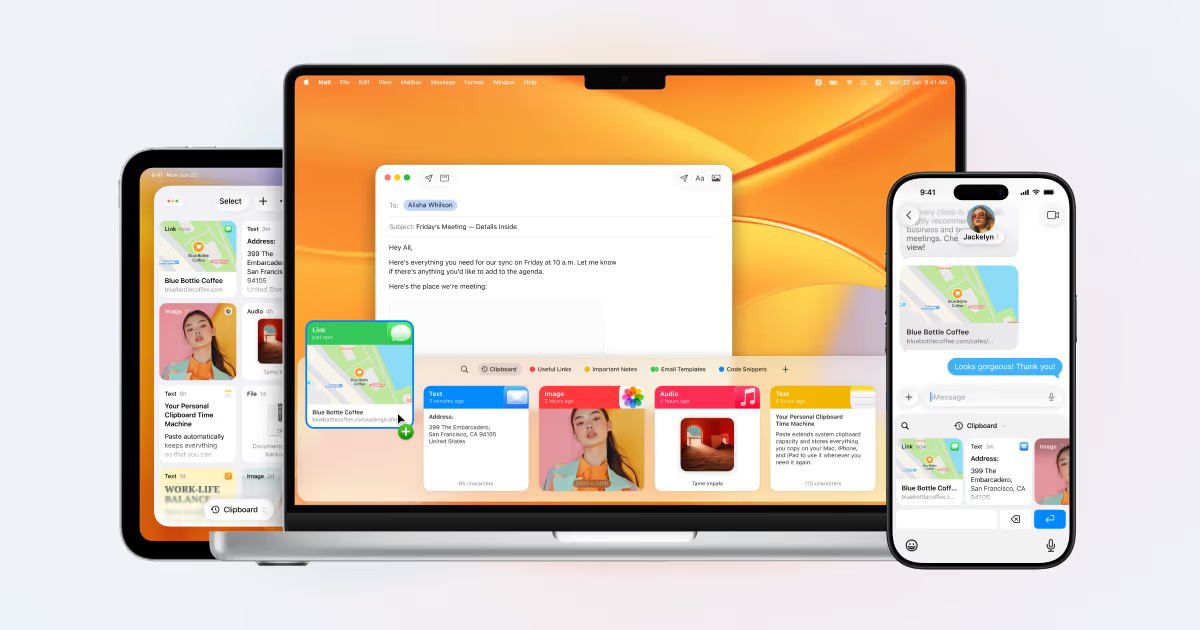
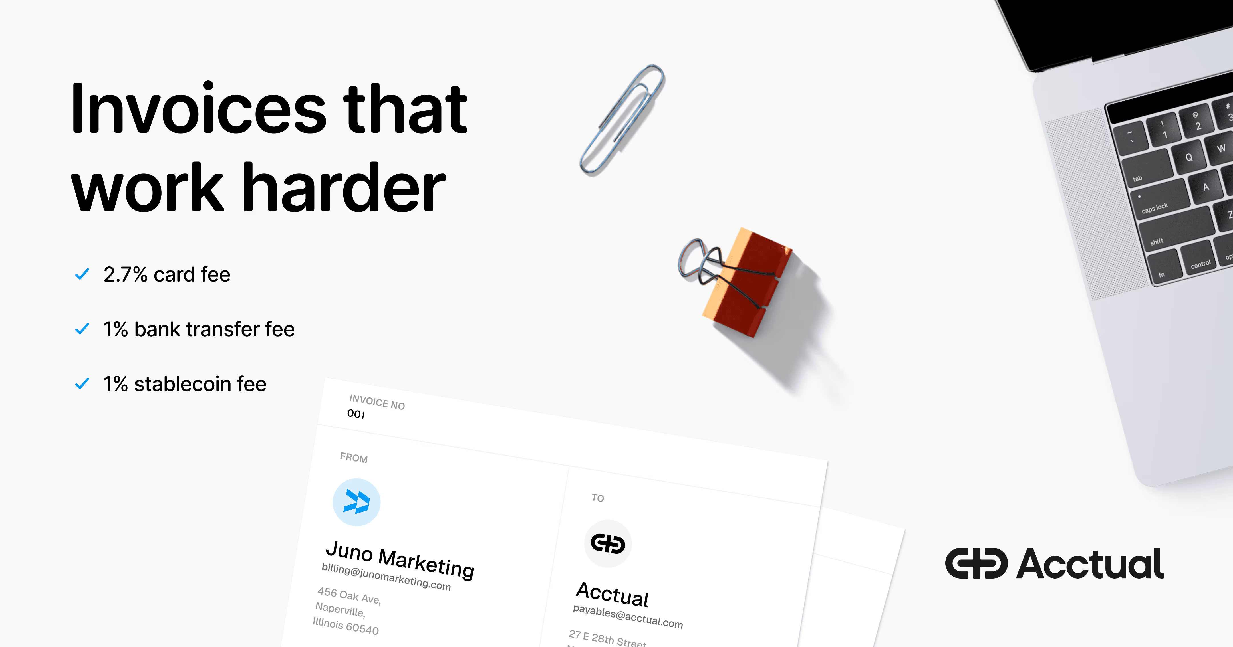
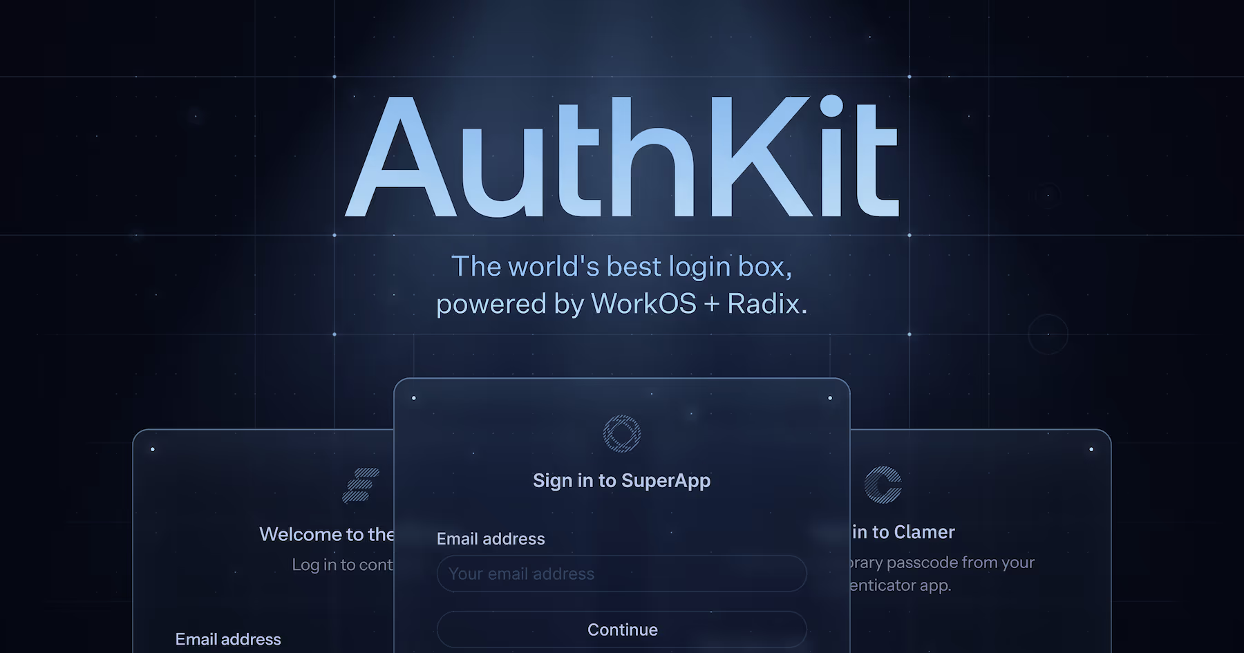
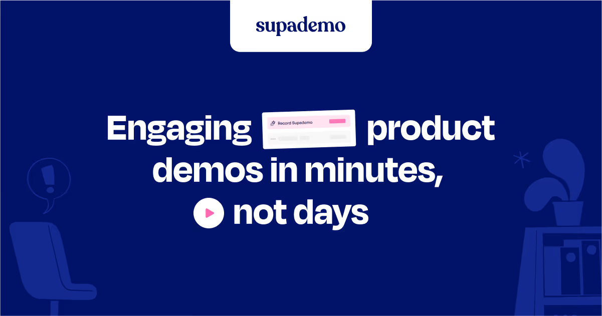
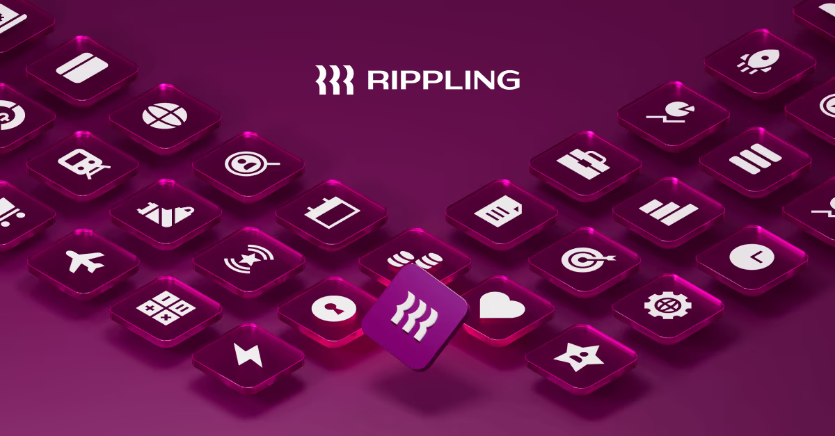
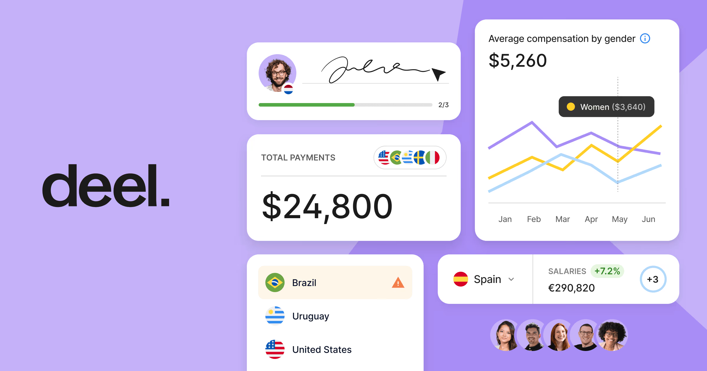
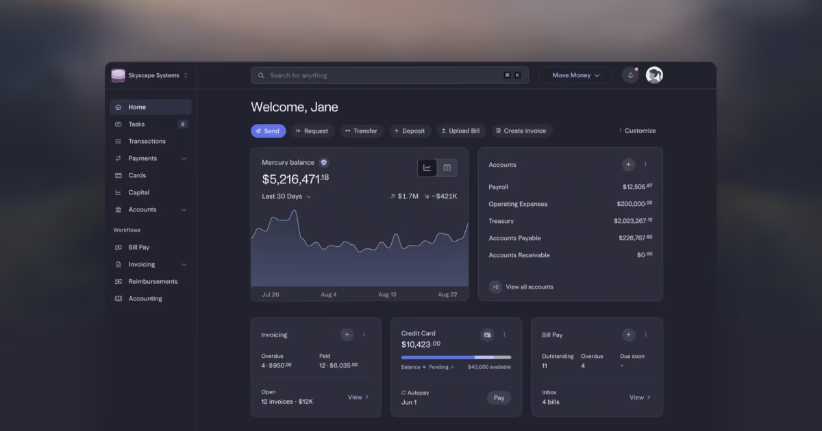
An OG image is almost always viewed at a fraction of its actual size — as a small card in a Slack unfurl, a Twitter/X timeline, or a link preview — which means the design test that matters isn't 'does this look good full-screen' but 'is the headline still legible shrunk down to a few hundred pixels wide.' That constraint rules out a lot of otherwise-good design choices: fine print, busy backgrounds, and full product screenshots (which read as noise at thumbnail scale) all tend to underperform a simple headline, logo, and one strong visual accent. The standard dimensions (1200×630px, roughly a 1.91:1 ratio) are what most platforms crop to, so anything important needs to sit safely inside that frame rather than at the edges, where different platforms crop differently. A growing number of SaaS sites now generate OG images dynamically per page (pulling the actual page title into a templated design at request time) rather than hand-designing one static image per page — useful once a site has more than a handful of indexable URLs, which is exactly the kind of catalog this site itself is.
What makes a great one
- Readable text at small sizes
- Strong brand colours and logo
- A single clear message, not a cluttered screenshot
- Consistent template across pages
From the blog
The 30 Best SaaS Websites in 2026 (Reviewed From Real Screenshots)
Thirty SaaS websites reviewed at equal depth from screenshots we captured ourselves — what's above the fold, the one section each does unusually well, and the stack, palette and typefaces behind it. With a stated selection method, not a handpicked vibe check.
24 Product Landing Page Examples, Measured Fold to Footer
Twenty-four product landing pages read start to finish from our own screenshots — what's in the fold, where the logo strip actually sits, how the page closes, and how long each one really runs, in pixels.
25 SaaS Contact Us Page Examples, Counted Field by Field
Dropbox's contact form asks for eleven things. Warp's asks for one. We counted the fields, the routes and the published email addresses on 25 real SaaS contact pages — and not one of them promises a response time.
Frequently asked
What size should a SaaS OG image be?
1200×630px is the standard most platforms expect and crop to (a 1.91:1 ratio) — smaller images get upscaled and look soft, so it's worth exporting at that size even if the design looks fine smaller.
Should OG images be generated dynamically per page?
For any site with more than a handful of indexable pages, yes — a templated, dynamically-generated OG image (pulling in the page's actual title) scales far better than hand-designing a static image for every URL, and keeps share previews accurate as content changes.
Does the OG image affect SEO rankings?
Not directly as a ranking factor, but it affects click-through rate on social shares and link previews — and click-through behavior is one of the signals search engines do weigh indirectly over time, so a legible, on-brand OG image is worth the same care as a meta description.