
169 SaaS website pricing page & section design examples
Pricing is where intent meets friction. These examples show how the best SaaS products present plans — making tiers easy to compare, guiding toward a recommended option, and answering objections right where they arise.
Sponsored by (opens in new tab)
(opens in new tab)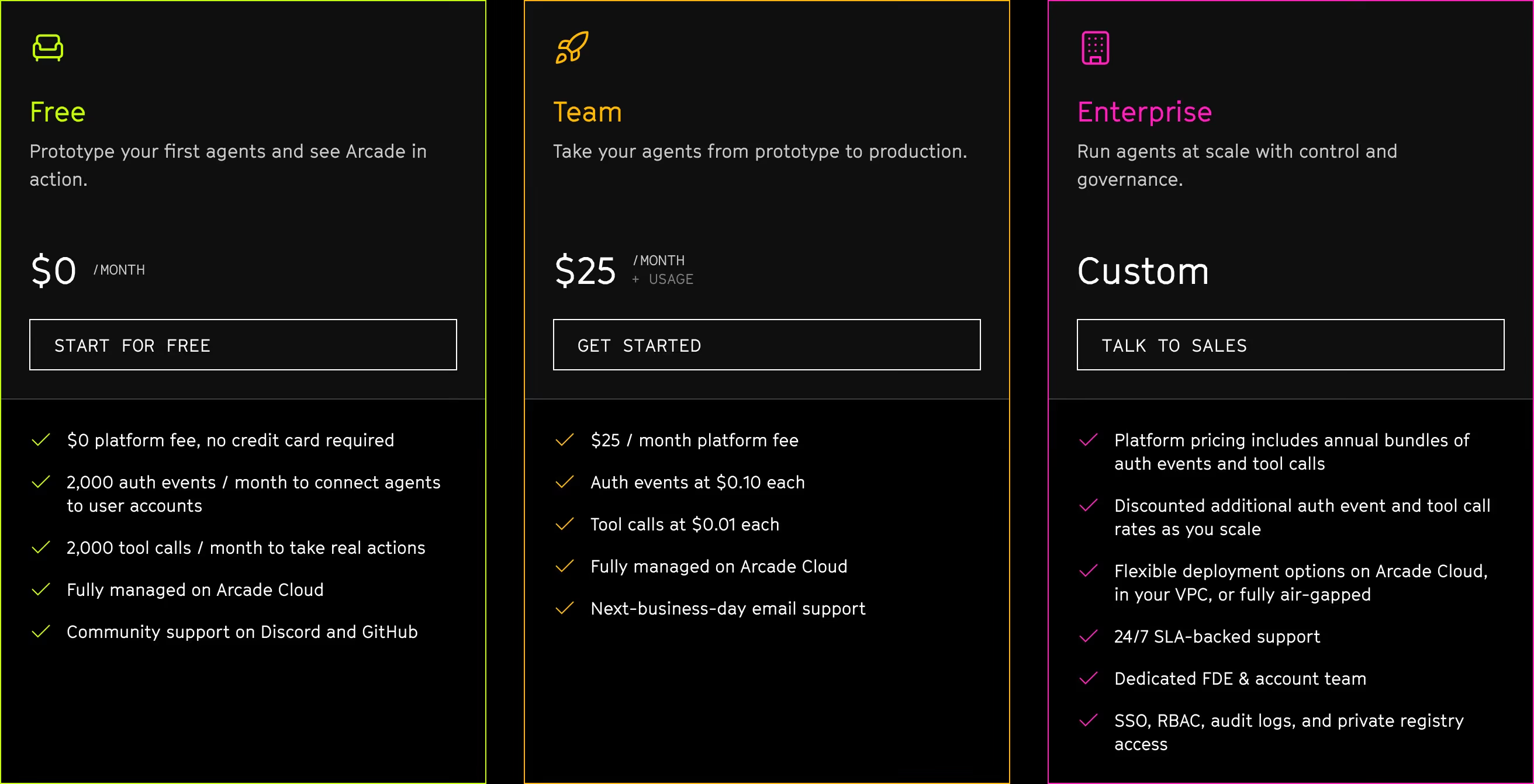

About pricing
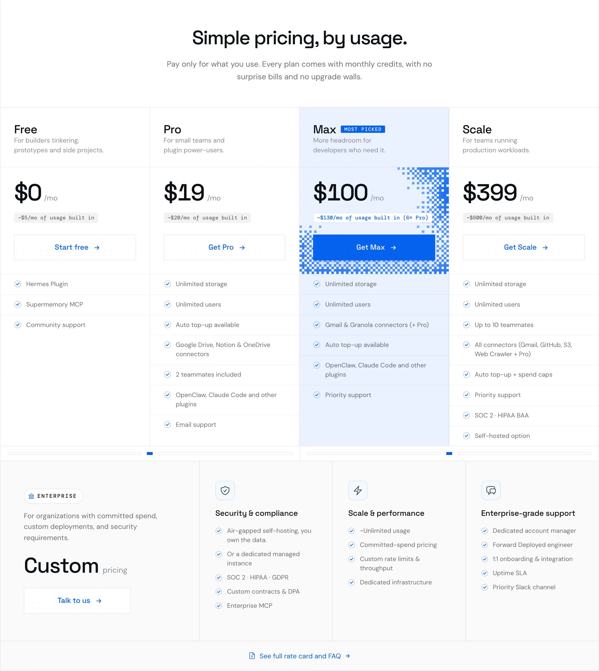
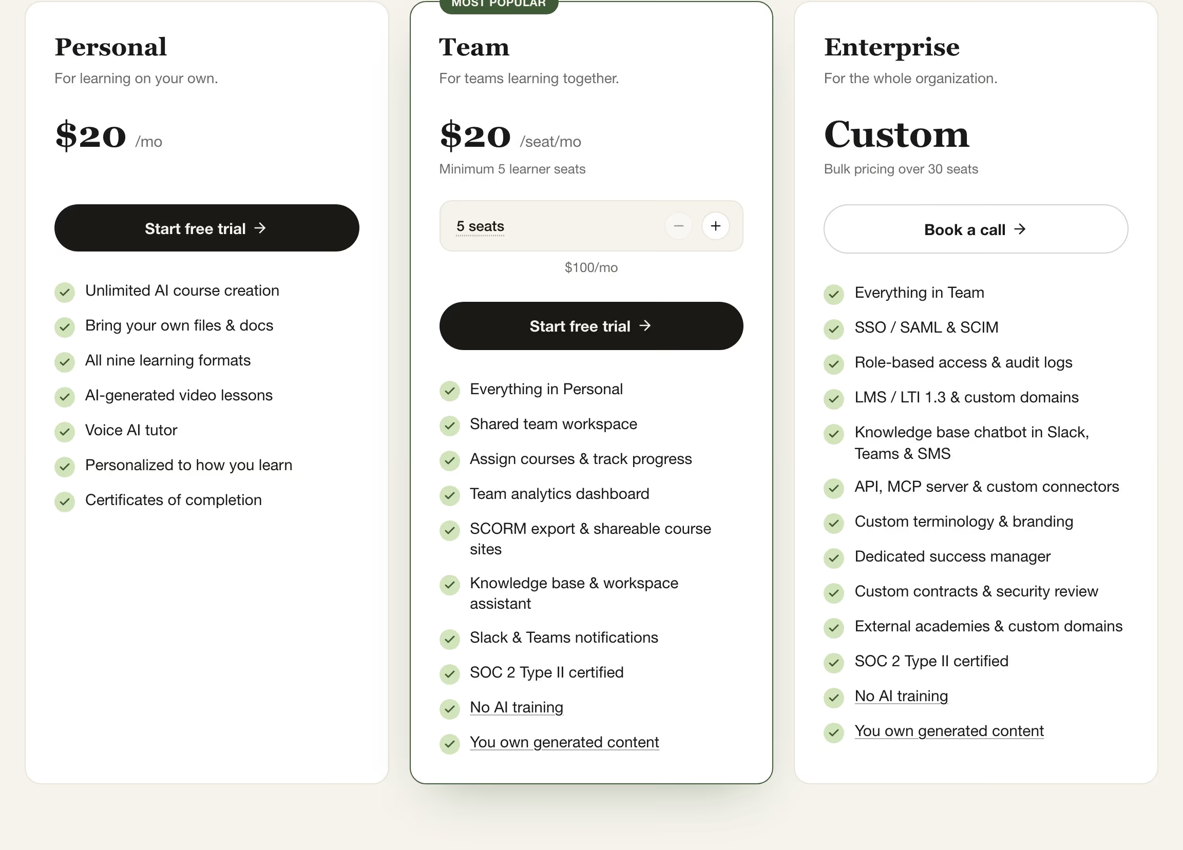
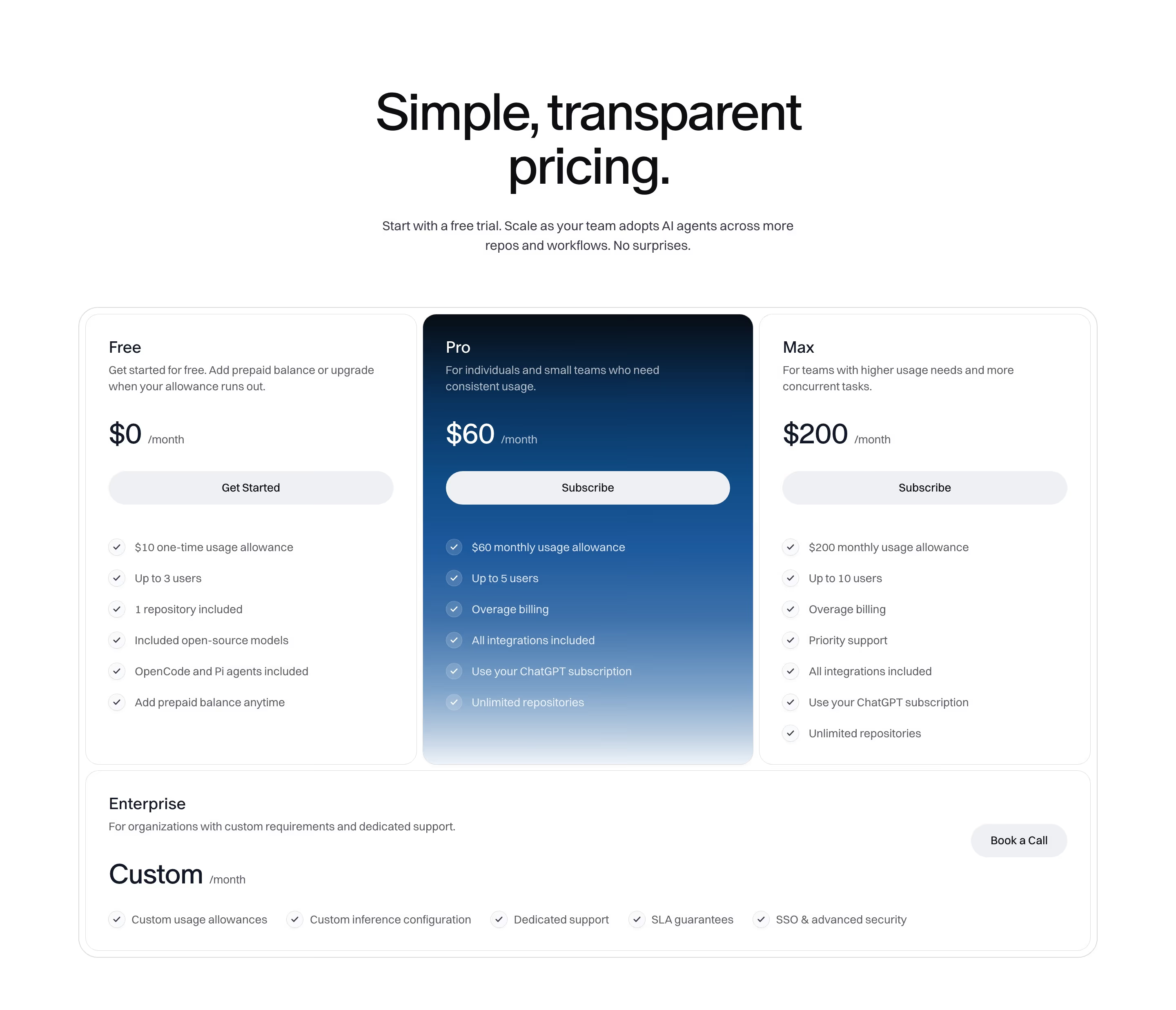
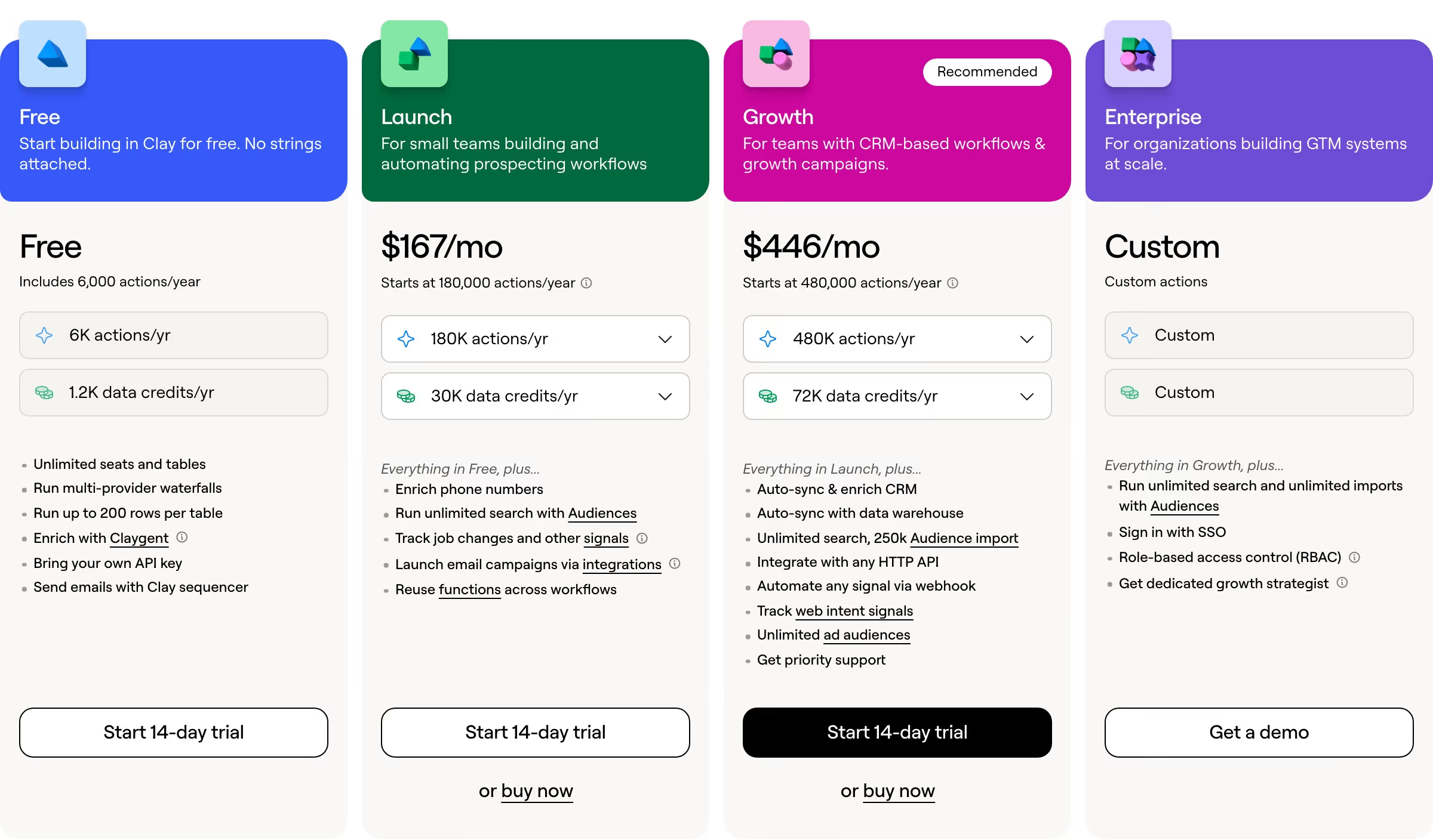
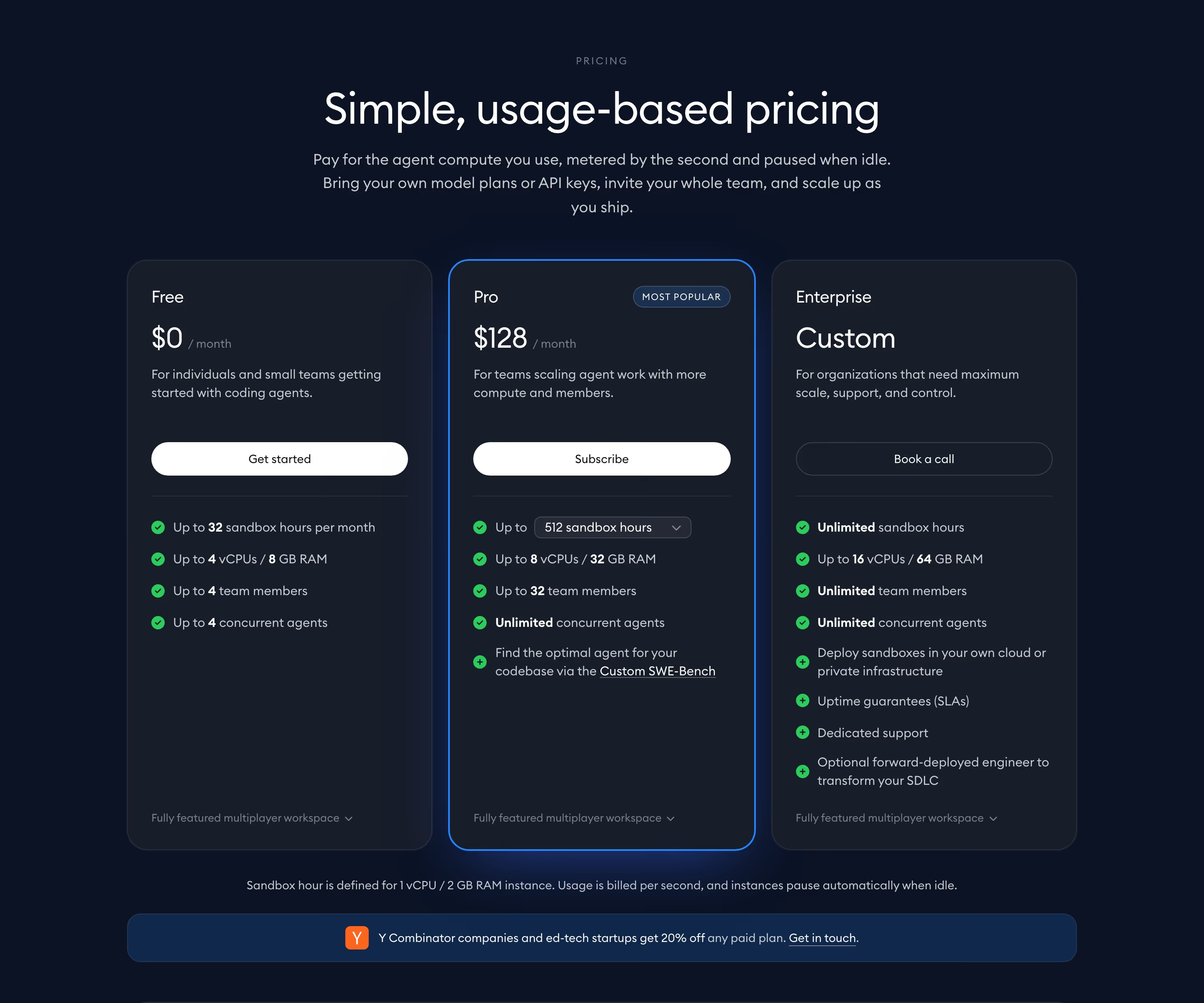
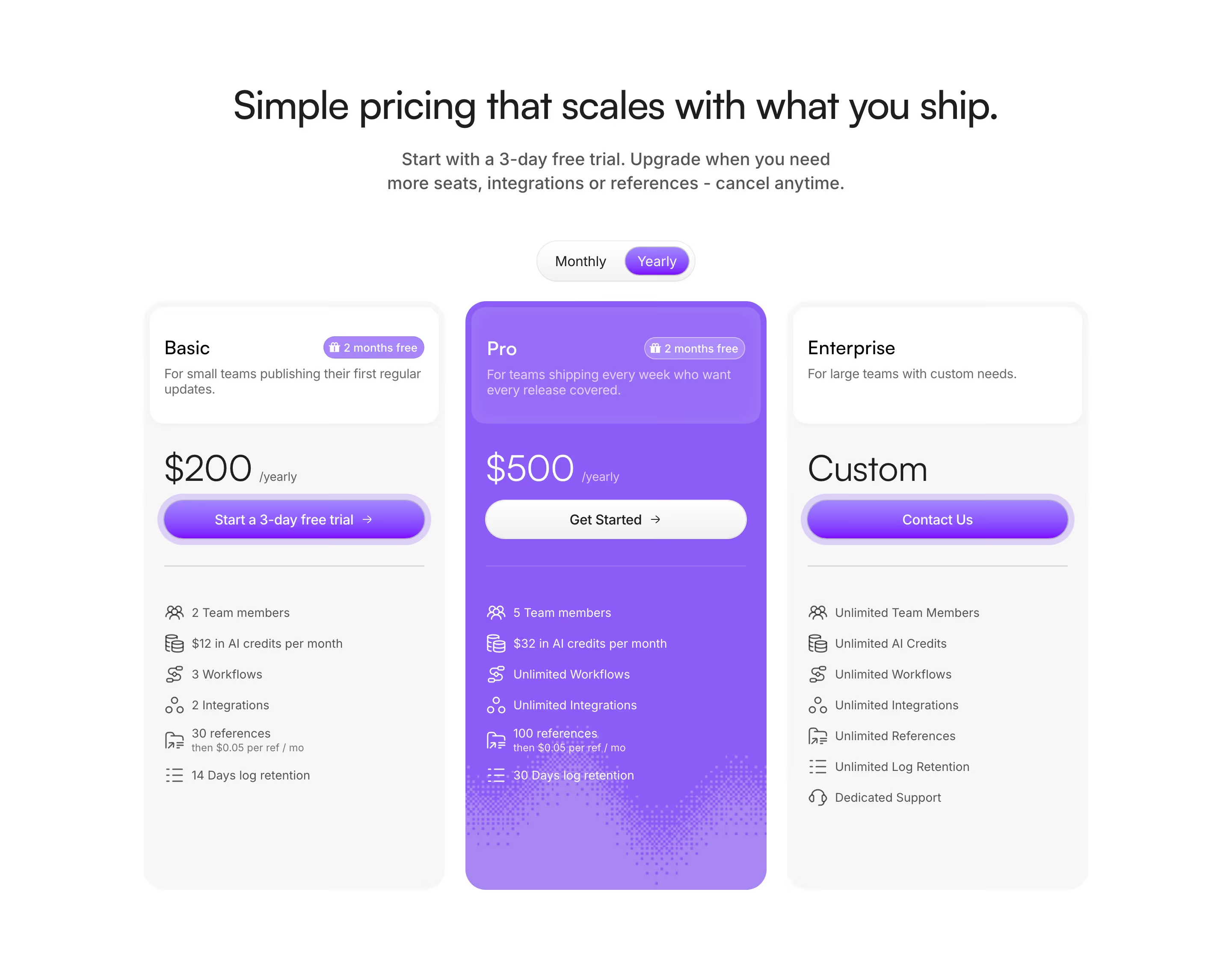
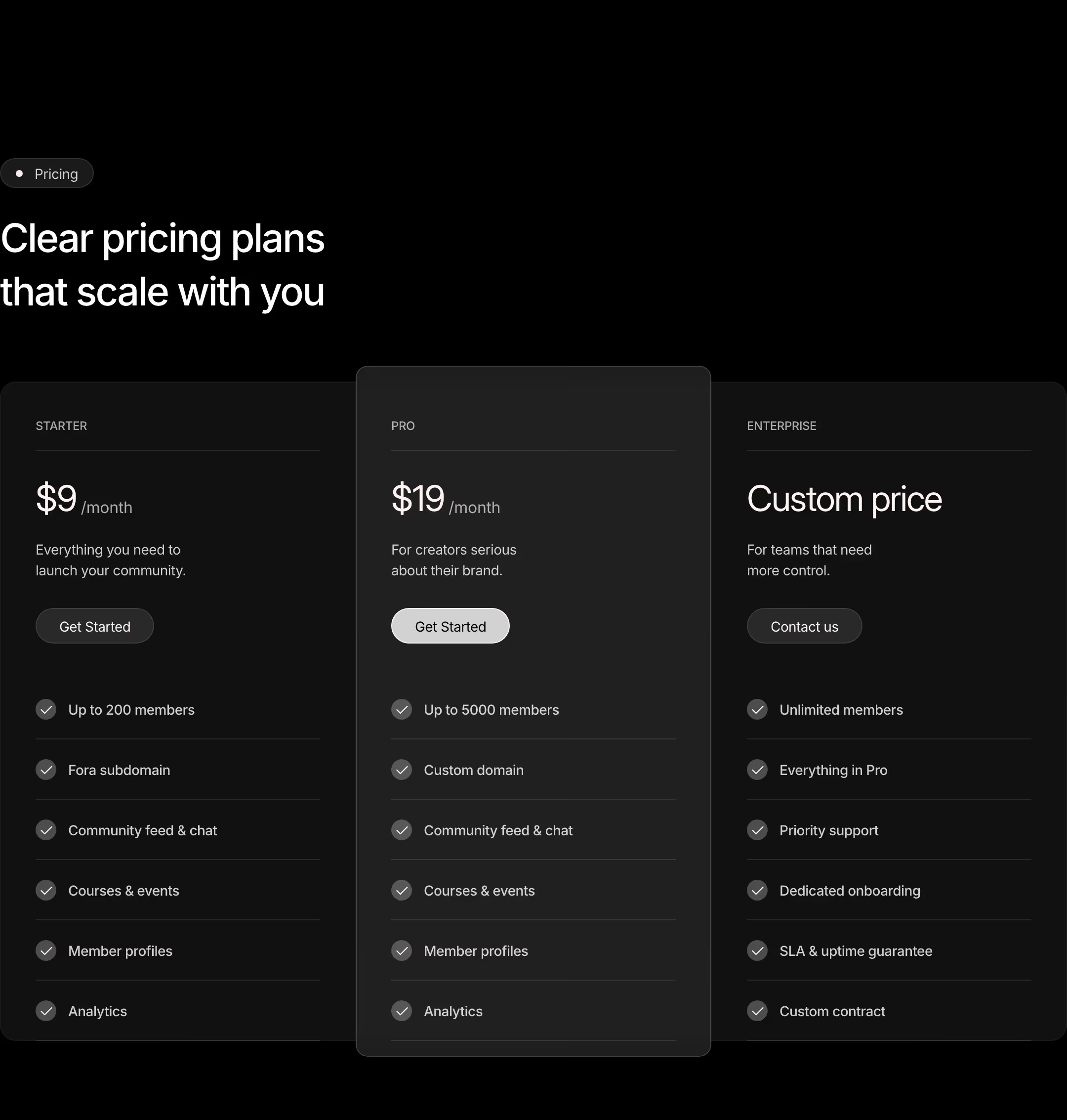
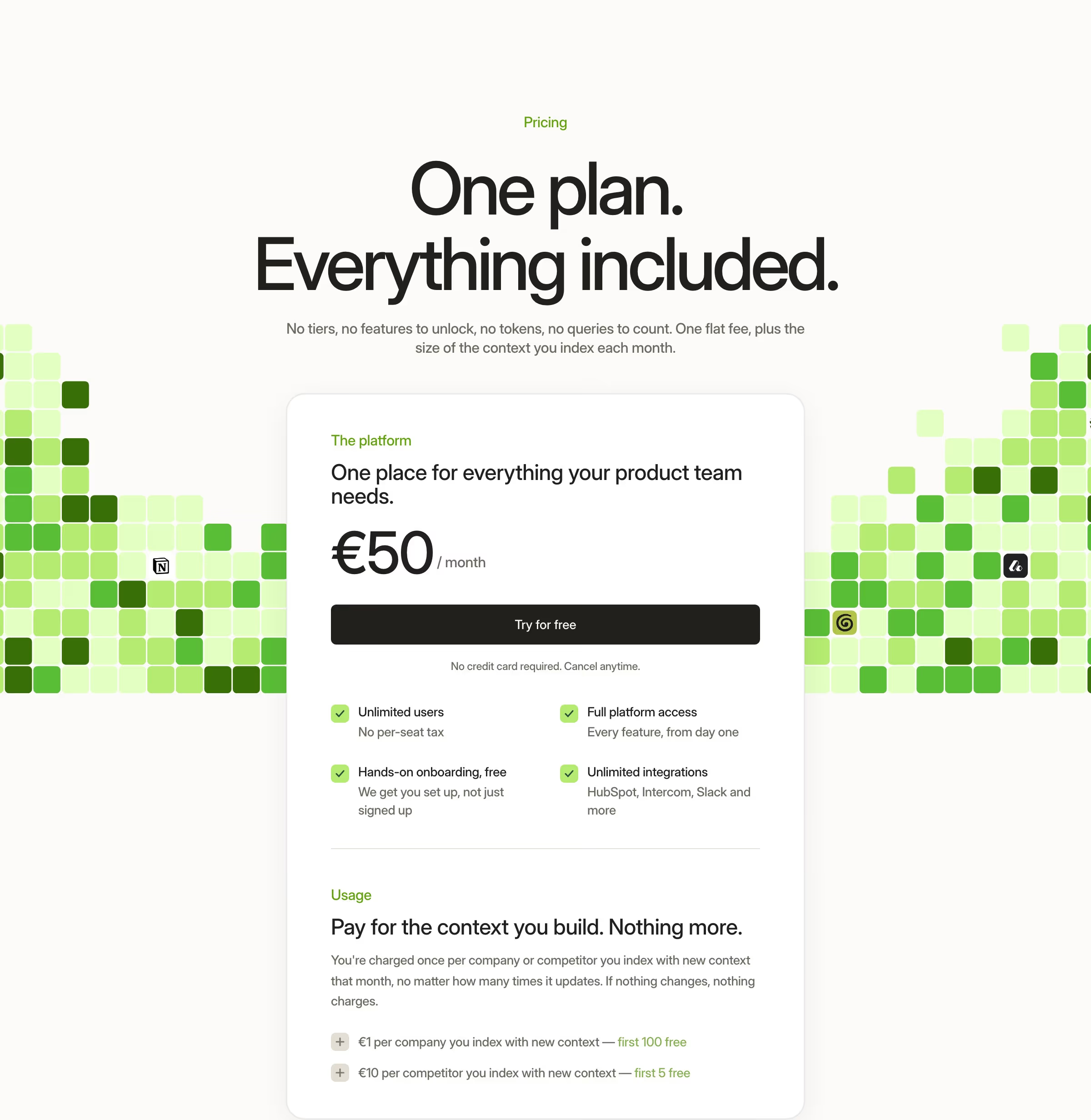
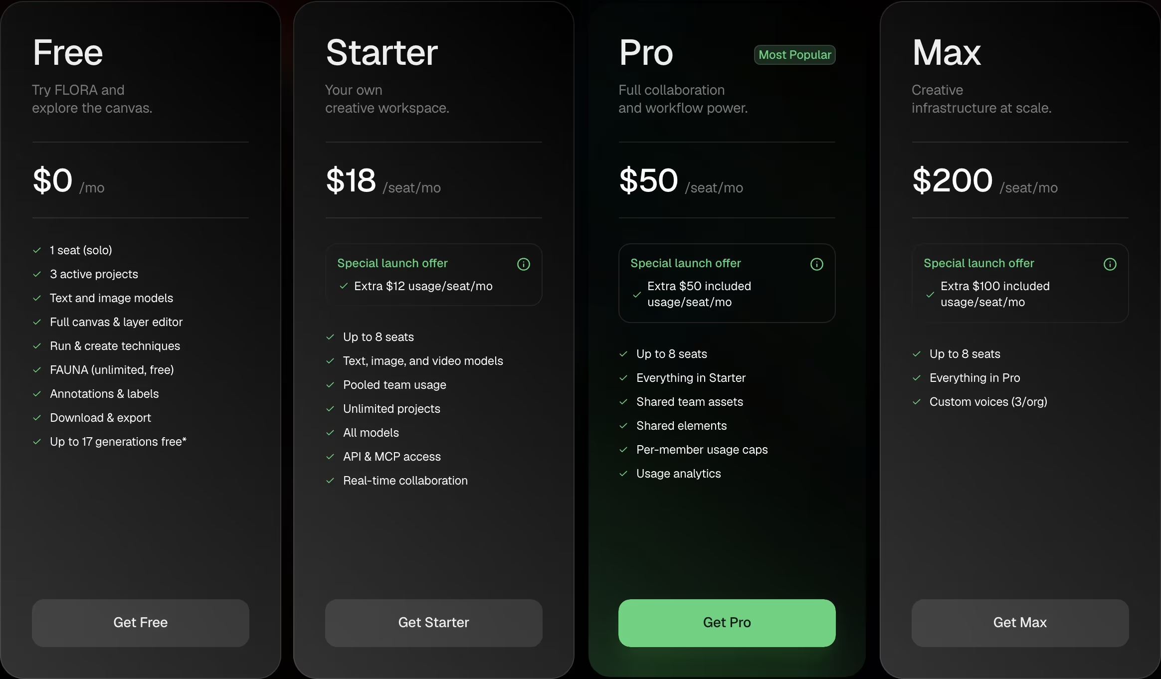
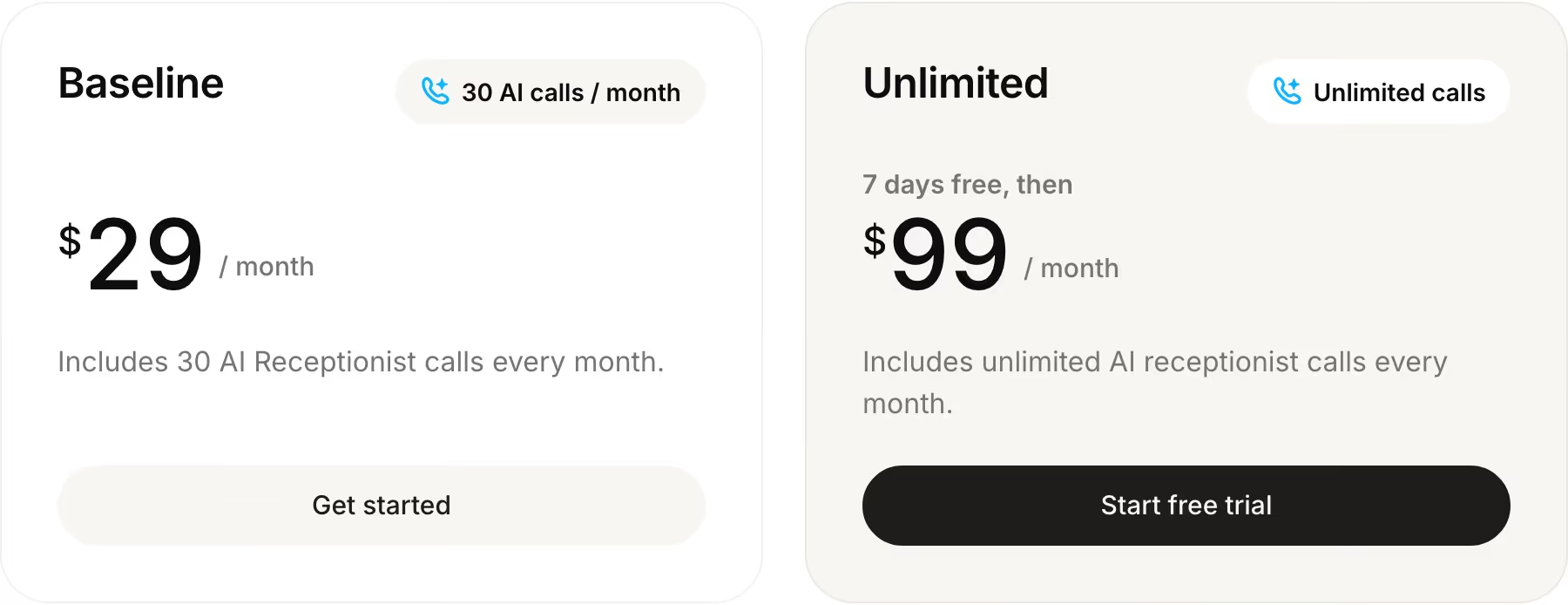
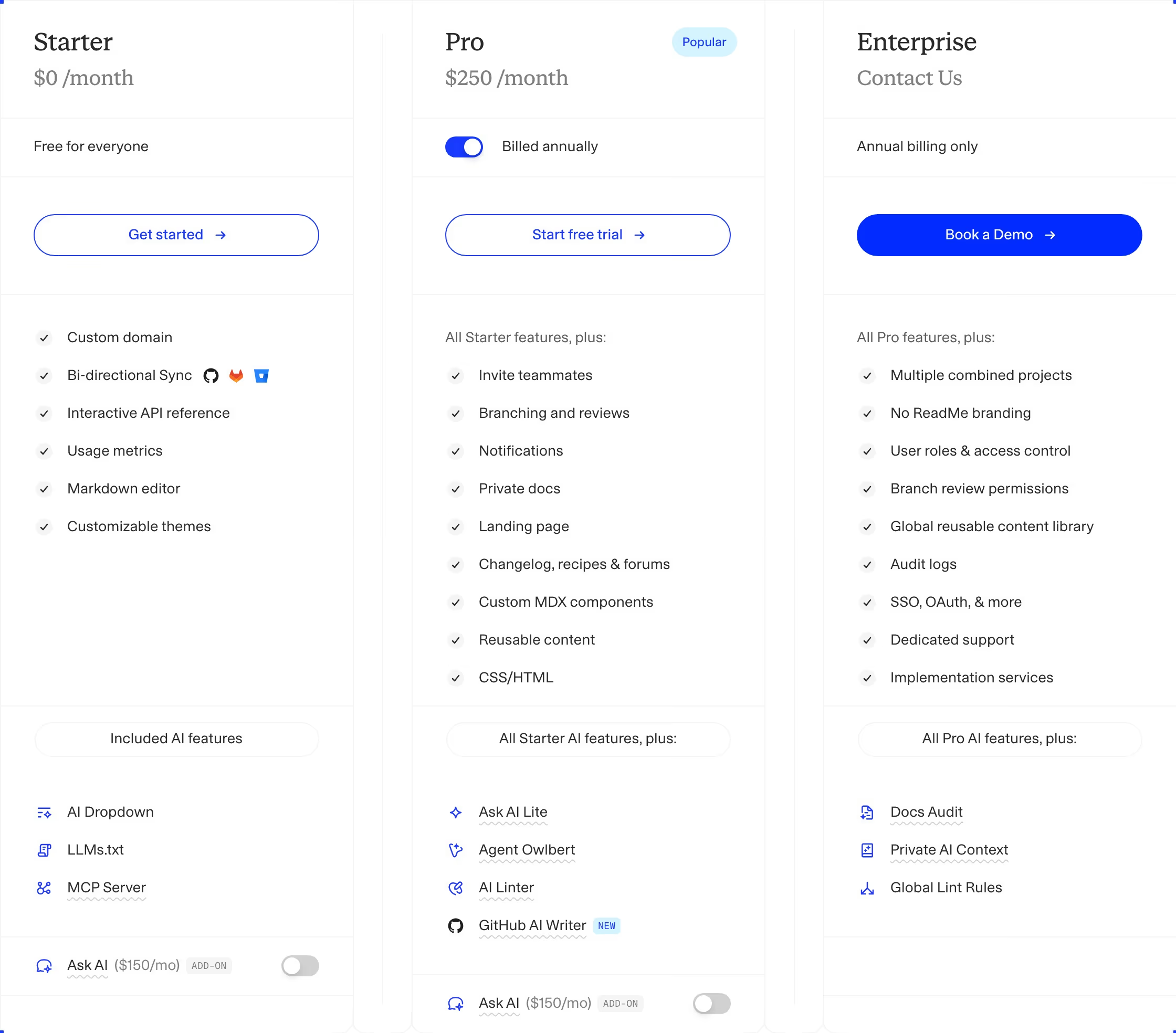
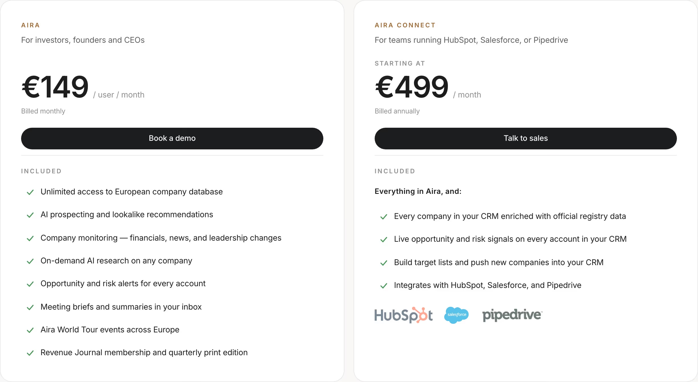
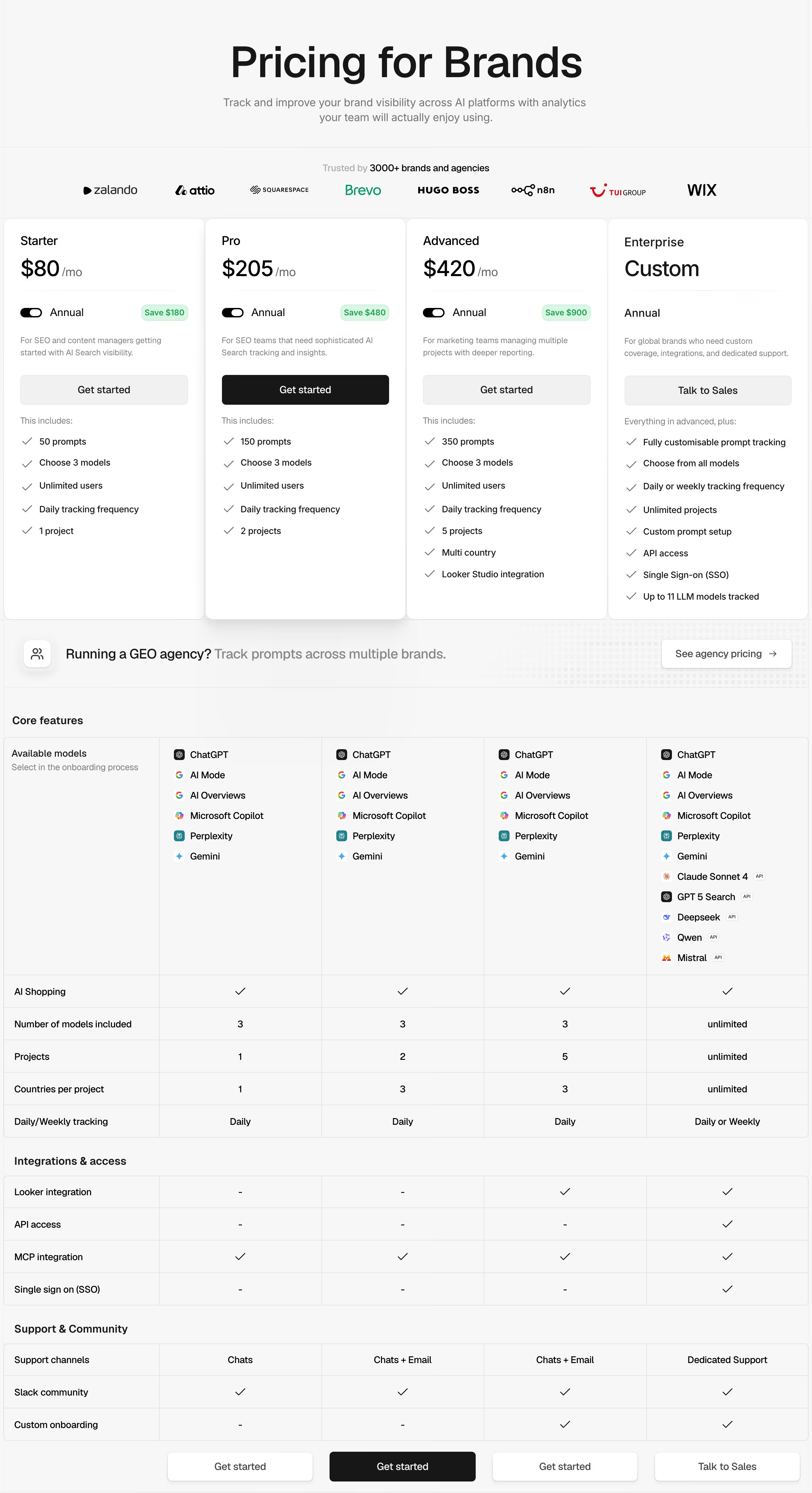
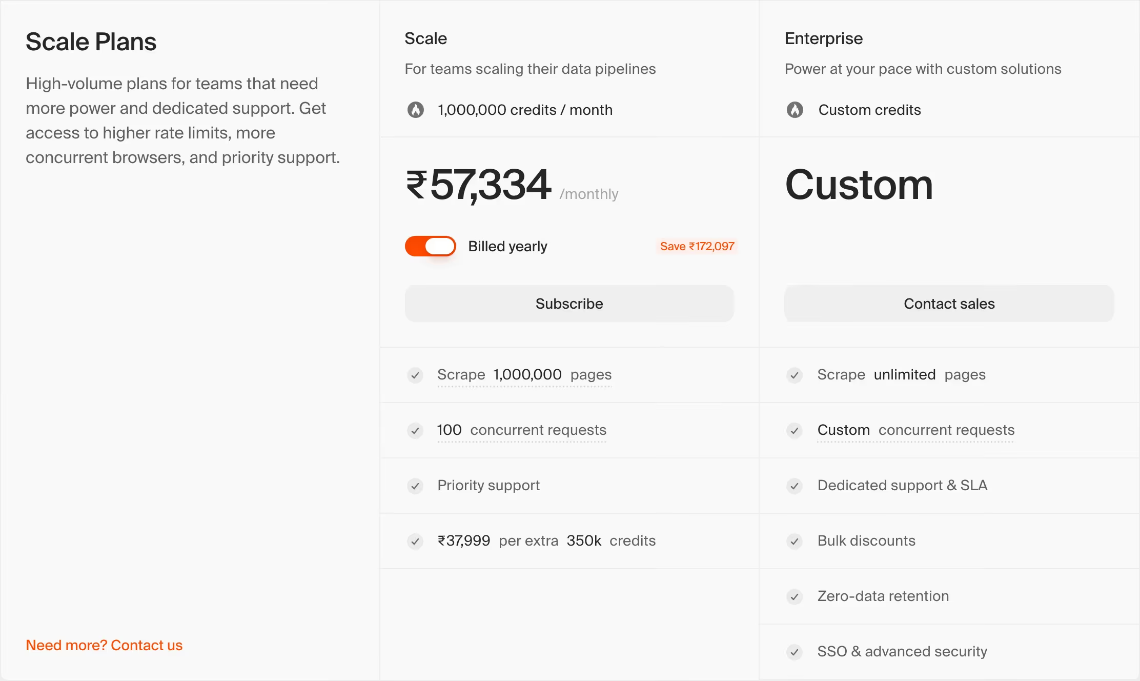
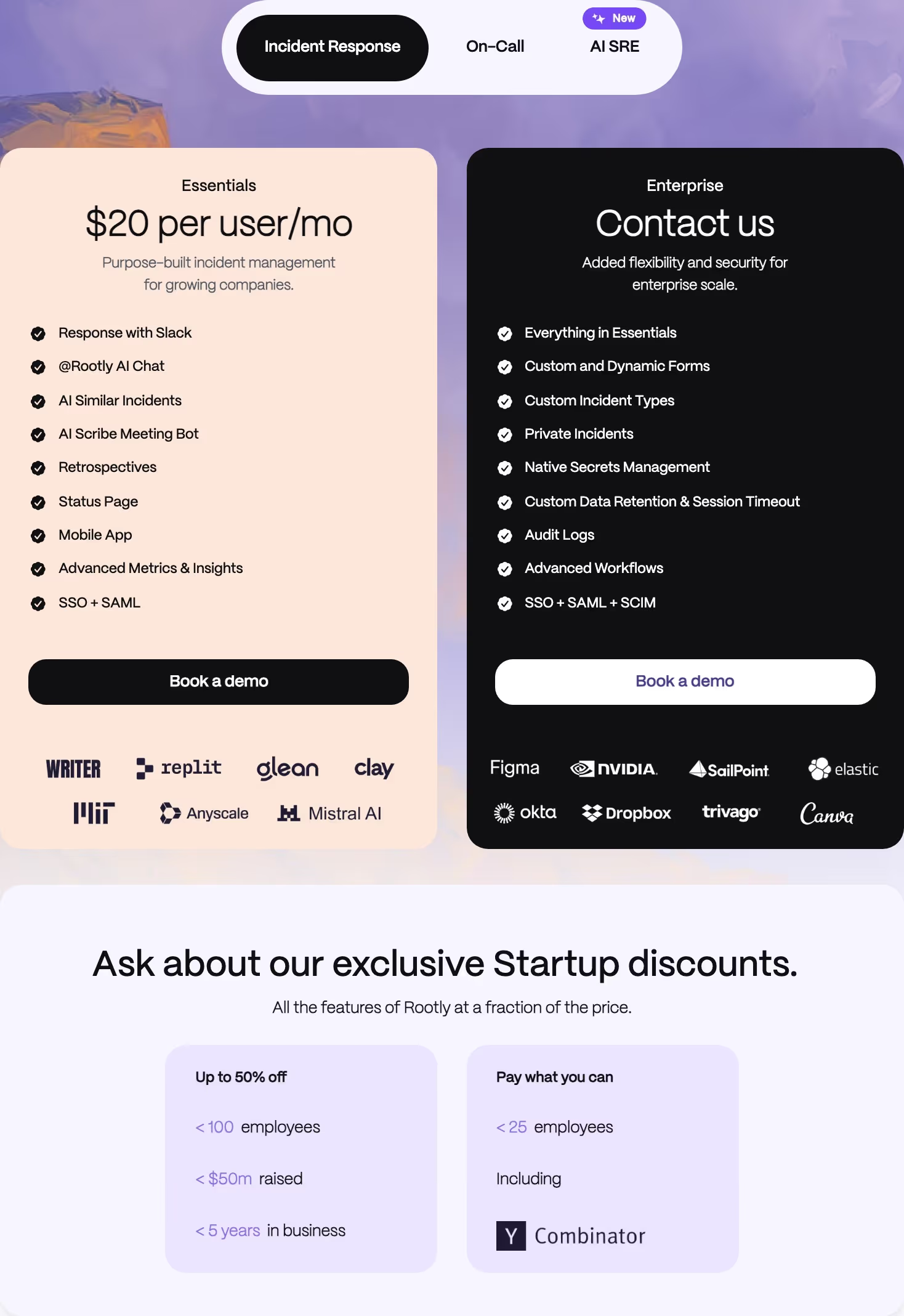
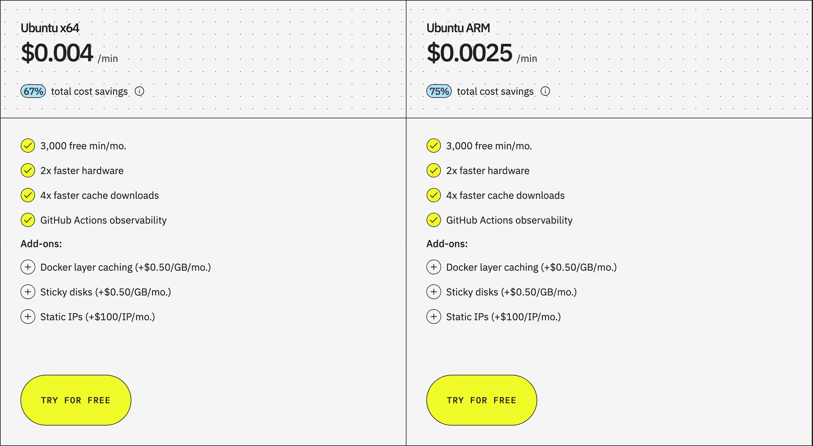
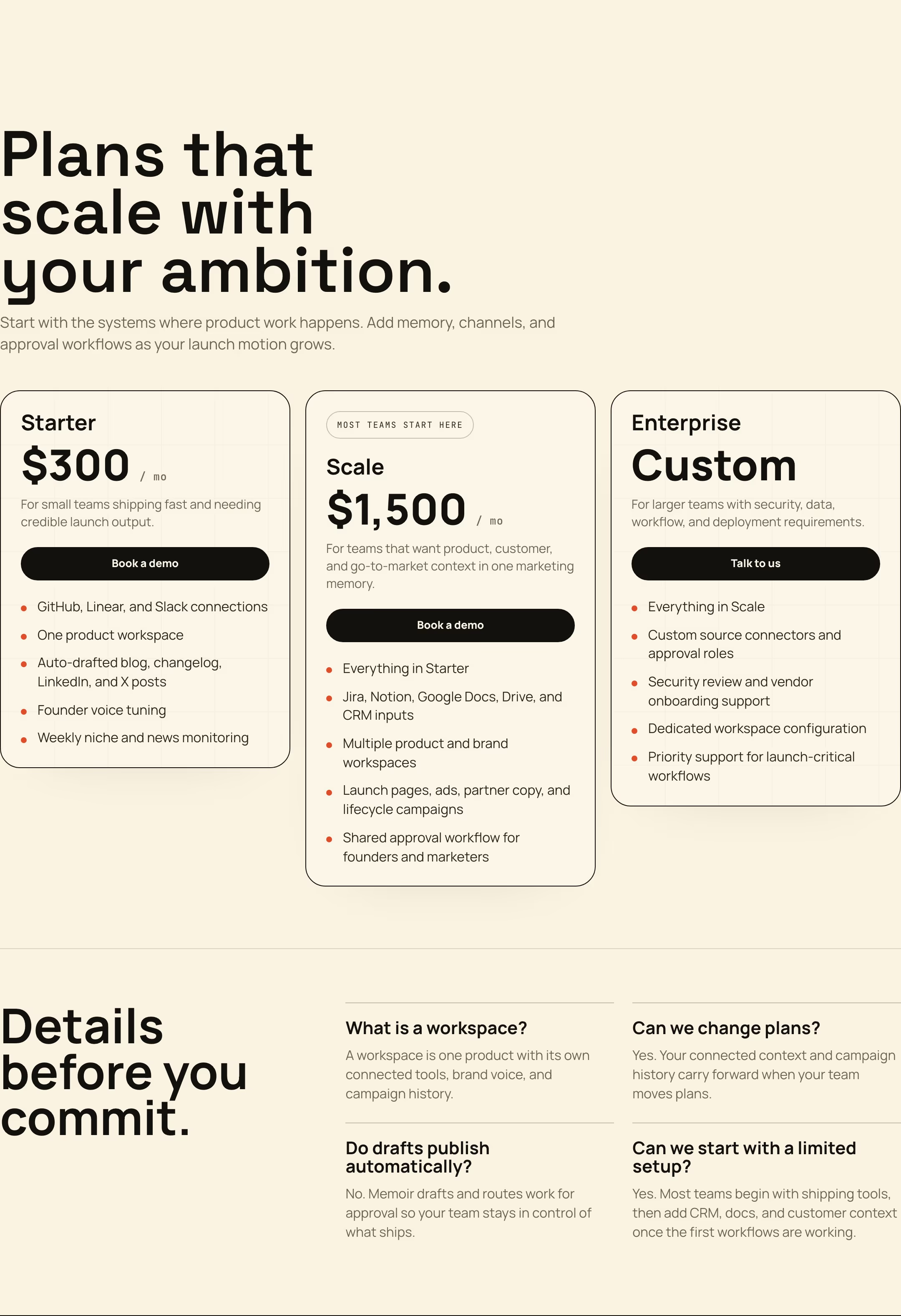
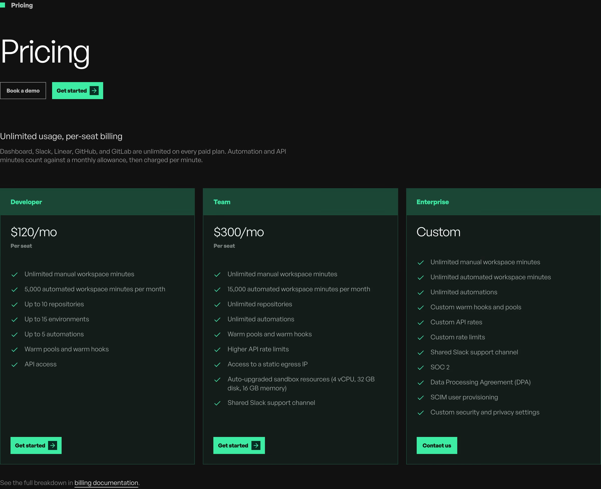
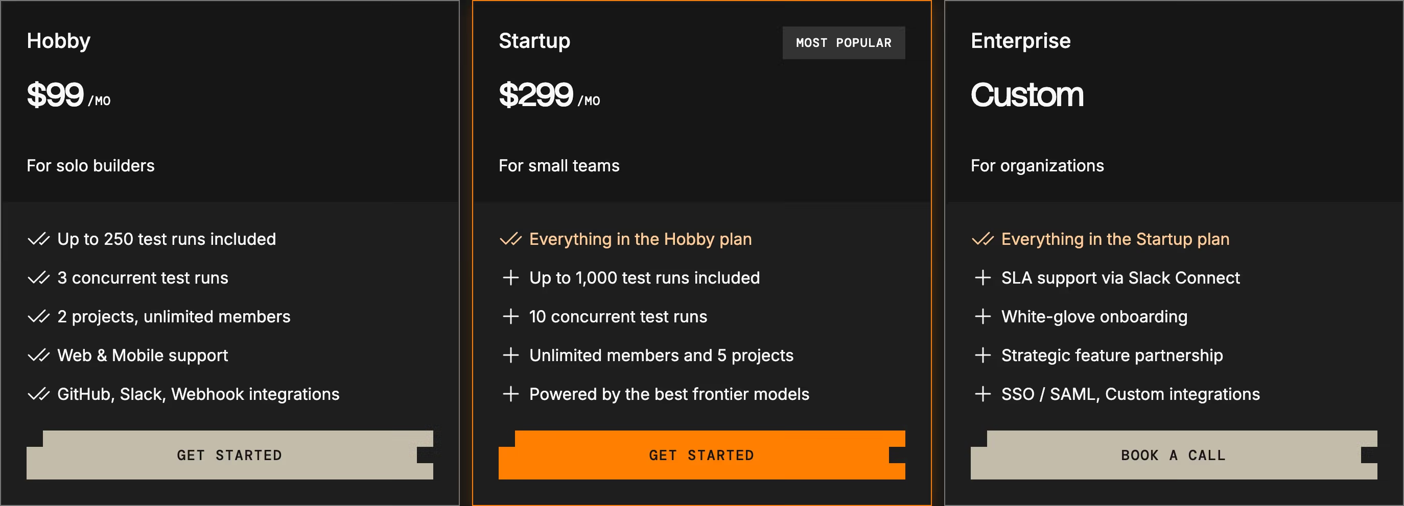
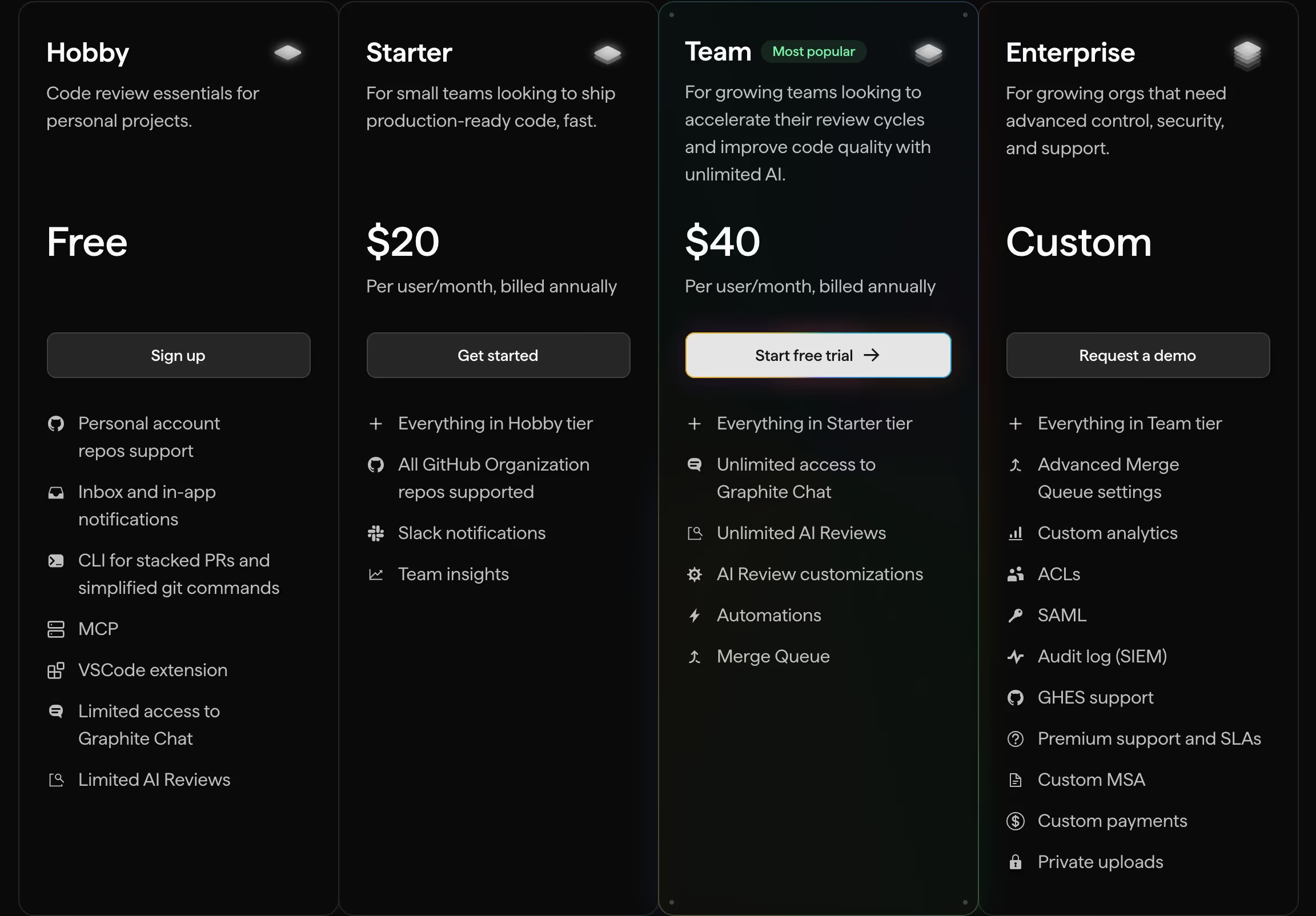
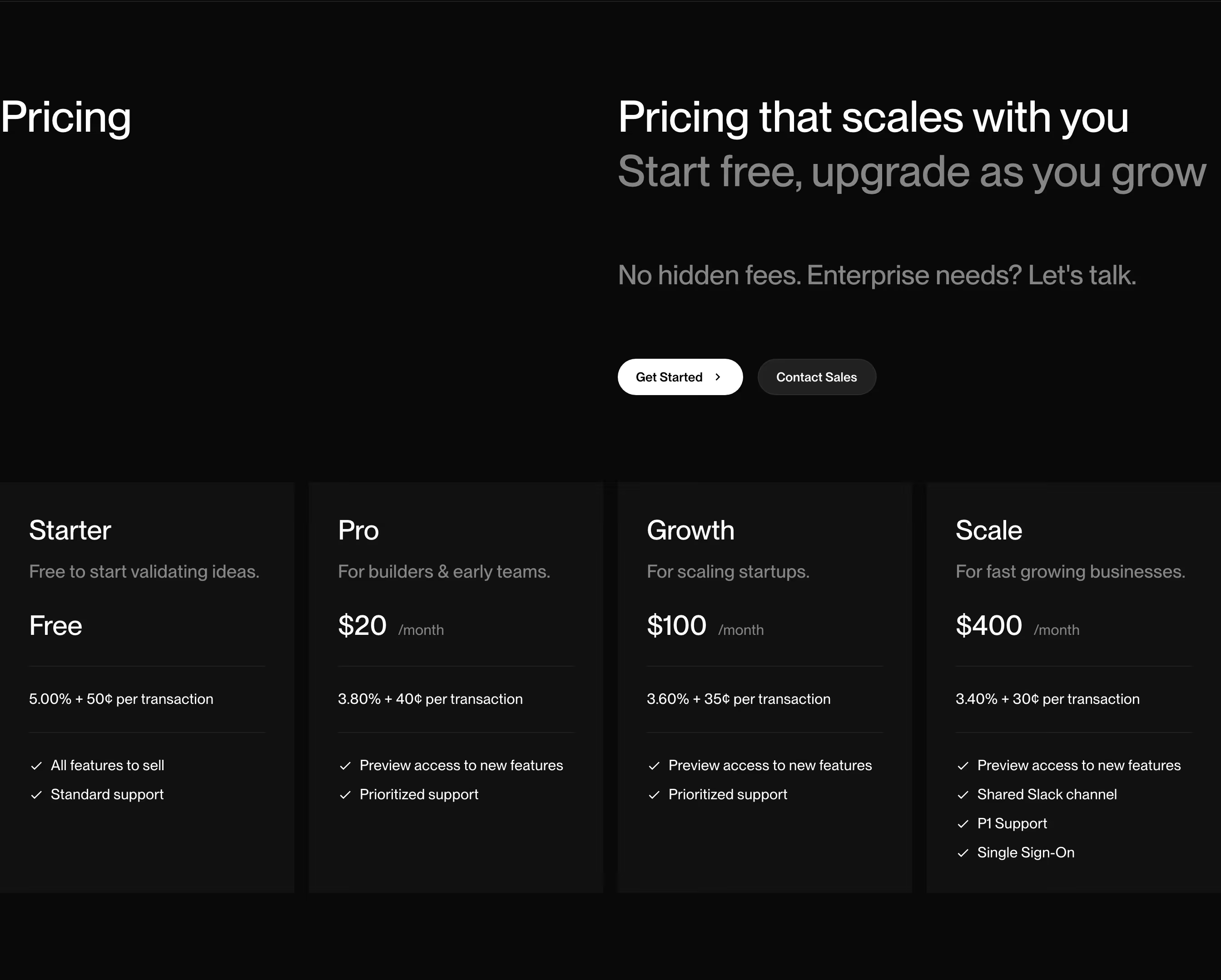
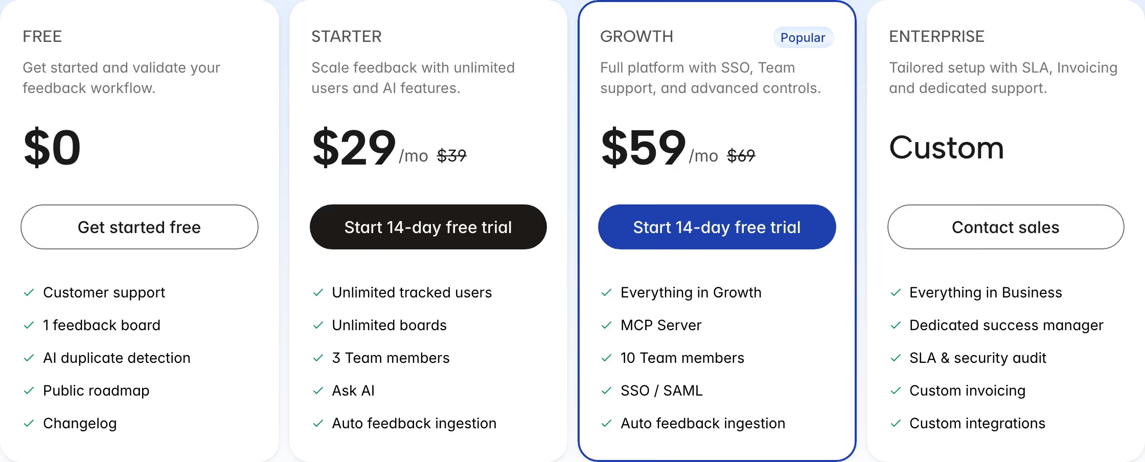
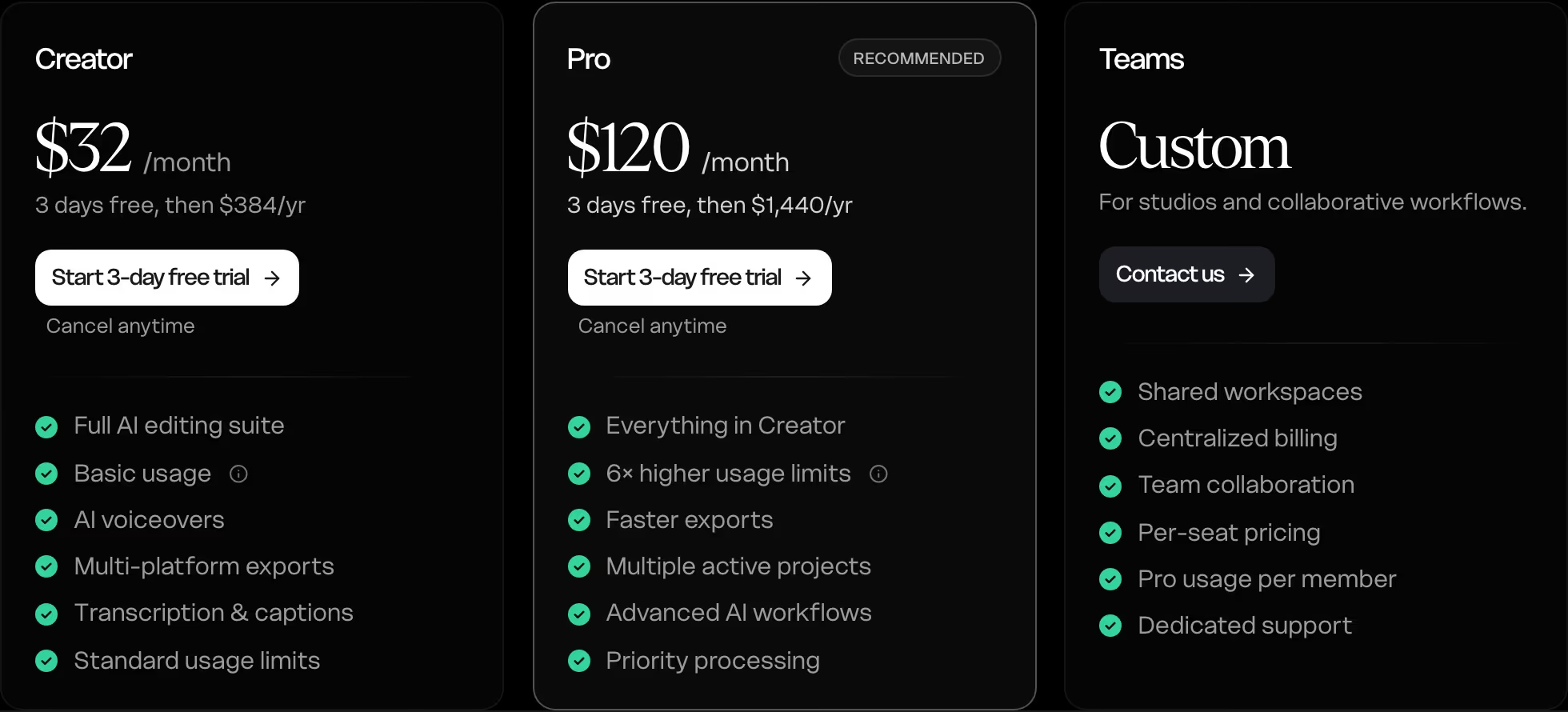
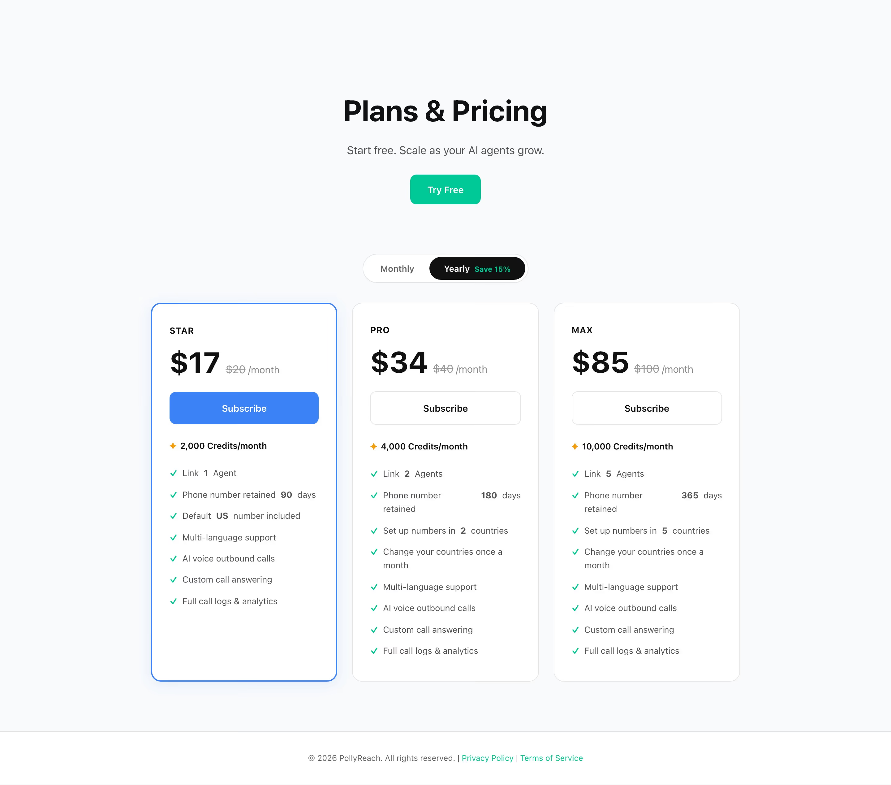
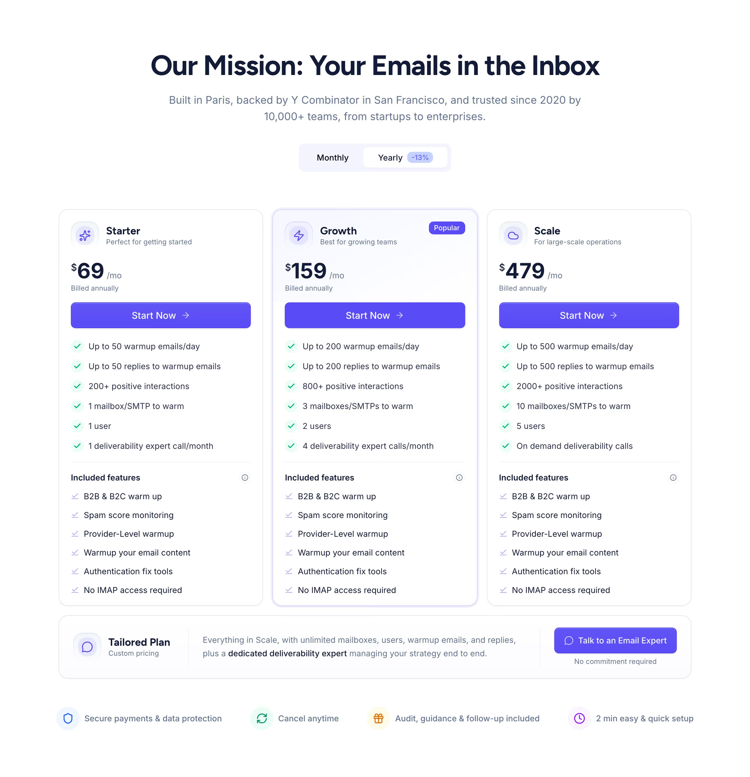
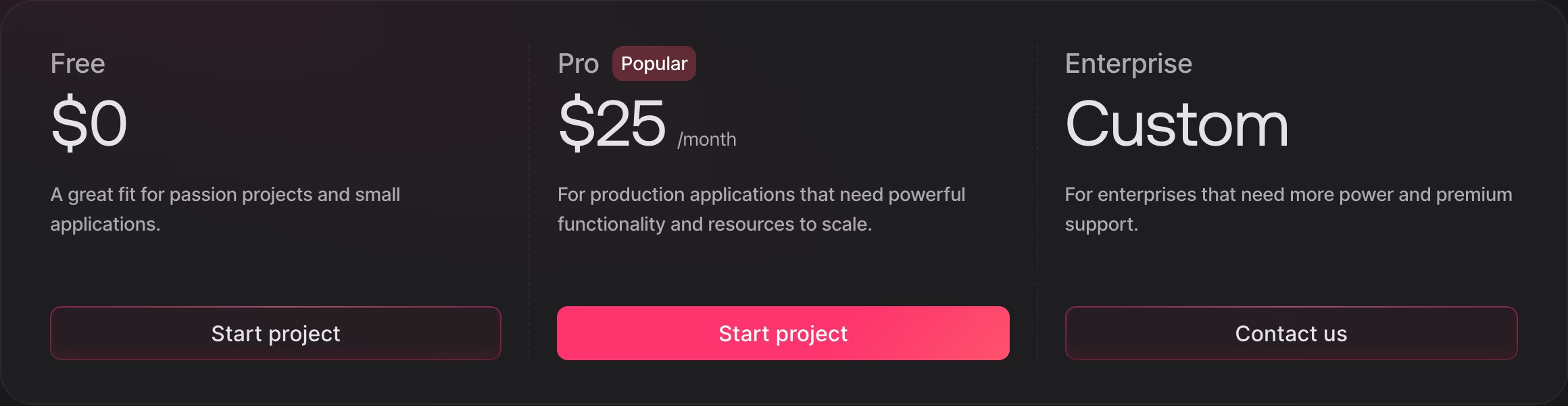
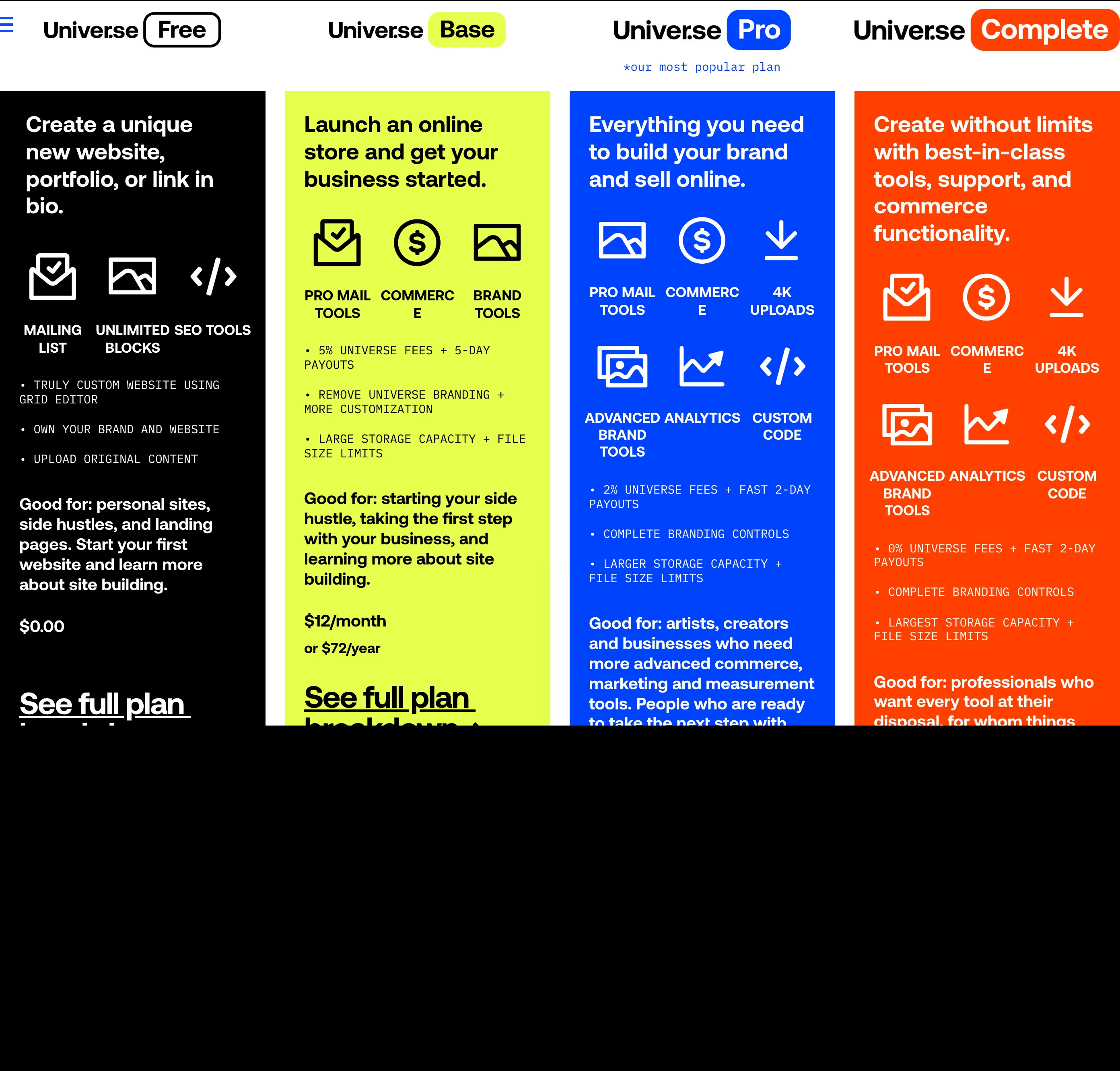
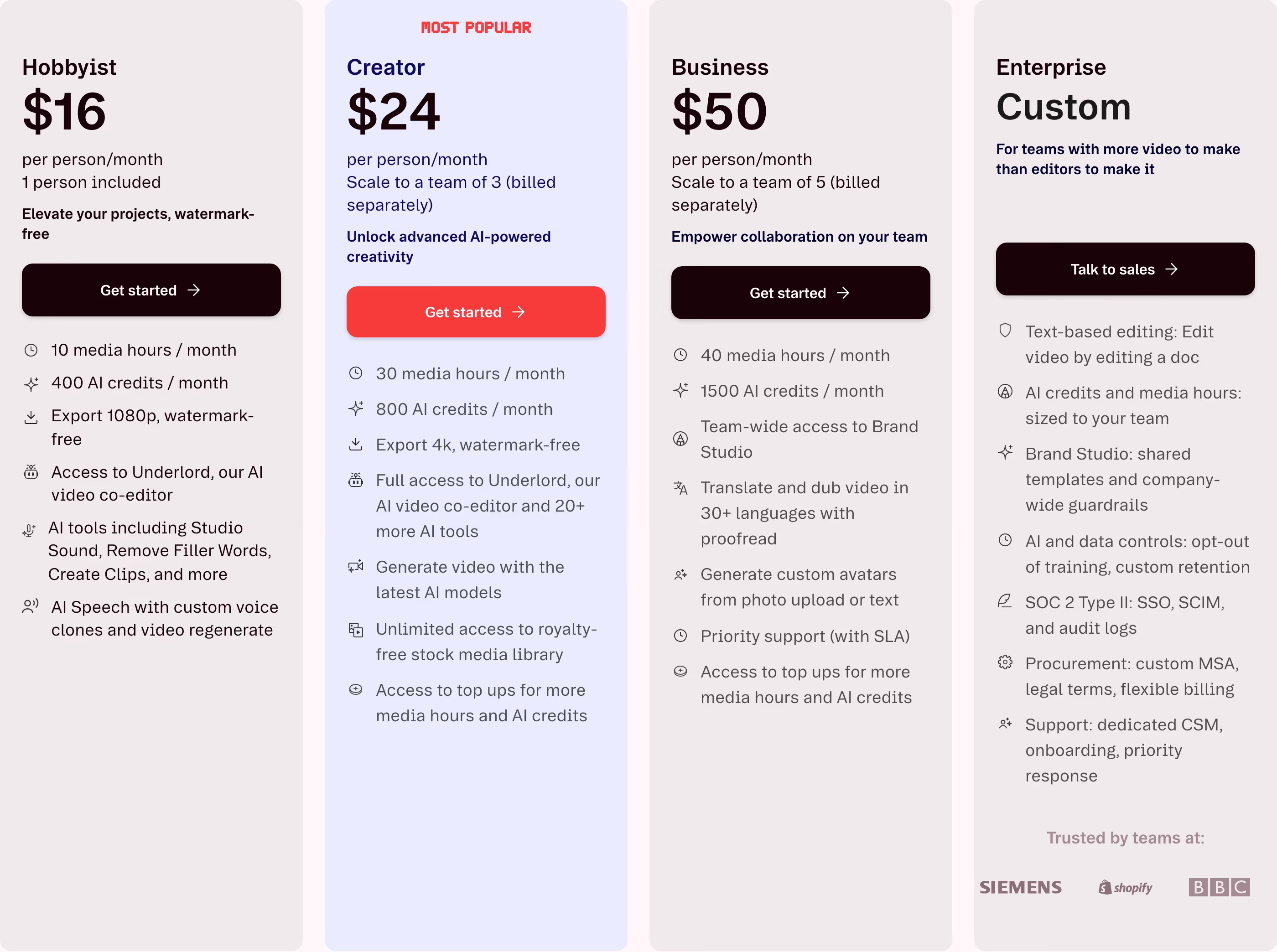
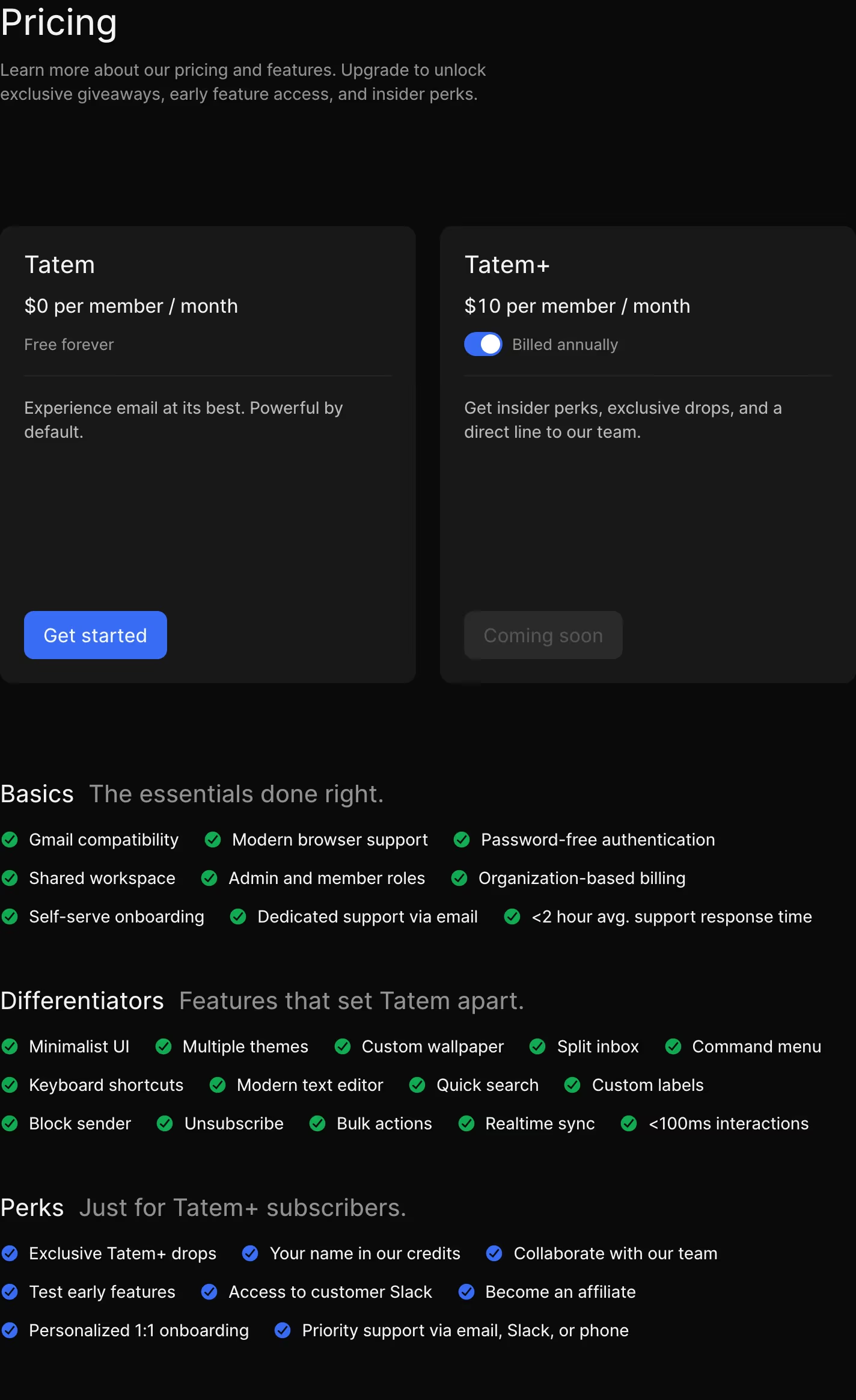
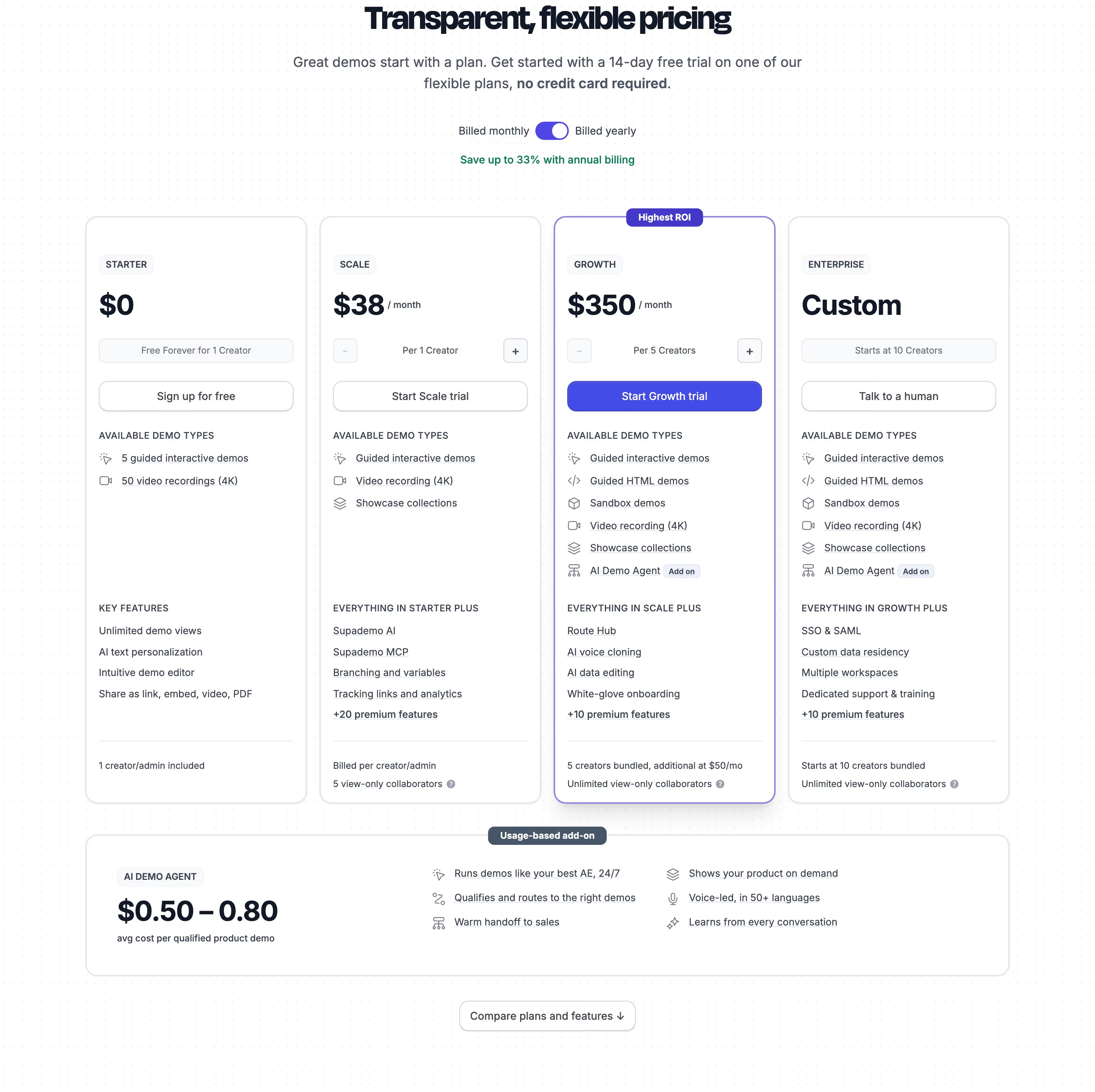
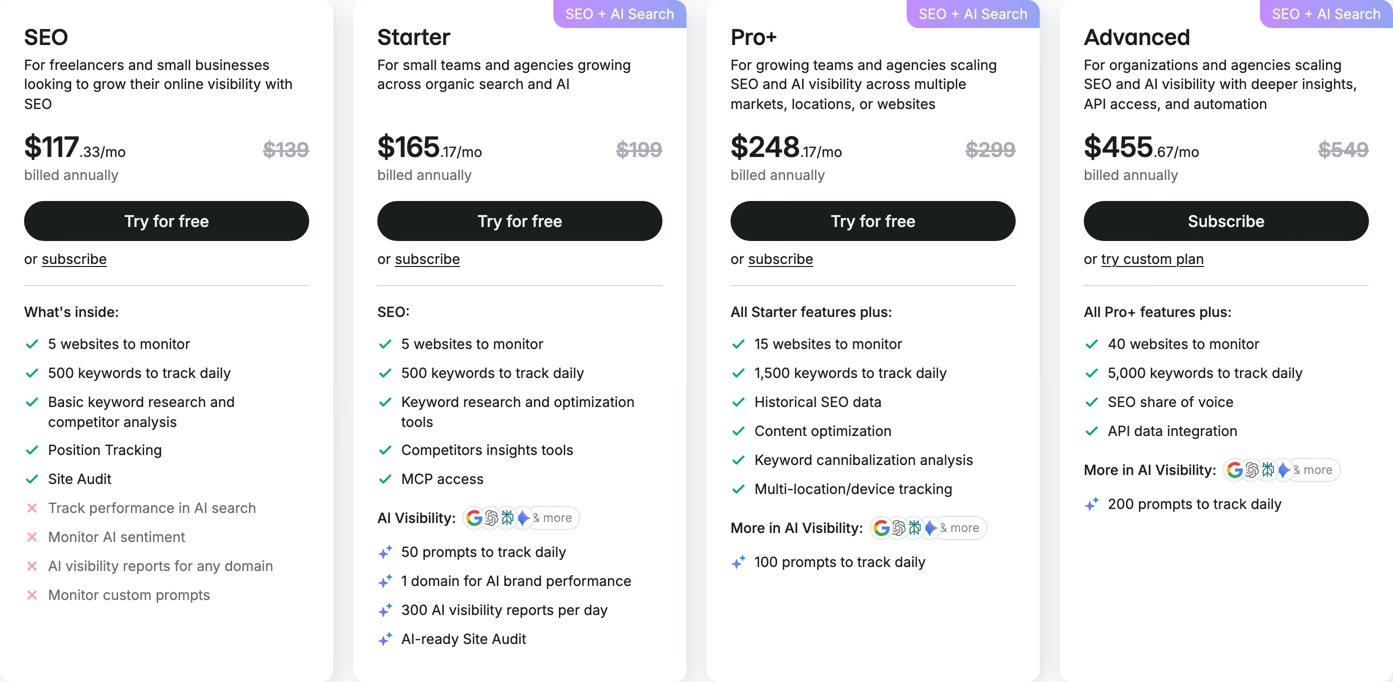
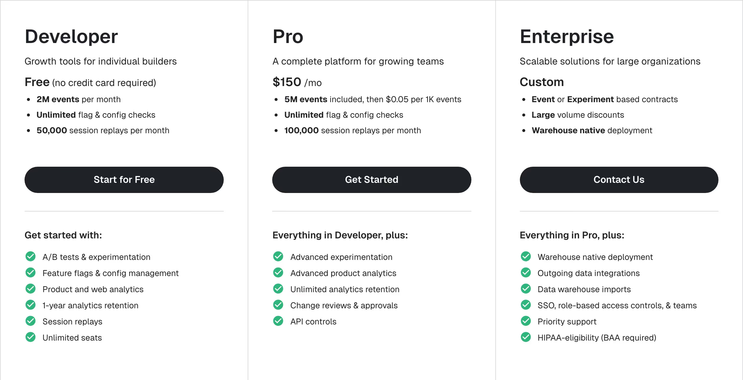
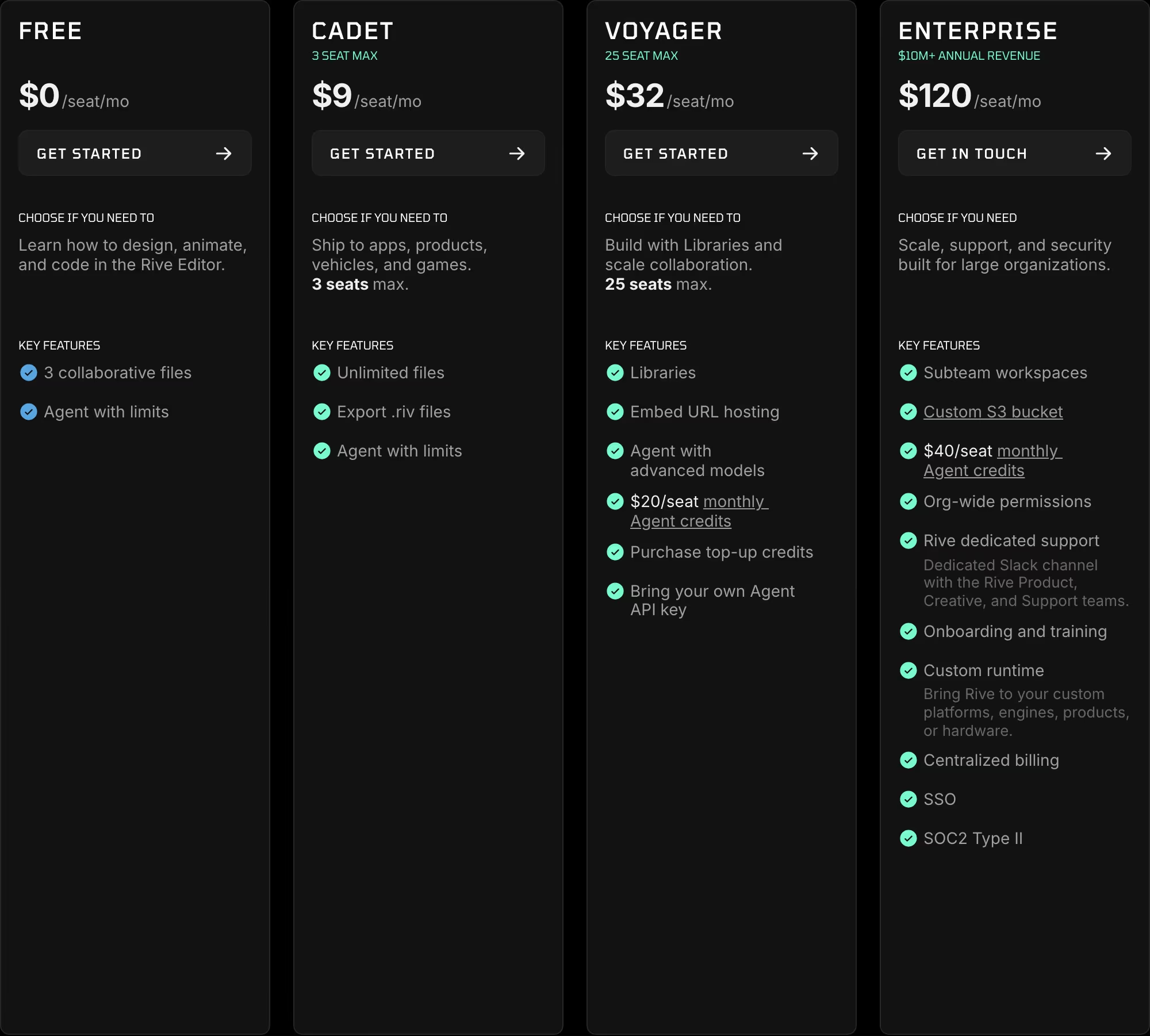
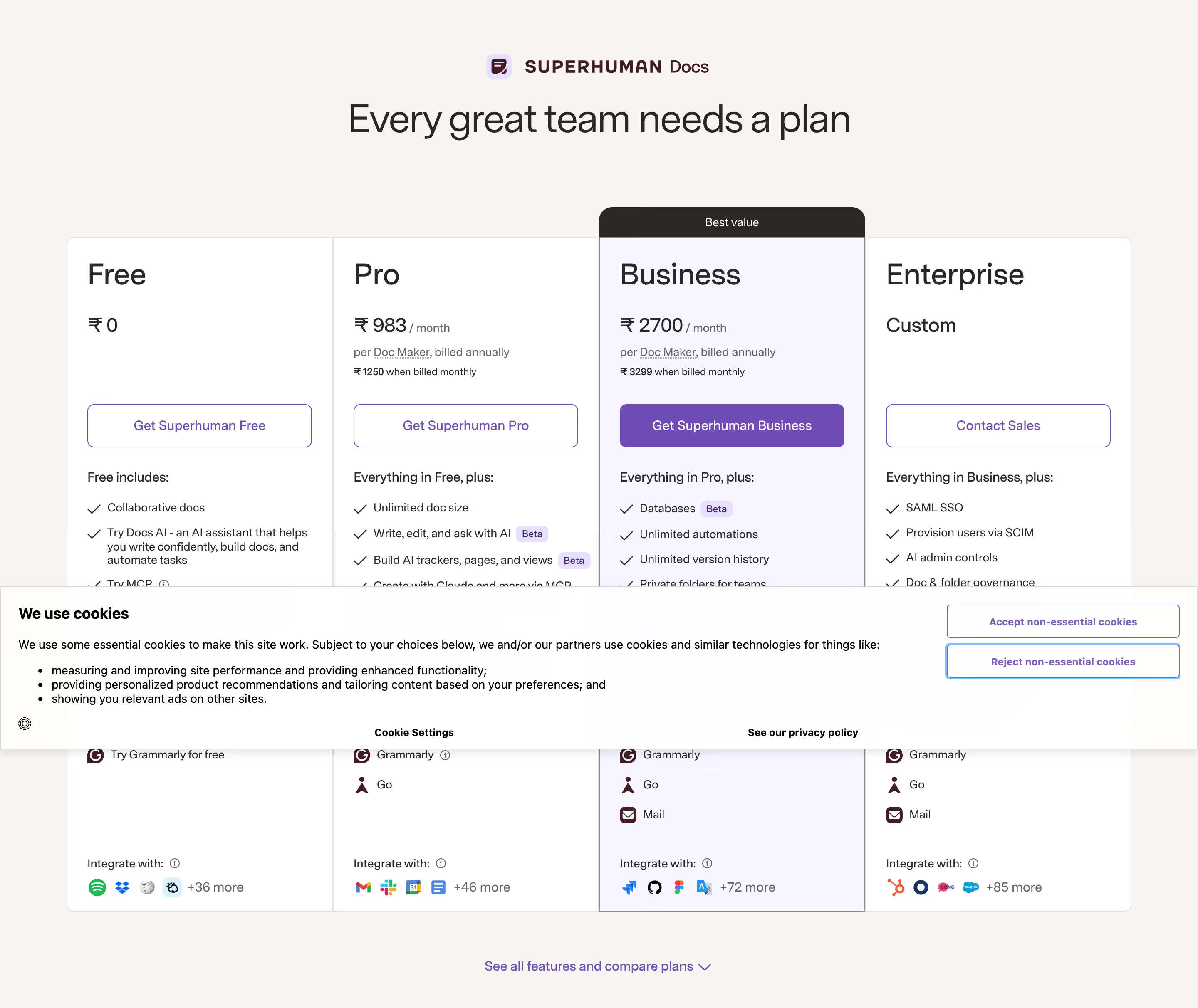
Most pricing pages that convert well use three tiers, not two or five — three gives a visitor a middle option to anchor on (priced and featured as the intended default) without the decision fatigue of comparing five nearly-identical rows of checkmarks. The visual treatment of that middle tier (a taller card, a border, a 'most popular' label) is usually the single highest-leverage design decision on the whole page, since it directs where undecided visitors land by default. Annual/monthly toggles need to be genuinely easy to use, not a trick — burying the better price behind a toggle a visitor has to find erodes exactly the trust the page is trying to build. And a short, specific FAQ placed directly beneath the tiers (refunds, seat limits, what happens if you exceed usage) resolves the exact hesitations that stop someone at the point of decision, which is why pricing and FAQ sections are so often paired on the same page rather than separated.
What makes a great one
- Plans that are easy to compare at a glance
- A highlighted or recommended tier
- Clear monthly/annual toggles and what each plan includes
- FAQs or guarantees that defuse hesitation
From the blog
8 Real SaaS Pricing Pages, and the Patterns Actually Worth Copying
A close look at how Notion, Sentry, Semrush, Superhuman, Gusto, Tailscale, Ramp and ElevenLabs actually structure their pricing pages — not generic pricing-page advice, but what's really on each page and why it works.
The 30 Best SaaS Websites in 2026 (Reviewed From Real Screenshots)
Thirty SaaS websites reviewed at equal depth from screenshots we captured ourselves — what's above the fold, the one section each does unusually well, and the stack, palette and typefaces behind it. With a stated selection method, not a handpicked vibe check.
24 Product Landing Page Examples, Measured Fold to Footer
Twenty-four product landing pages read start to finish from our own screenshots — what's in the fold, where the logo strip actually sits, how the page closes, and how long each one really runs, in pixels.
Frequently asked
Should a SaaS pricing page show a free tier?
It depends on the go-to-market motion. Self-serve, high-volume products benefit from a genuinely usable free tier as an acquisition channel; higher-touch or enterprise-leaning products often do better with a free trial instead, since a permanent free tier can undercut sales conversations.
How many pricing tiers convert best?
Three is the most common and generally best-performing structure — it provides a clear middle anchor. Two tiers can feel like a binary decision with no 'safe middle,' and five or more tends to overwhelm rather than clarify.
Should pricing be public or 'Contact us'?
Public pricing builds trust and reduces sales friction for products under a certain deal size; 'Contact us' makes sense once pricing genuinely varies by scale or custom terms. Hiding pricing purely to force a sales conversation, when the price wouldn't actually change much, tends to frustrate evaluators instead.