
248 Colorful SaaS website designs
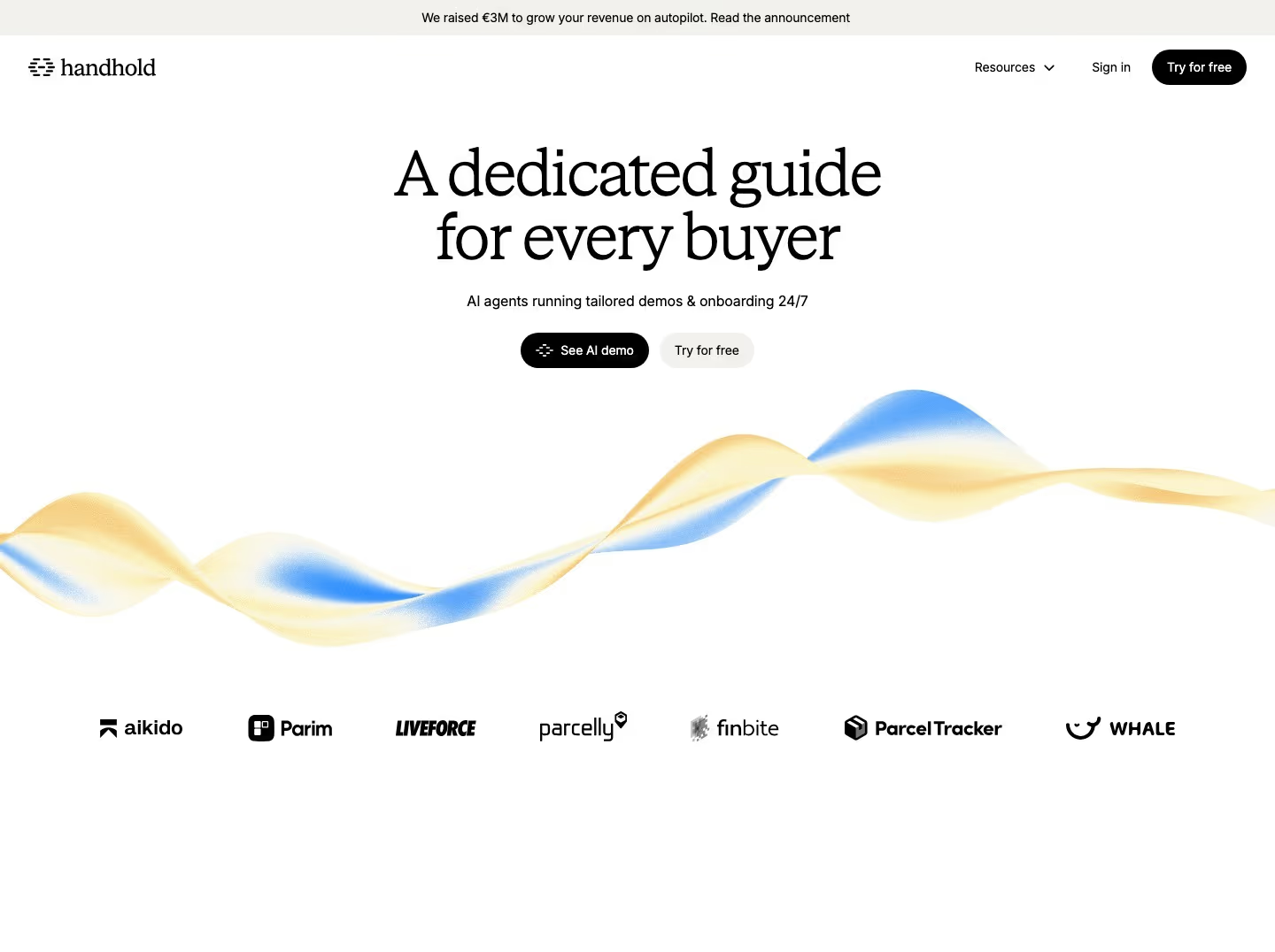
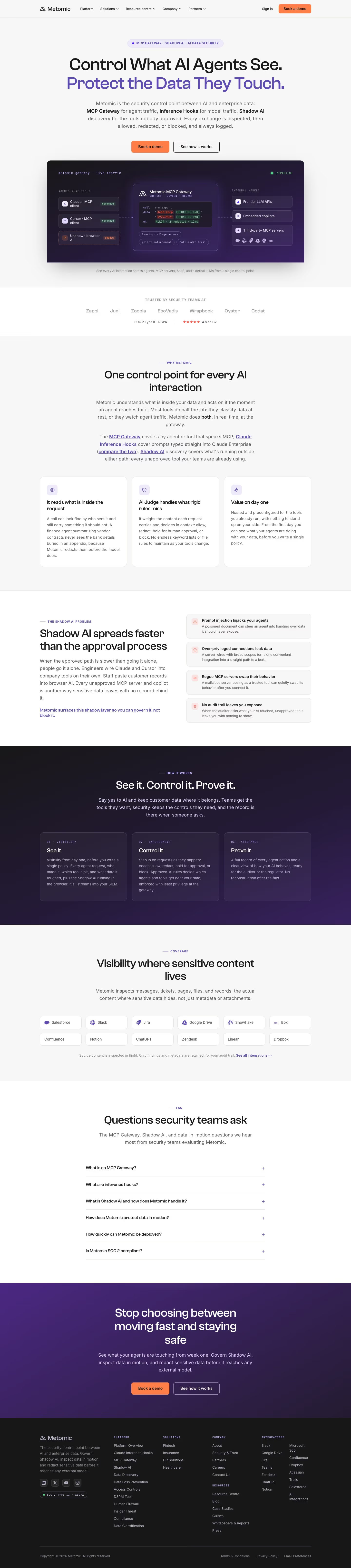
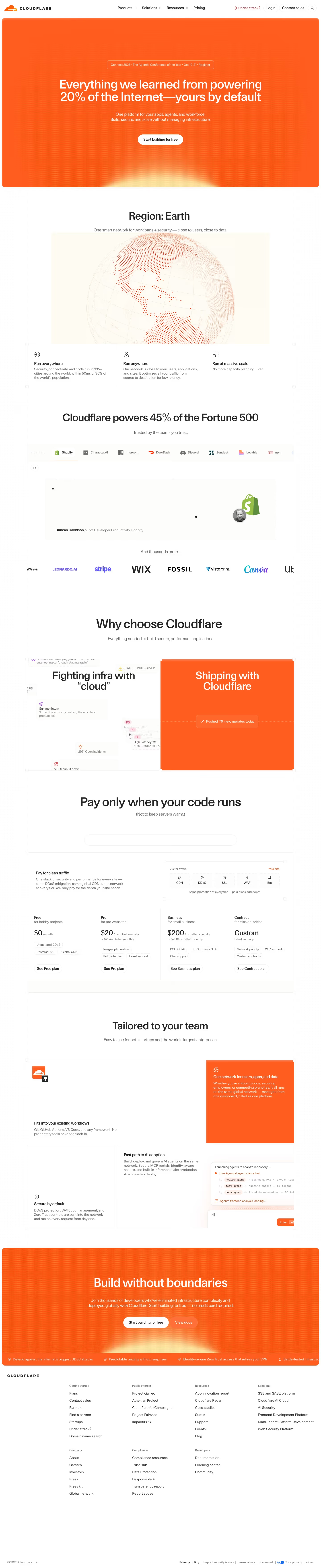
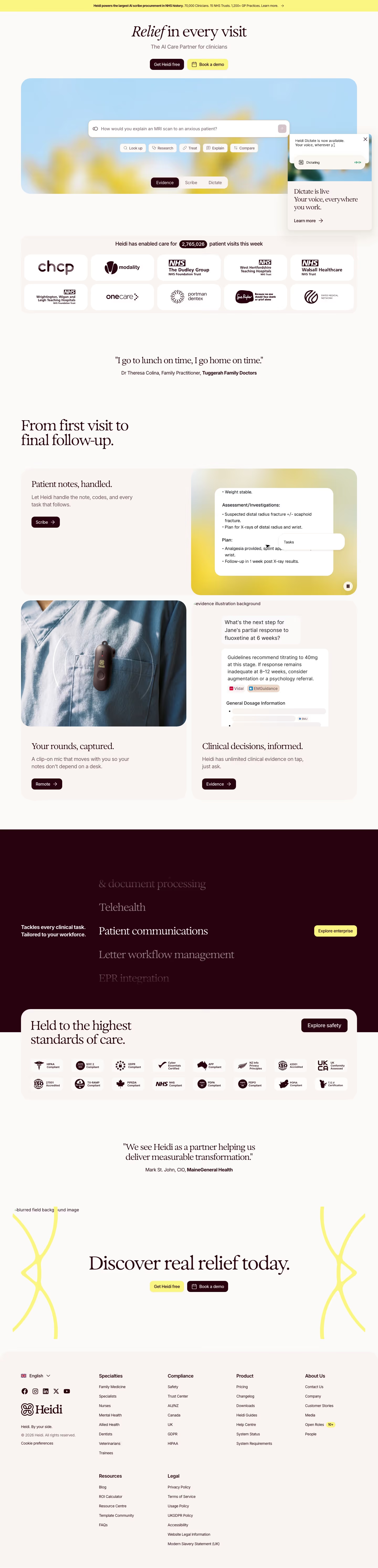
Bold, colorful landing pages stand out in a sea of blue-and-white SaaS. These examples show how brands use vivid palettes, gradients and playful accents while keeping the page legible and on-message.
Sponsored by (opens in new tab)
(opens in new tab)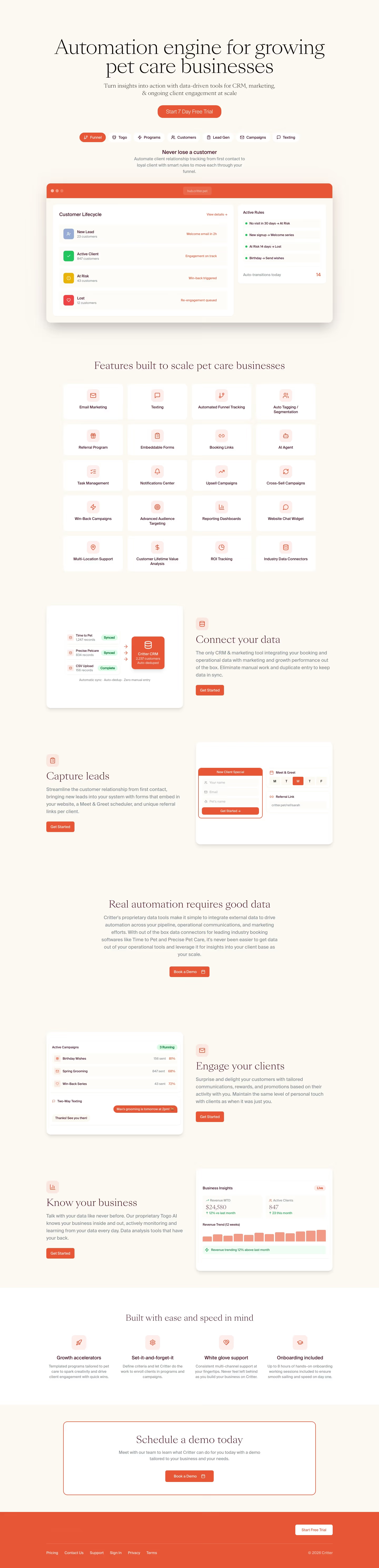























About colorful designs
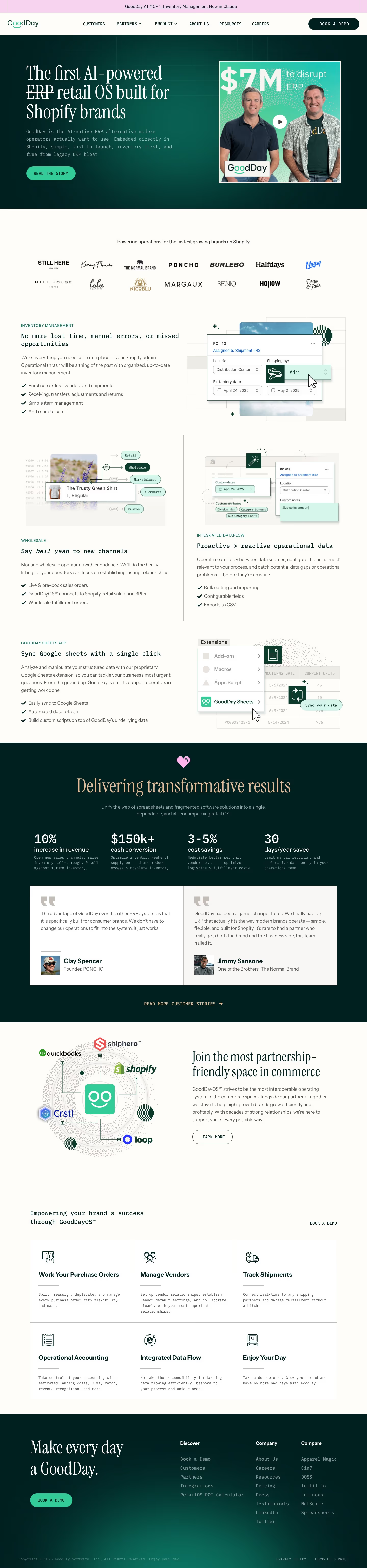
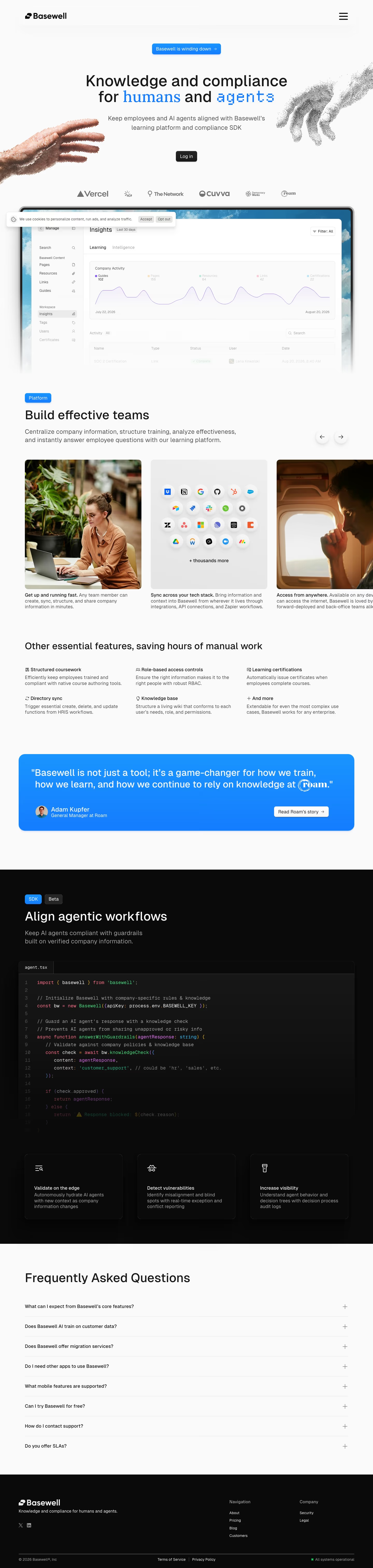
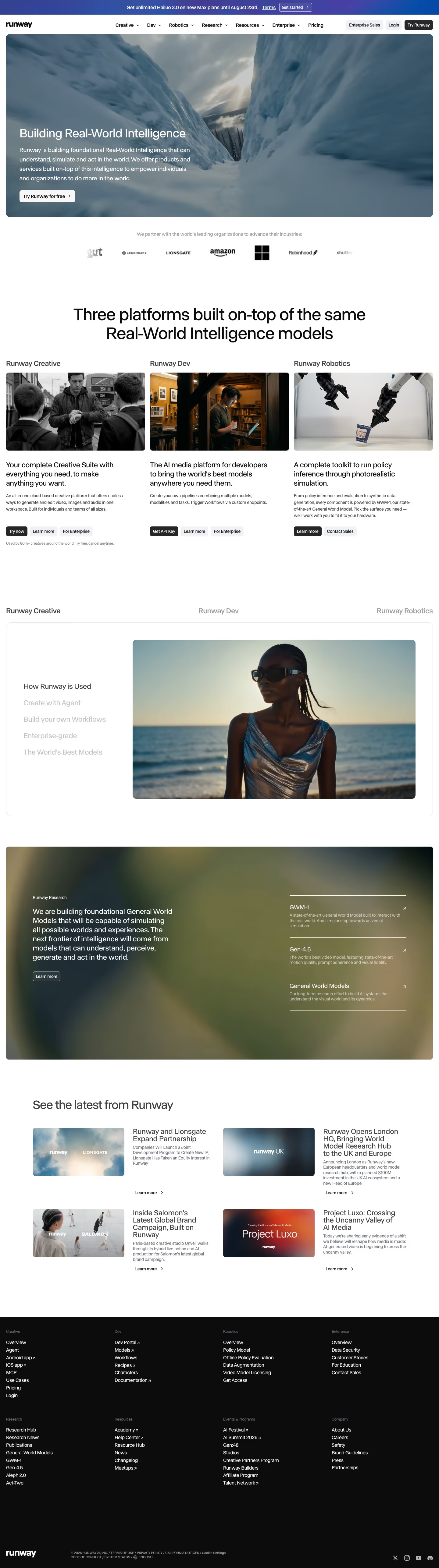
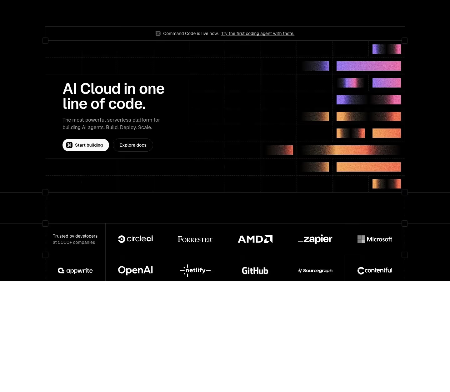
Committing to a bold, colorful palette is a genuine differentiation strategy in a category where most competitors default to blue-and-white — the risk is that color becomes decoration rather than direction, and the sites that pull it off use color to guide the eye toward the next action (a bright button, a highlighted pricing tier) rather than spreading saturation evenly across the page. Two or three colors used with intent tend to outperform a wider palette used loosely, because a visitor can still tell what's clickable versus what's just brand expression when the palette is constrained. Gradients specifically have a shelf life as a trend, cycling in and out of fashion roughly every few years — the versions that age well tend to be subtle (a soft two-tone wash behind a hero) rather than the whole page rendered as a gradient, which reads as dated faster.
What to look for
- A confident, cohesive multi-color palette
- Color used to guide the eye, not just decorate
- Contrast preserved despite the saturation
- Personality that still feels trustworthy
From the blog
25 SaaS Contact Us Page Examples, Counted Field by Field
Dropbox's contact form asks for eleven things. Warp's asks for one. We counted the fields, the routes and the published email addresses on 25 real SaaS contact pages — and not one of them promises a response time.
The 30 Best SaaS Websites in 2026 (Reviewed From Real Screenshots)
Thirty SaaS websites reviewed at equal depth from screenshots we captured ourselves — what's above the fold, the one section each does unusually well, and the stack, palette and typefaces behind it. With a stated selection method, not a handpicked vibe check.
22 SaaS Affiliate Program Pages, and the Terms They Actually Publish
Semrush publishes a 120-day cookie window and a four-tier commission table. Typeform caps you at $500 per referral. Seven of these 22 pages publish no rate at all. A page-by-page read of what SaaS affiliate pages actually disclose.
Frequently asked
Is a colorful design riskier for a B2B SaaS brand?
It carries more brand risk than a safe blue-and-white palette, but risk isn't the same as ineffectiveness — for a product trying to stand out in a crowded, visually similar category, a distinctive palette can be a genuine differentiator rather than a liability, as long as legibility and hierarchy aren't sacrificed for it.
How many accent colors should a landing page use?
Two to three used deliberately (one primary, one or two supporting) tends to work better than a wider palette spread loosely across the page — the goal is color that still signals hierarchy, not color as generalized decoration.
Do gradients still look modern in 2026?
Subtle, restrained gradients (a soft wash behind a hero, a gentle transition on a button) still read as current; a whole page rendered in a loud multi-color gradient reads closer to a specific, dateable trend than a timeless choice.