
270 Light SaaS website designs
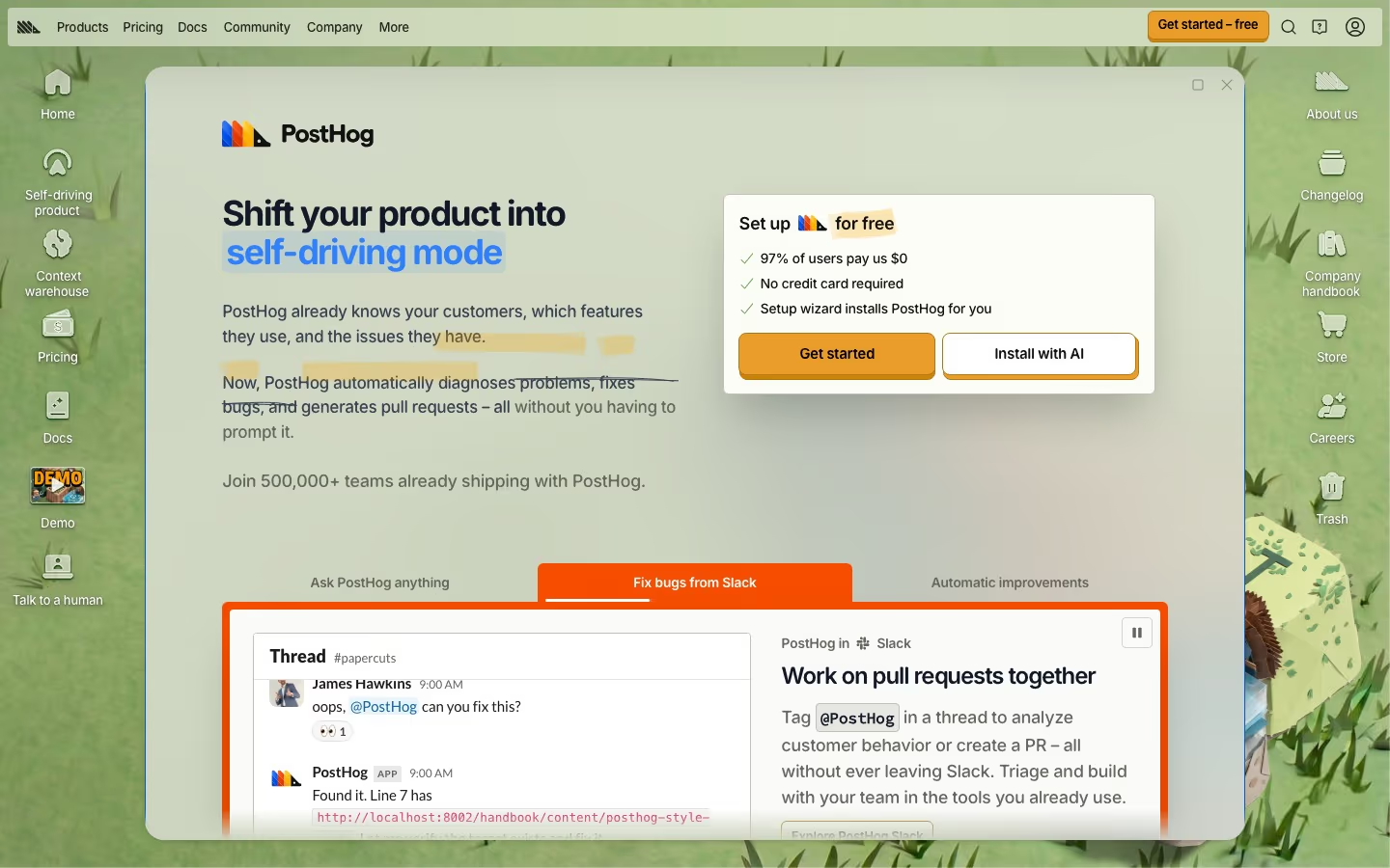
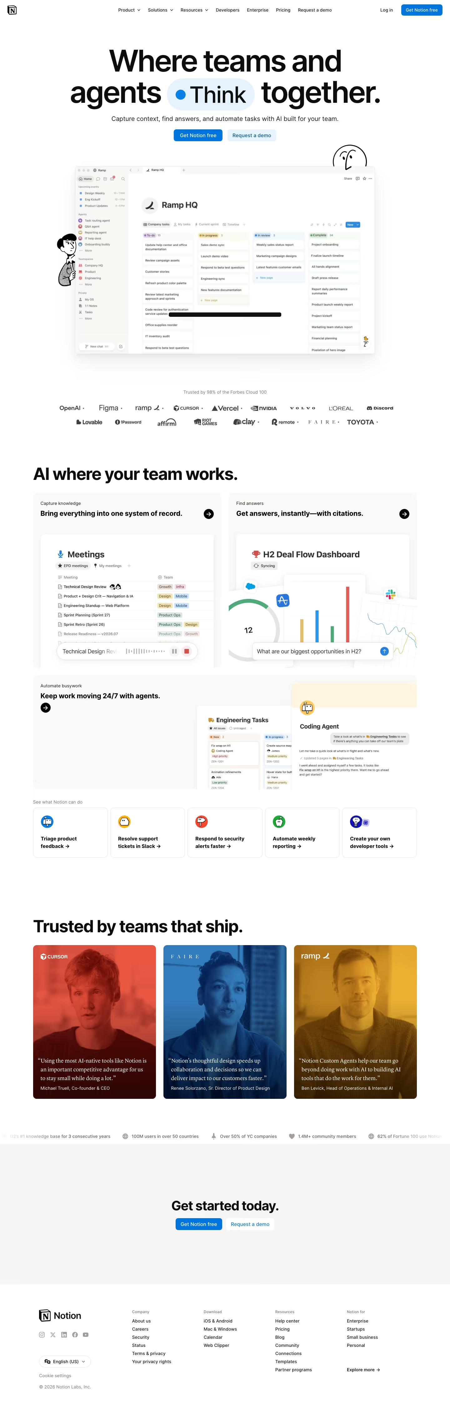
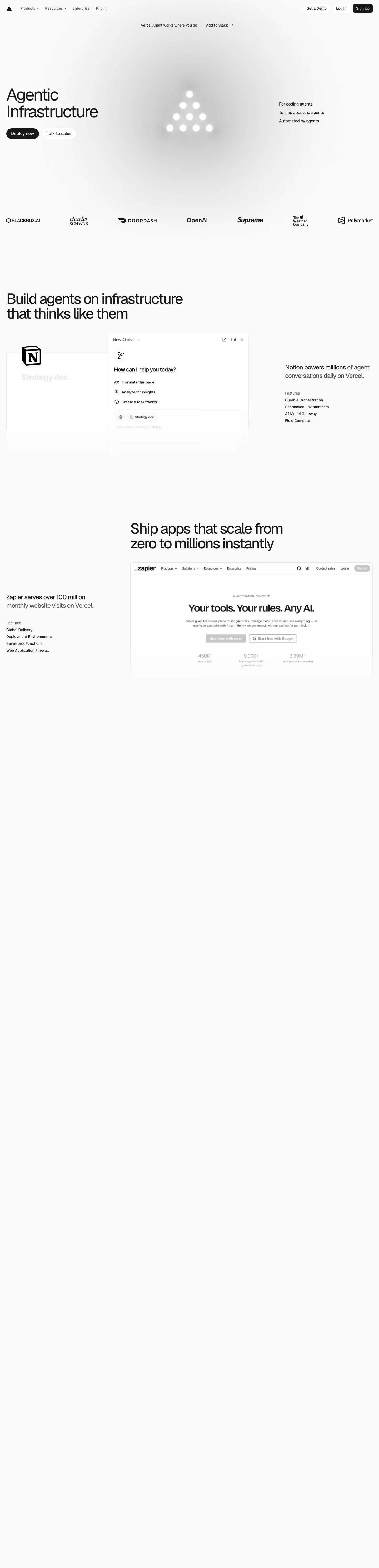
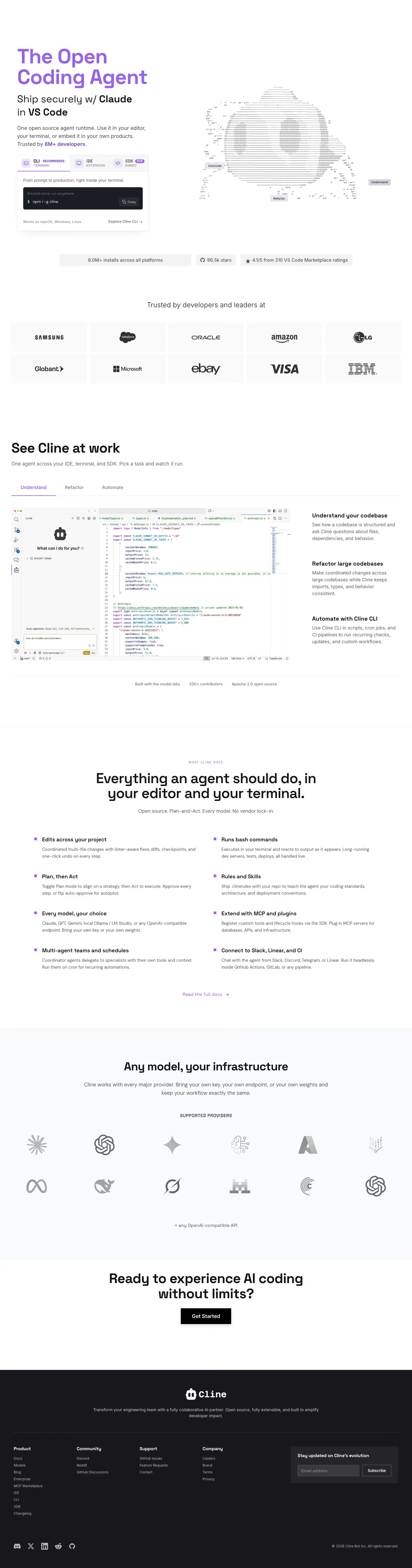
Light, airy landing pages still convert best for most SaaS audiences. These examples show how leading products use whitespace, restraint and a single accent to keep a bright design from feeling flat.
Sponsored by (opens in new tab)
(opens in new tab)

























About light designs
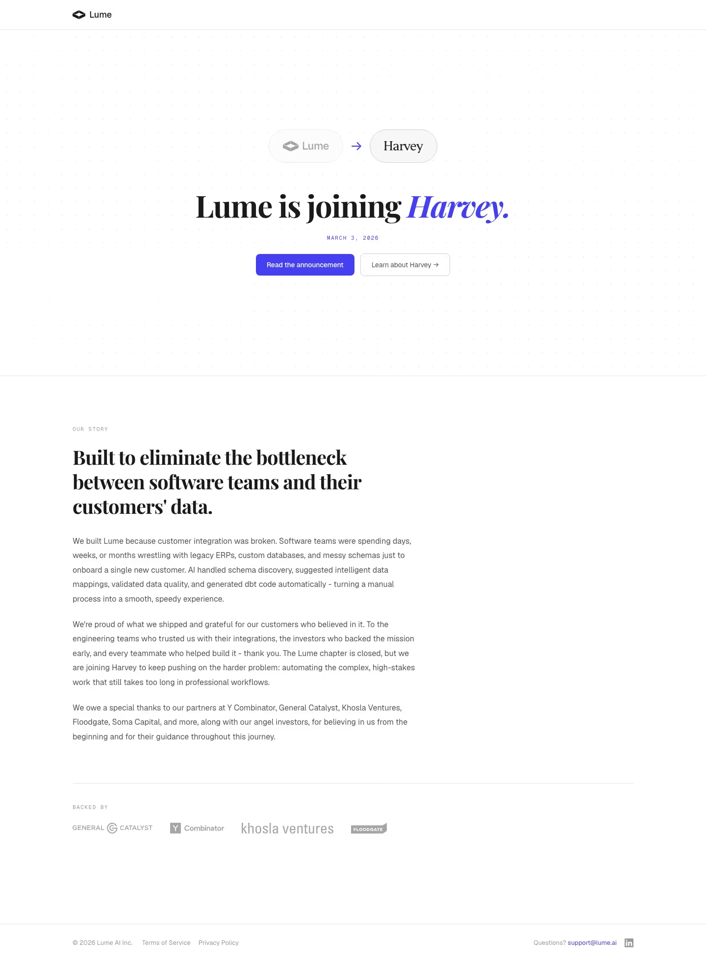
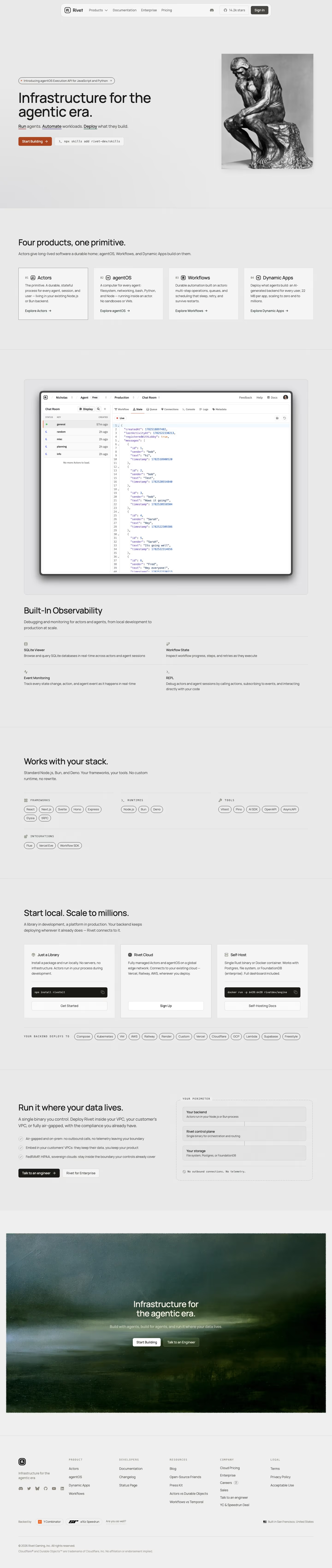
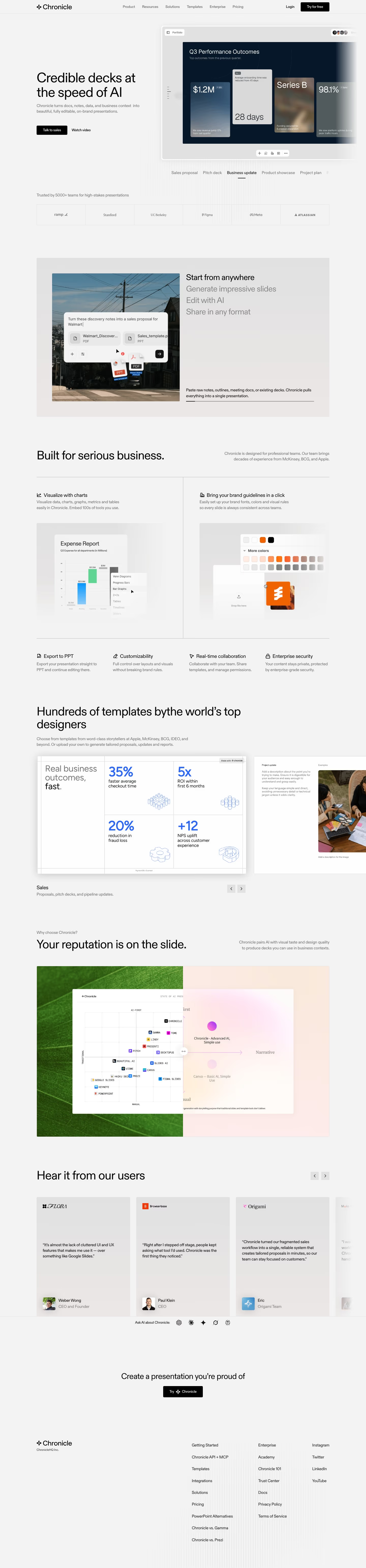
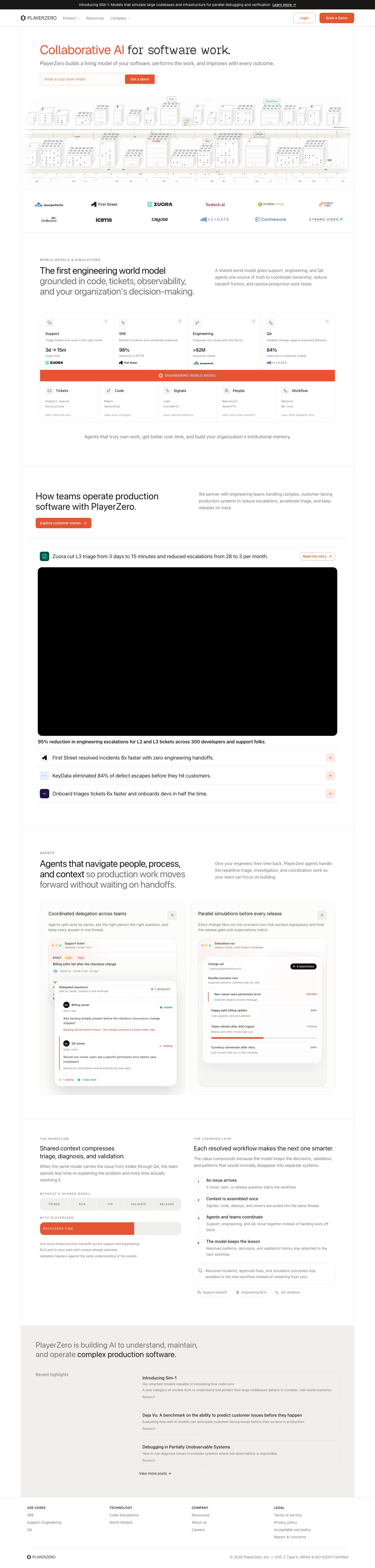
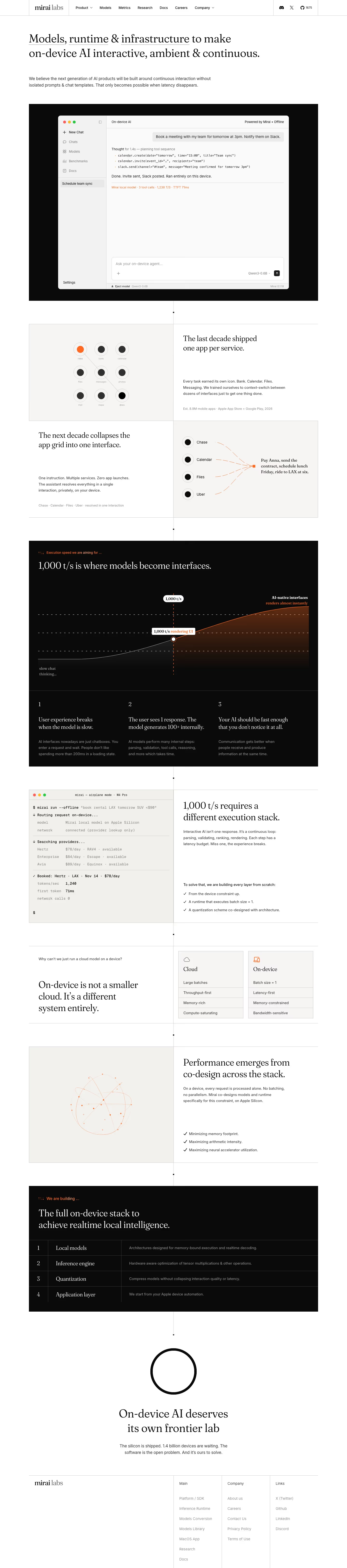
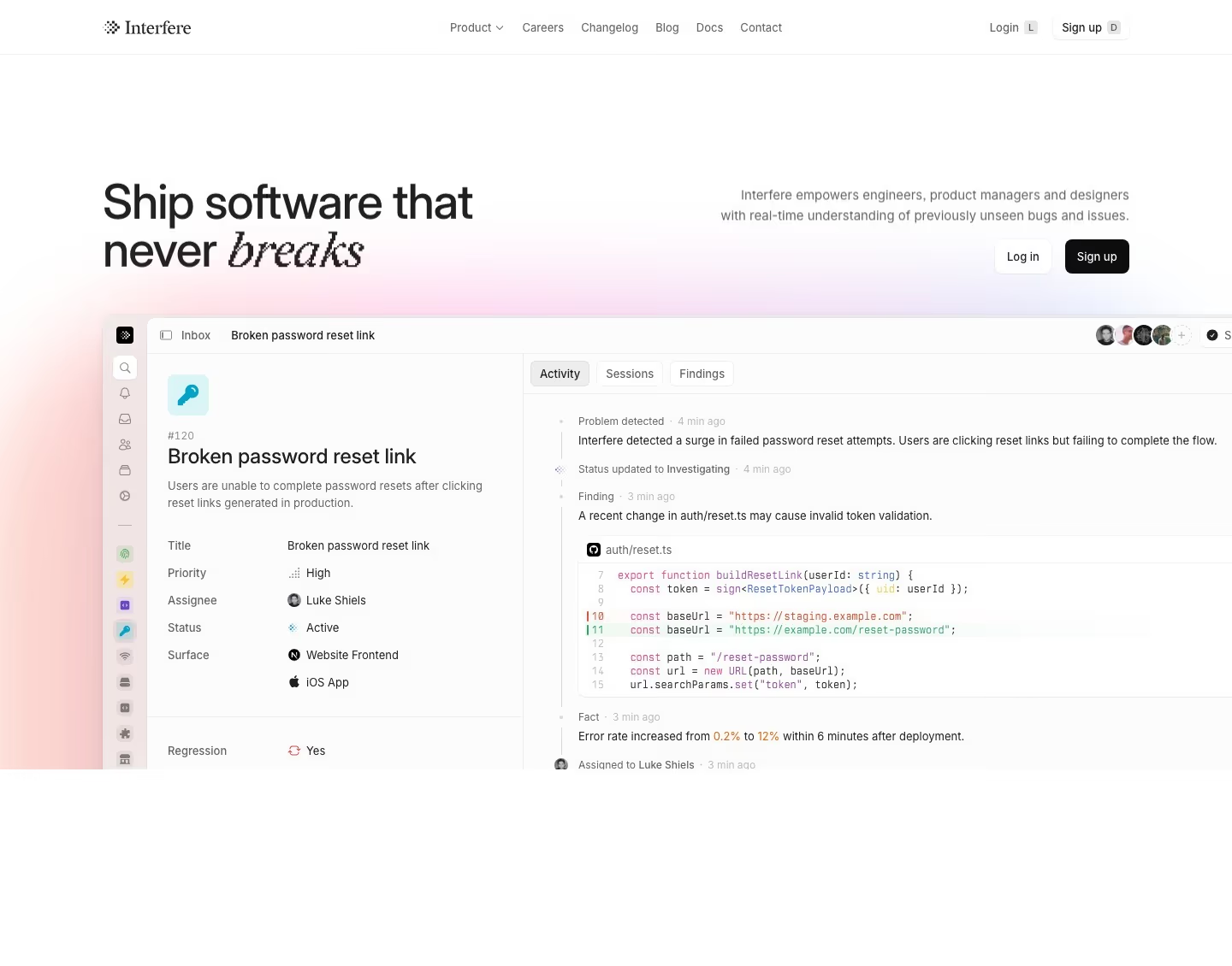
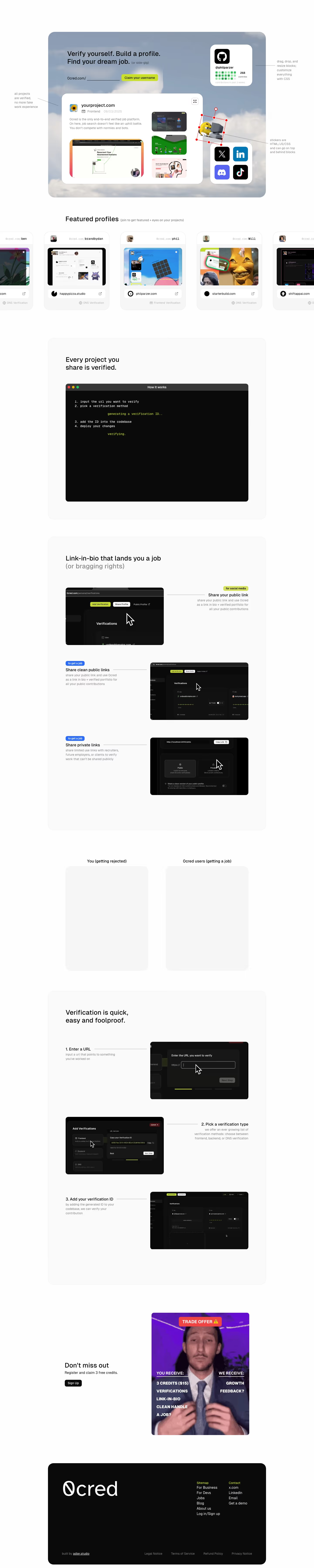
Light backgrounds remain the default for most SaaS marketing sites for a practical reason as much as an aesthetic one — they read as neutral and approachable to the widest range of buyers, which matters most for products selling into HR, finance, or general business audiences rather than a narrower technical crowd. The risk with a light design is that it can end up looking generic rather than restrained, and the difference usually comes down to typography and spacing doing deliberate work rather than filling space by default — a light page with a strong type system and a disciplined single accent color reads as confident, while the same layout with default system fonts and no clear accent reads as unfinished. Depth still matters even without a dark canvas to create contrast naturally: soft shadows, subtle borders, and layered cards give a light page dimensionality that a flat white background alone doesn't provide, which is part of why 'light' and 'flat' aren't the same thing in the strongest examples.
What to look for
- Generous whitespace and clear hierarchy
- A disciplined, limited accent palette
- Crisp typography that carries the page
- Subtle depth — shadows, borders, soft gradients
From the blog
25 SaaS Contact Us Page Examples, Counted Field by Field
Dropbox's contact form asks for eleven things. Warp's asks for one. We counted the fields, the routes and the published email addresses on 25 real SaaS contact pages — and not one of them promises a response time.
The 30 Best SaaS Websites in 2026 (Reviewed From Real Screenshots)
Thirty SaaS websites reviewed at equal depth from screenshots we captured ourselves — what's above the fold, the one section each does unusually well, and the stack, palette and typefaces behind it. With a stated selection method, not a handpicked vibe check.
24 SaaS About Us Page Examples, Module by Module
We read 24 real SaaS About Us pages against the same seven-module checklist — team photos, named people, stat tiles, timelines, investor walls, hiring CTAs, manifestos — and counted what's actually there. Only one page uses a timeline.
Frequently asked
Why do most SaaS sites default to light backgrounds?
Light themes read as neutral, approachable and trustworthy to the broadest range of buyers, which matters most for products selling to non-technical or enterprise audiences rather than a narrower developer-focused one.
How much whitespace is too much?
It's too much when whitespace starts working against hierarchy rather than for it — if a visitor has to scroll further than the content justifies to find the next piece of information, the spacing has crossed from restraint into padding.
Does a light theme limit brand personality?
No — personality comes from typography, a disciplined accent color, and photography/illustration choices, not from the background being dark or light. Many of the most distinctive SaaS brands run entirely on light backgrounds.