
155 Minimal & monochrome SaaS website designs
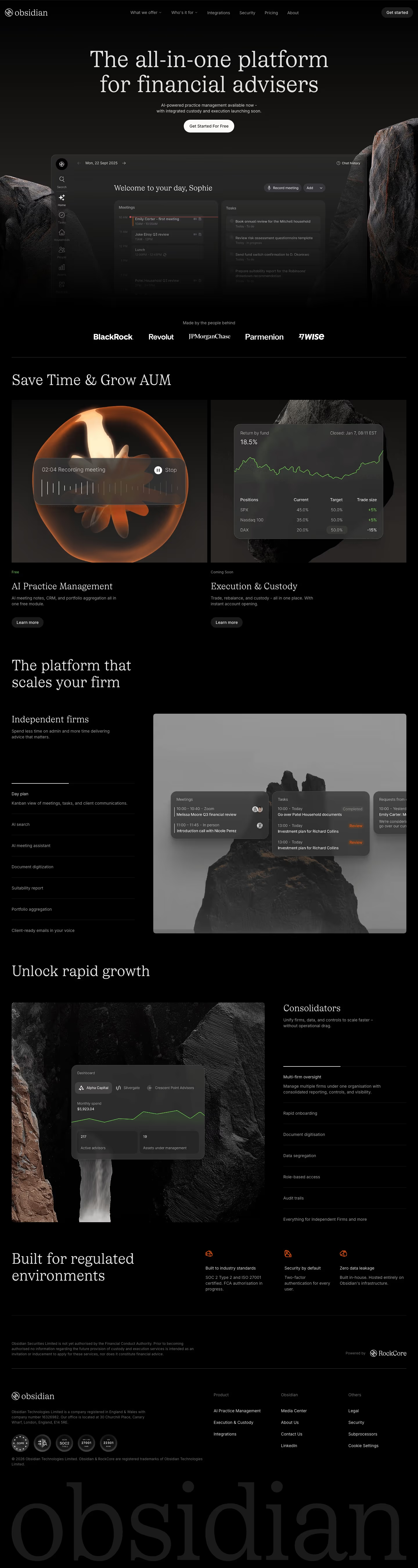
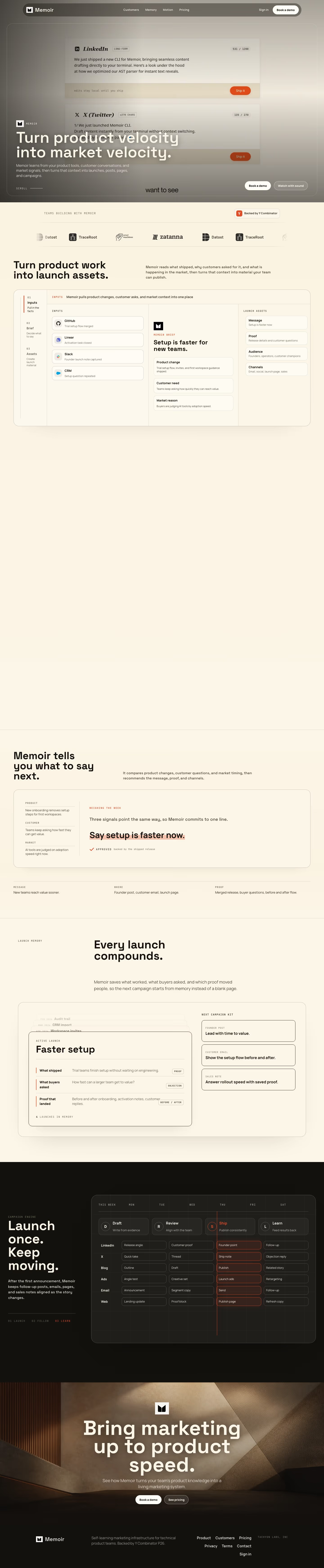
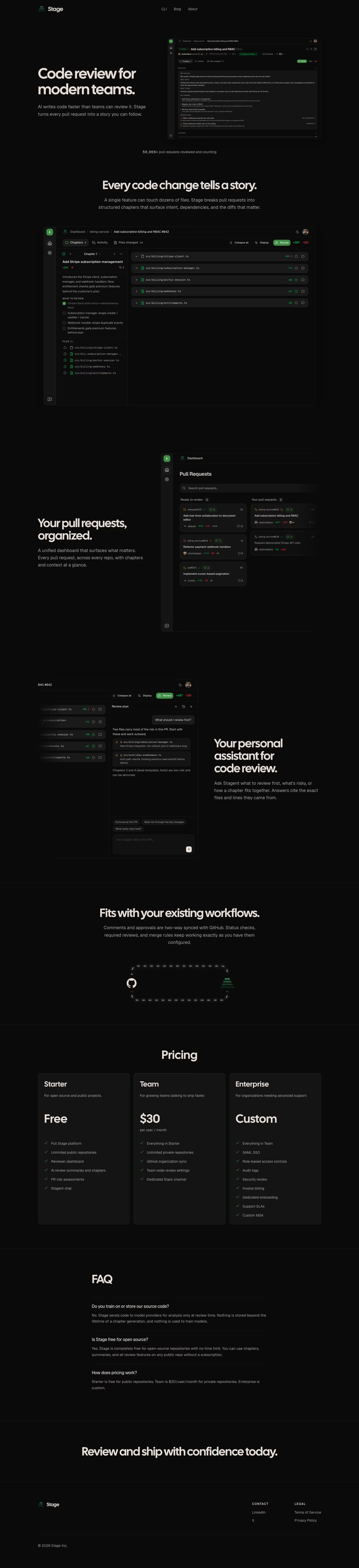
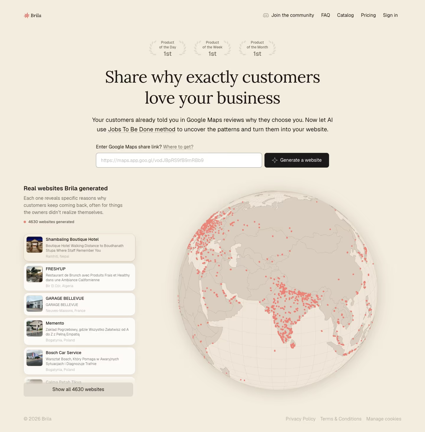
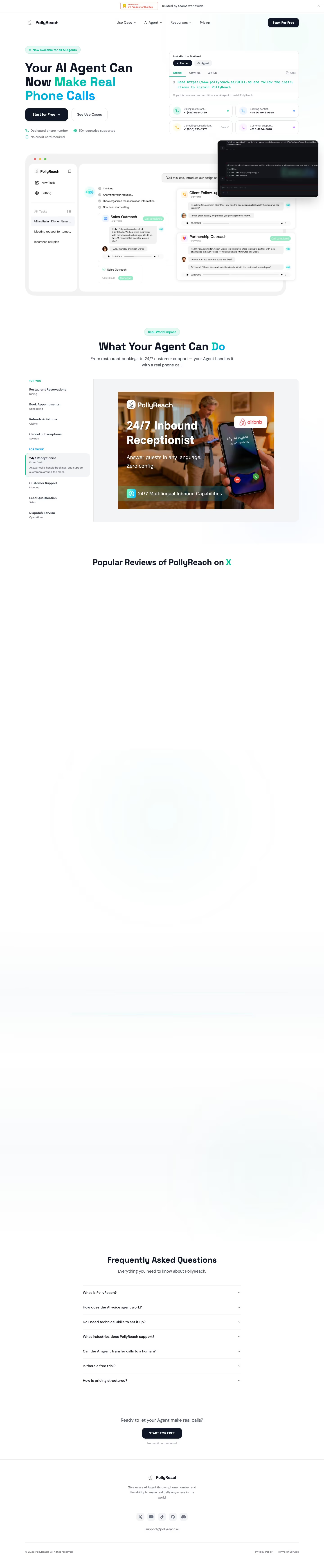
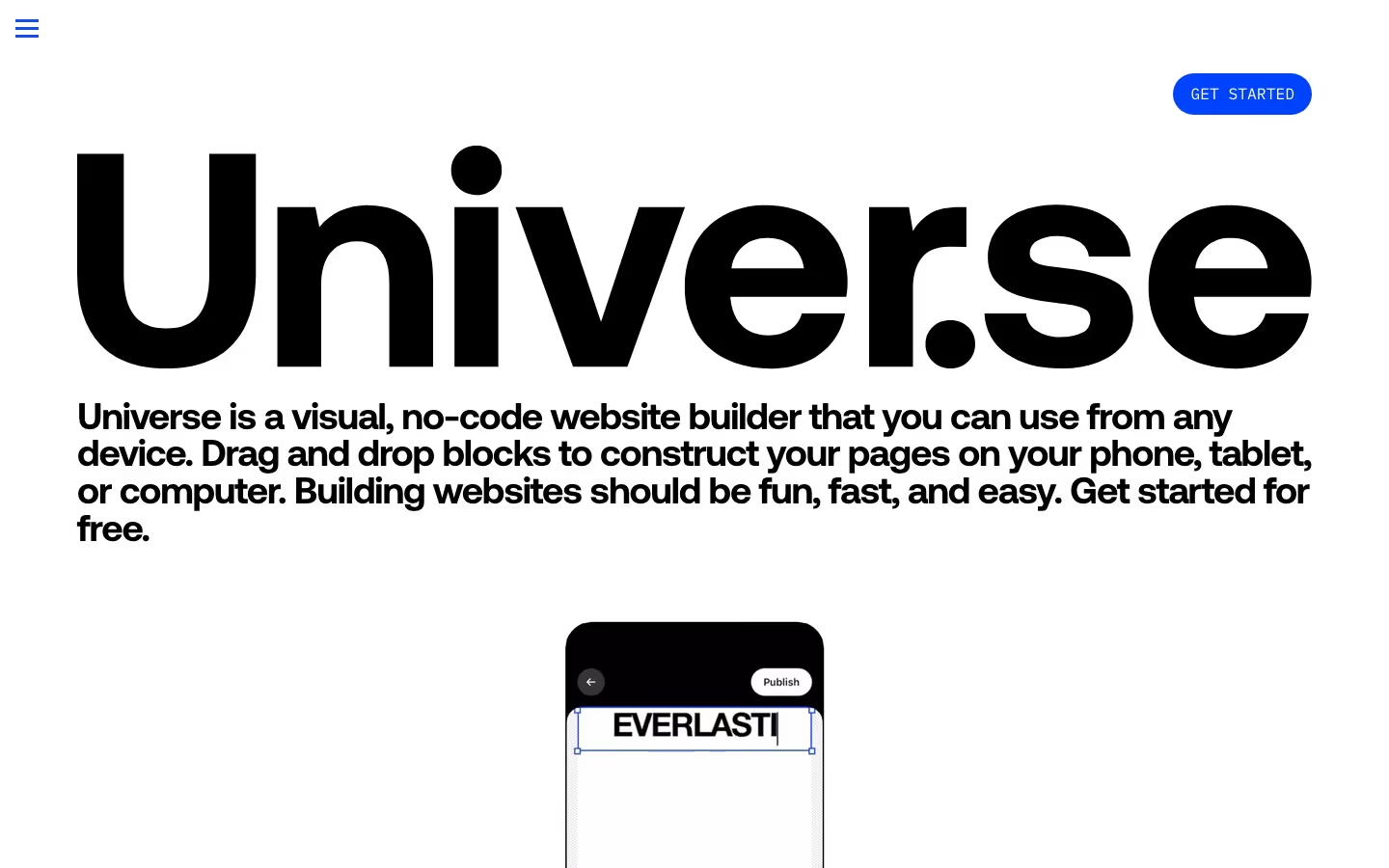
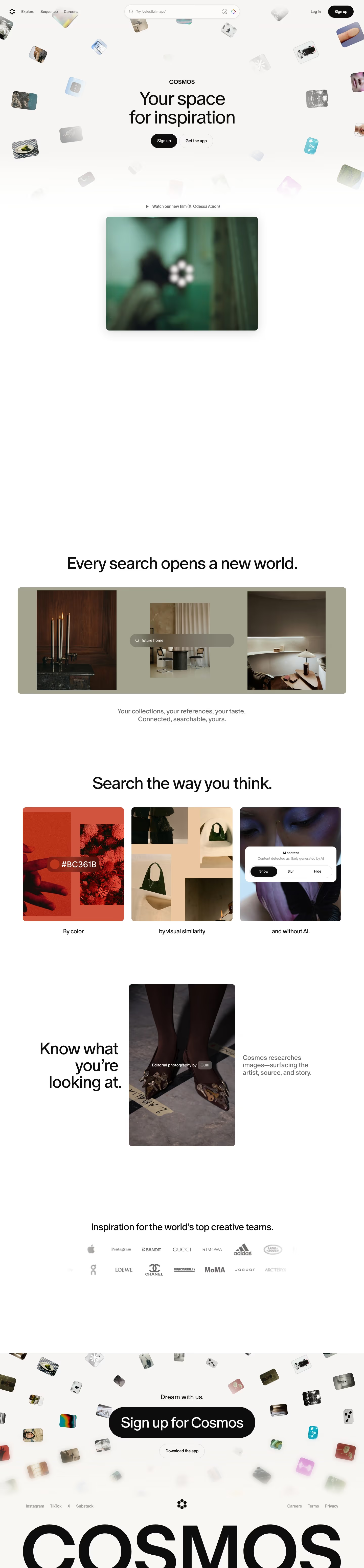
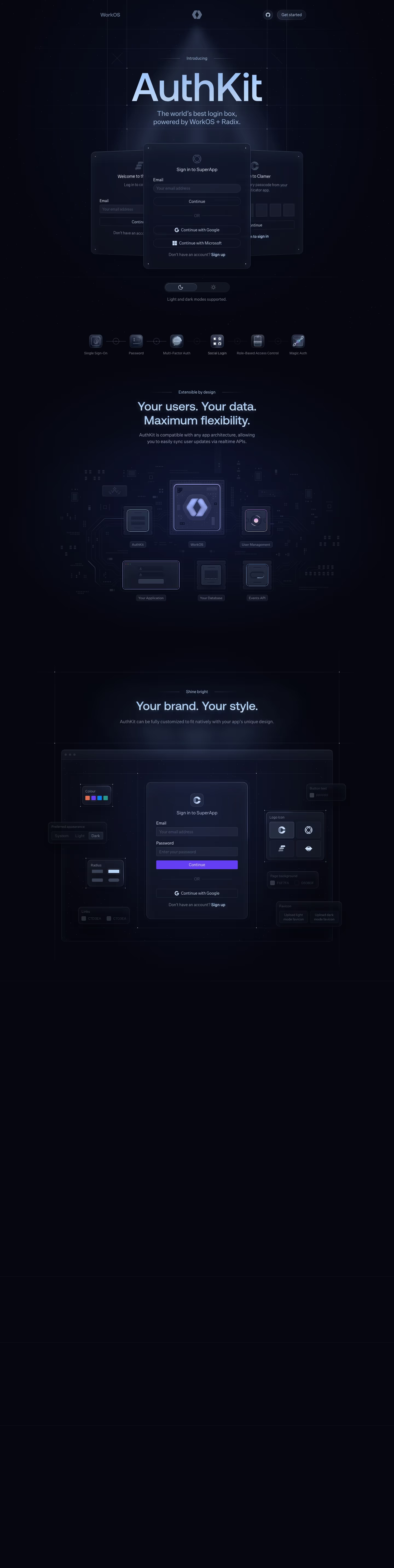
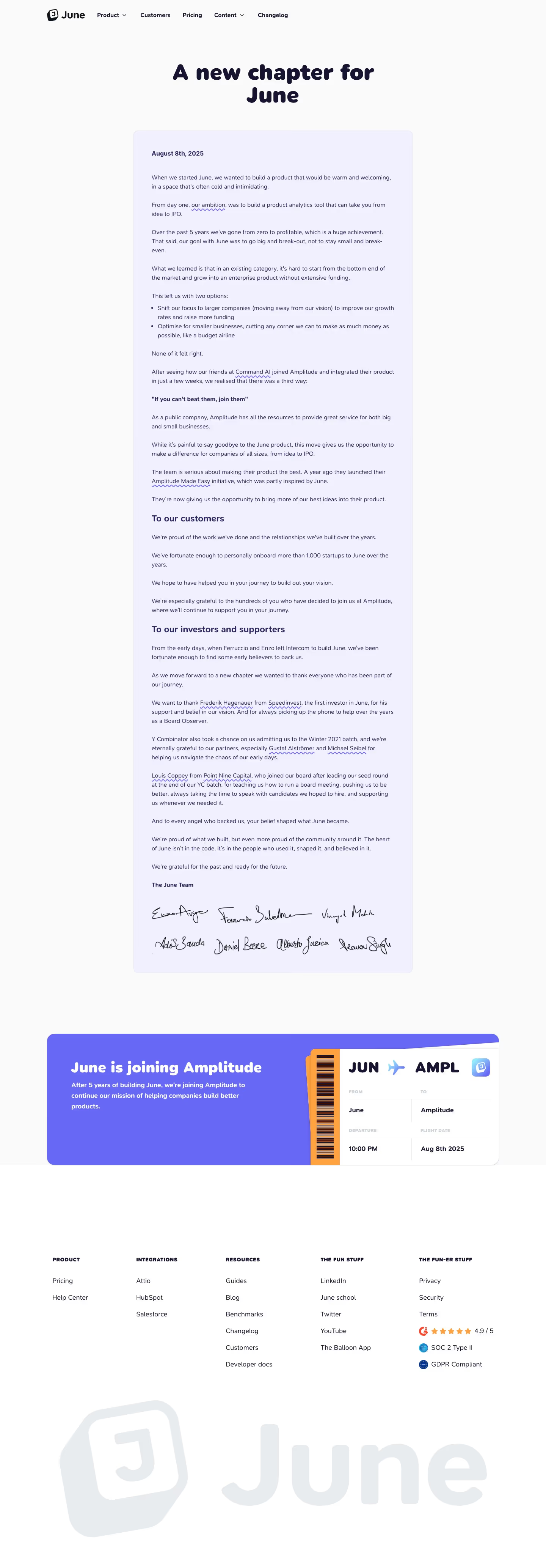
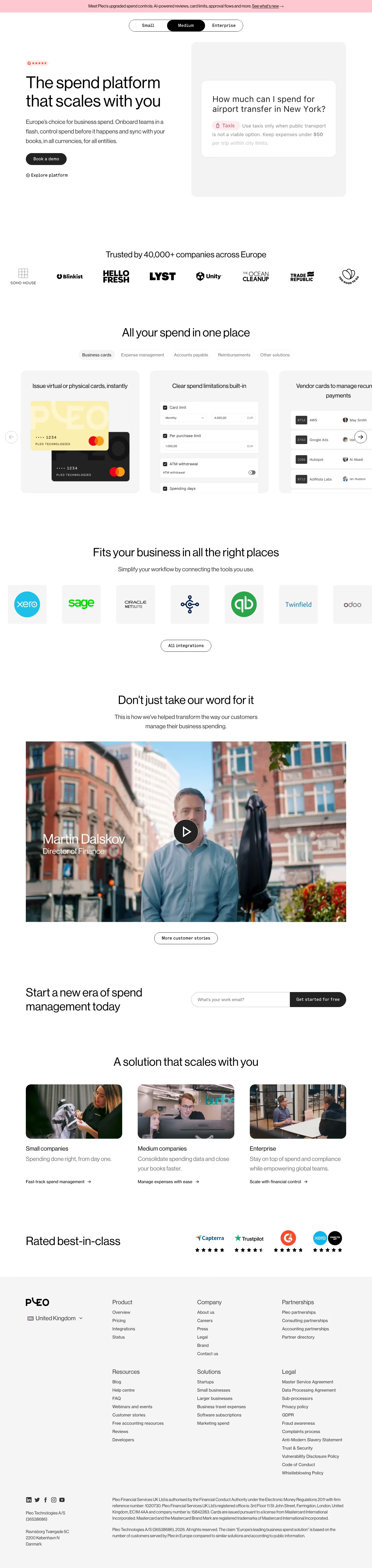
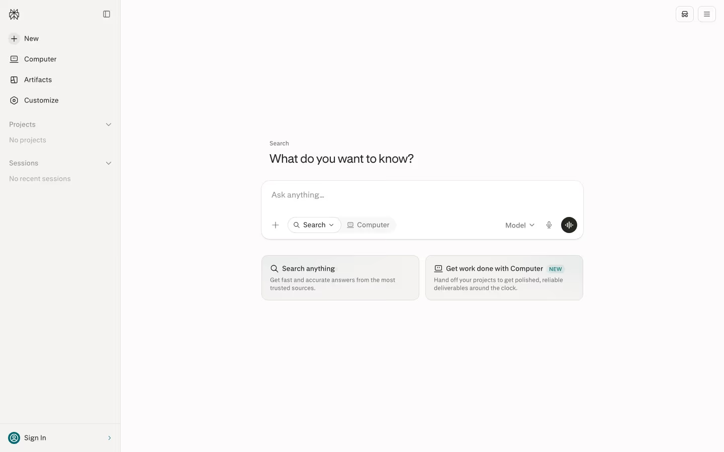
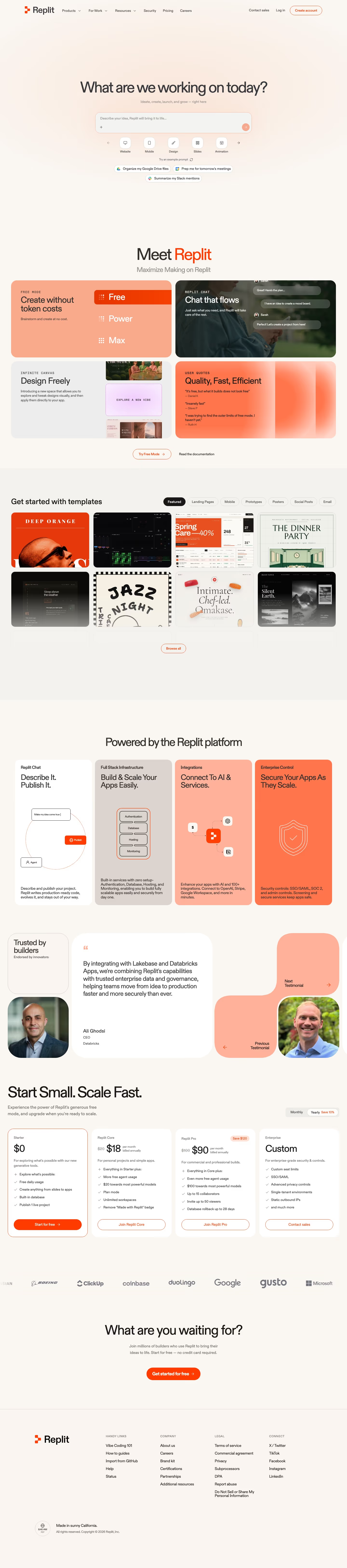
Minimal, near-monochrome landing pages let the product and copy do the talking. These examples show how restraint — one or two colors, lots of space, sharp type — can read as confident and premium.
Sponsored by (opens in new tab)
(opens in new tab)
























About minimal designs
Minimal design is easy to mistake for 'less work' when it's usually the opposite — with almost no color or decoration to lean on, every remaining choice (type scale, spacing rhythm, the one accent color that does appear) has to be precise, because there's nothing else to distract from a misjudged detail. The sites that do this well use typography as the primary design tool rather than an afterthought: a strong type scale with clear size and weight differences between headline, subhead and body text creates hierarchy on its own, without needing color or borders to separate sections. The single accent color, when there is one, tends to be reserved entirely for interactive elements (links, the primary button) so its scarcity keeps it meaningful — spend it on decoration elsewhere and it stops signaling 'click here' as clearly.
What to look for
- A tight, near-monochrome palette
- Typography and spacing doing the heavy lifting
- One deliberate accent, used sparingly
- Clarity over decoration
From the blog
24 Product Landing Page Examples, Measured Fold to Footer
Twenty-four product landing pages read start to finish from our own screenshots — what's in the fold, where the logo strip actually sits, how the page closes, and how long each one really runs, in pixels.
The 30 Best SaaS Websites in 2026 (Reviewed From Real Screenshots)
Thirty SaaS websites reviewed at equal depth from screenshots we captured ourselves — what's above the fold, the one section each does unusually well, and the stack, palette and typefaces behind it. With a stated selection method, not a handpicked vibe check.
24 SaaS About Us Page Examples, Module by Module
We read 24 real SaaS About Us pages against the same seven-module checklist — team photos, named people, stat tiles, timelines, investor walls, hiring CTAs, manifestos — and counted what's actually there. Only one page uses a timeline.
Frequently asked
Does minimal design mean less content?
Not necessarily — it means the same content presented with more restraint in color and decoration. A minimal page can cover just as much ground as a busier one; the difference is in how much visual noise surrounds that content.
What's the difference between minimal and just empty?
Minimal design still has deliberate hierarchy — clear typographic scale, intentional spacing, one accent color used consistently. An empty page just has gaps with nothing directing attention; minimal design uses restraint to direct attention more precisely, not less.
Which SaaS categories lean minimal most often?
Design tools, developer tools and premium productivity products lean minimal most consistently — categories where the brand wants to signal precision and craft, which a restrained, typography-led page communicates more directly than a busier one.